
Your landing page’s weakest score is Trust.
How Lifeforce ranks
66Growth scoreupdated
category scores
category scoresShowHide
Trust
48PoorProof that the product is real, competent, and safe to try.
| Trust read | |
|---|---|
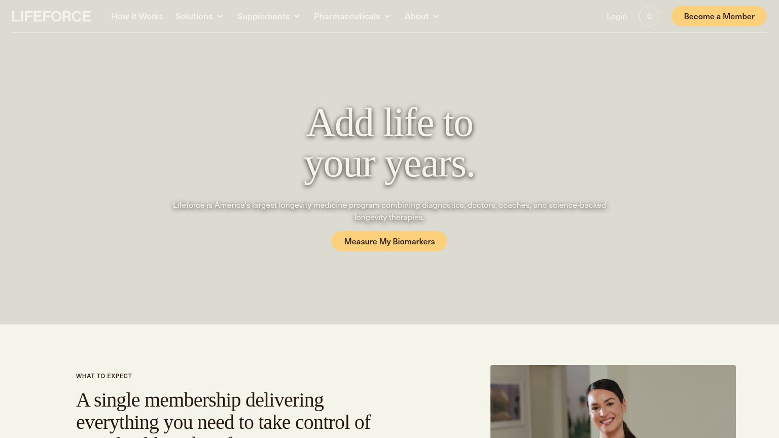
| Lifeforce | "Lifeforce is America's largest longevity medicine program combining diagnostics, doctors, coaches, and science-backed l |
| "Canada's #1 Proactive Health Platform" badge | |
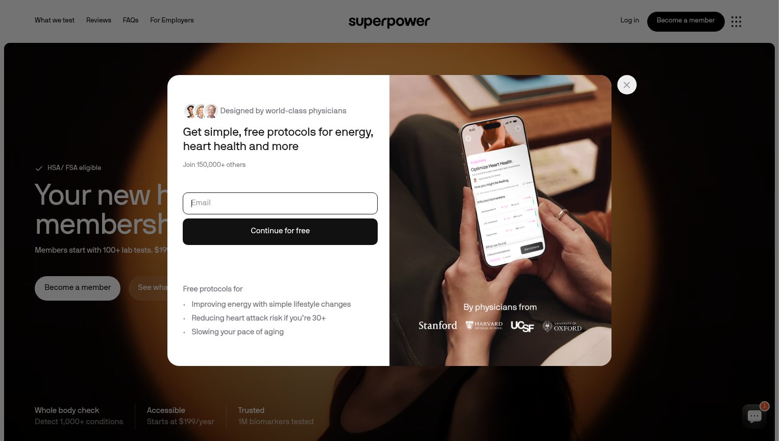
| "HSA/FSA Eligible" badge above the headline | |
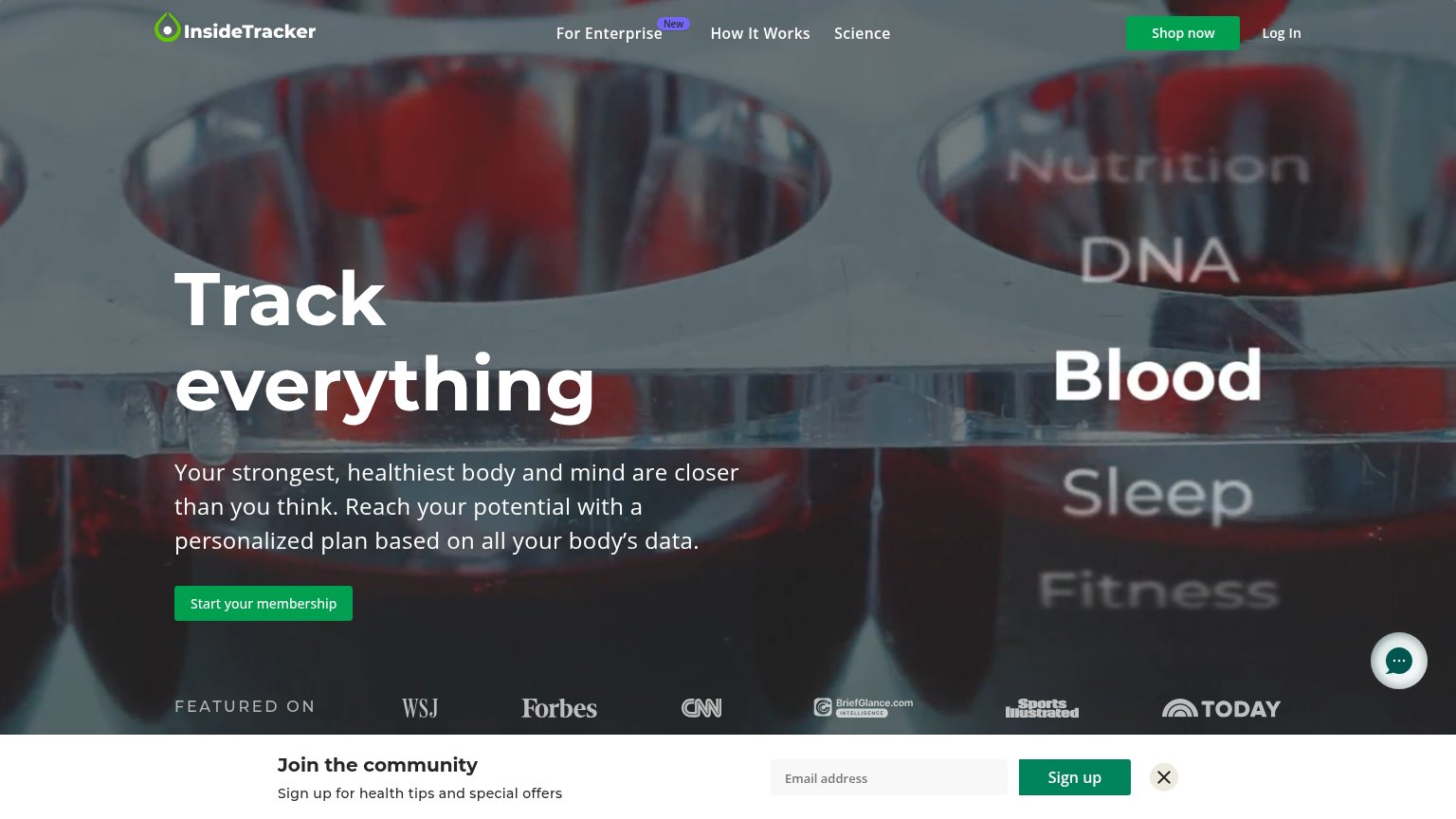
| "FEATURED ON" press bar with WSJ, Forbes, CNN, Sports Illustrated, and TODAY logos | |
| "By physicians from" logo strip: Stanford, Harvard Medical School, UCSF, University of Oxford | |
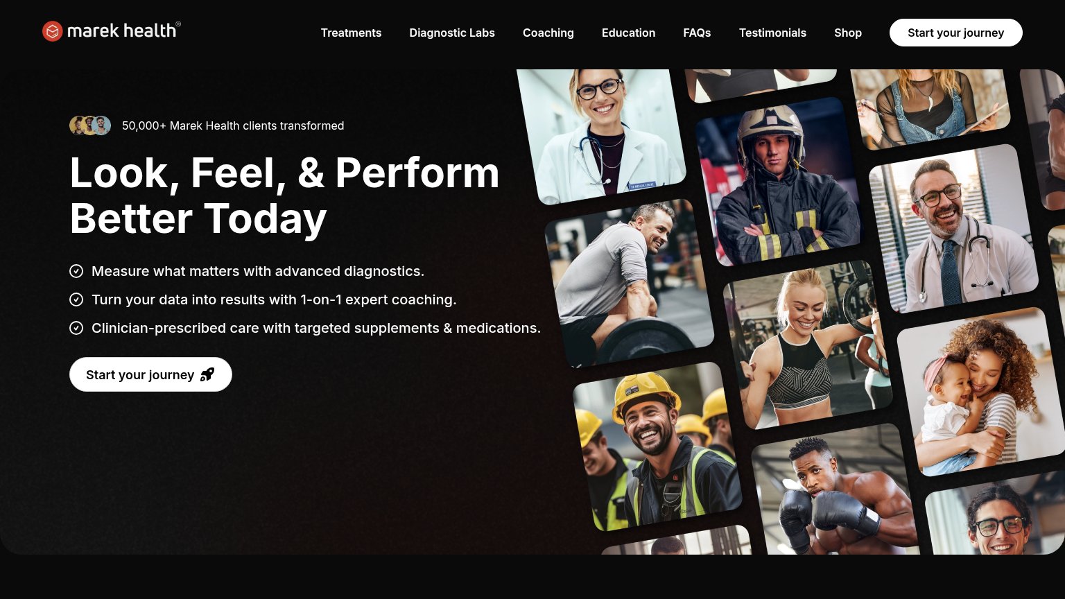
| "50,000+ Marek Health clients transformed" with avatar thumbnails |
Information hierarchy
66FairDoes the design help or inhibit what the page is trying to say?
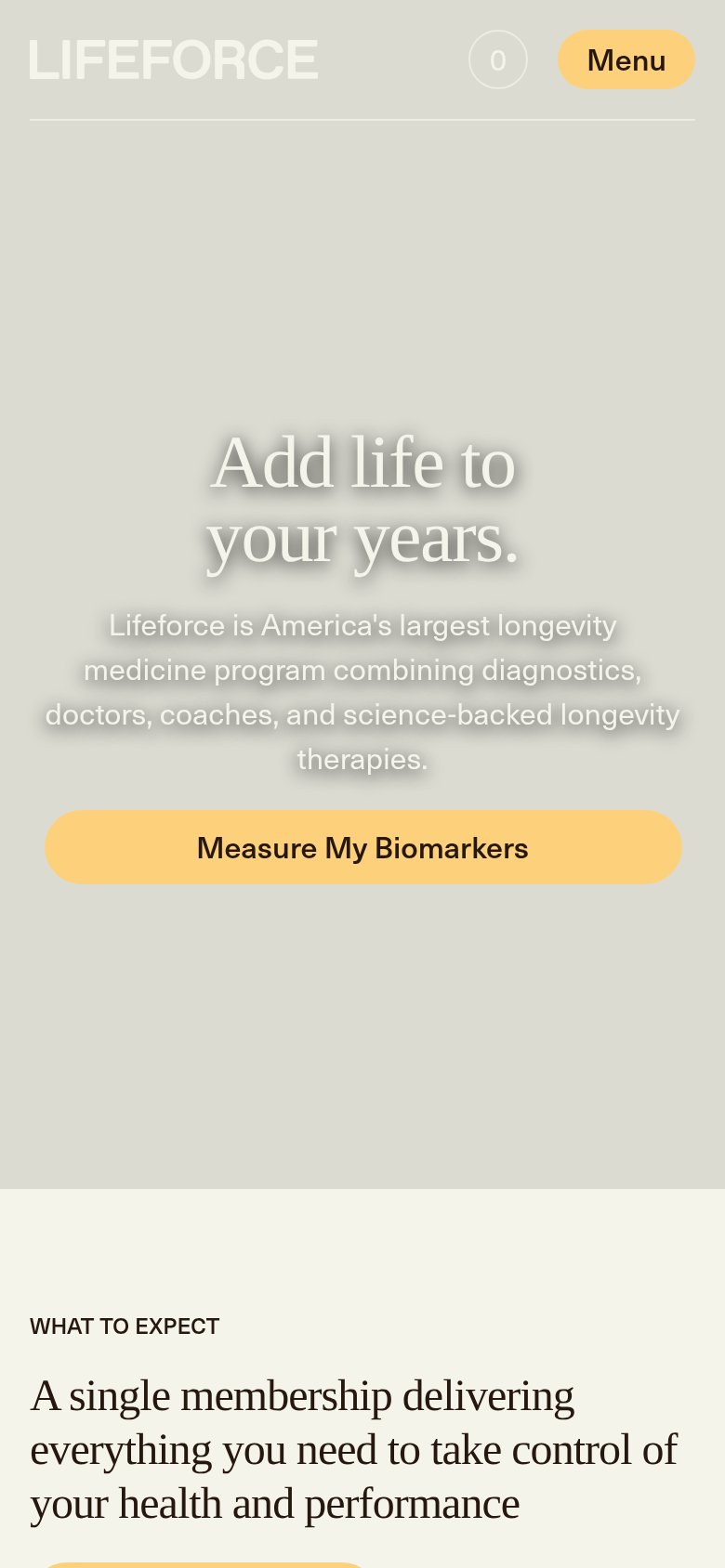
1234- Hero headline shadow — White serif headline on pale beige with heavy drop shadow reads as blurry and low-contrast, weakening the value prop at a glance.
- Become a Member button — Styled at the same yellow weight as the hero CTA, splitting the visitor between two competing primary actions.
- Hero subheadline text — Light gray text with glow on a similar-toned background falls near the legibility floor for the one sentence explaining what Lifeforce is.
- Nav dropdown row — Four dropdown menus (Solutions, Supplements, Pharmaceuticals, About) plus Login and cart open dozens of exit paths before the CTA.
CTA
72FairCopy, size, verb, cost-feel — does the primary CTA earn the click?
How Lifeforce compares
Recommended rewrites
Value props
72FairTitle, subtitle, hero — do they sell the product's true value?
Lifeforce’s headline
Add life to your years.
Lifeforce is America's largest longevity medicine program combining diagnostics, doctors, coaches, and science-backed longevity therapies.
Working
Could improve
Mobile web
72FairThe phone experience as a first-class citizen.
What works
What to improve