
Your landing page’s weakest score is Mobile web.
How Sprout.ai ranks
Mobile web
56FairThe phone experience as a first-class citizen.
 1234
- Explore our platform CTA — Pushed to the bottom of a long first scroll by the oversized headline; not a full-width tap target and easy to miss.
- Oversized hero headline — "Changing insurance, for good / Fast" scales barely down from desktop, wrapping into five towering lines that eat most of the viewport.
- Webinar promo banner — Two-line sticky promo strip consumes the top of the fold before the brand or value proposition appears.
- Chat bubble overlaps dashboard — Floating chat widget sits on top of the product screenshot, obscuring the visual proof it introduces.
Trust
58FairProof that the product is real, competent, and safe to try.
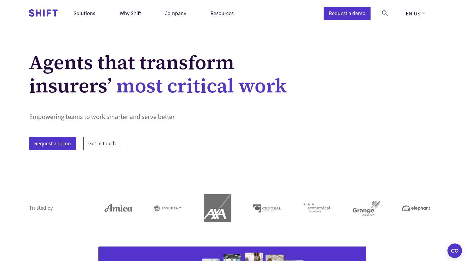
| Trust read | |
|---|---|
| Sprout.ai | No visible trust signal identified. |
| BACKED BY Y Combinator · Afore Capital badge | |
| Announcement bar: "Live Demo on Oct 6th: AI Underwriter for Life & Health → RSVP" | |
| No visible trust signal identified. | |
| "Enabling the world's leading claims organizations" section heading (mobile) | |
| "Trusted by" logo strip with Amica, Assurant, AXA, Central, Economical, Grange, and Elephant |
Value props
64FairTitle, subtitle, hero — do they sell the product's true value?
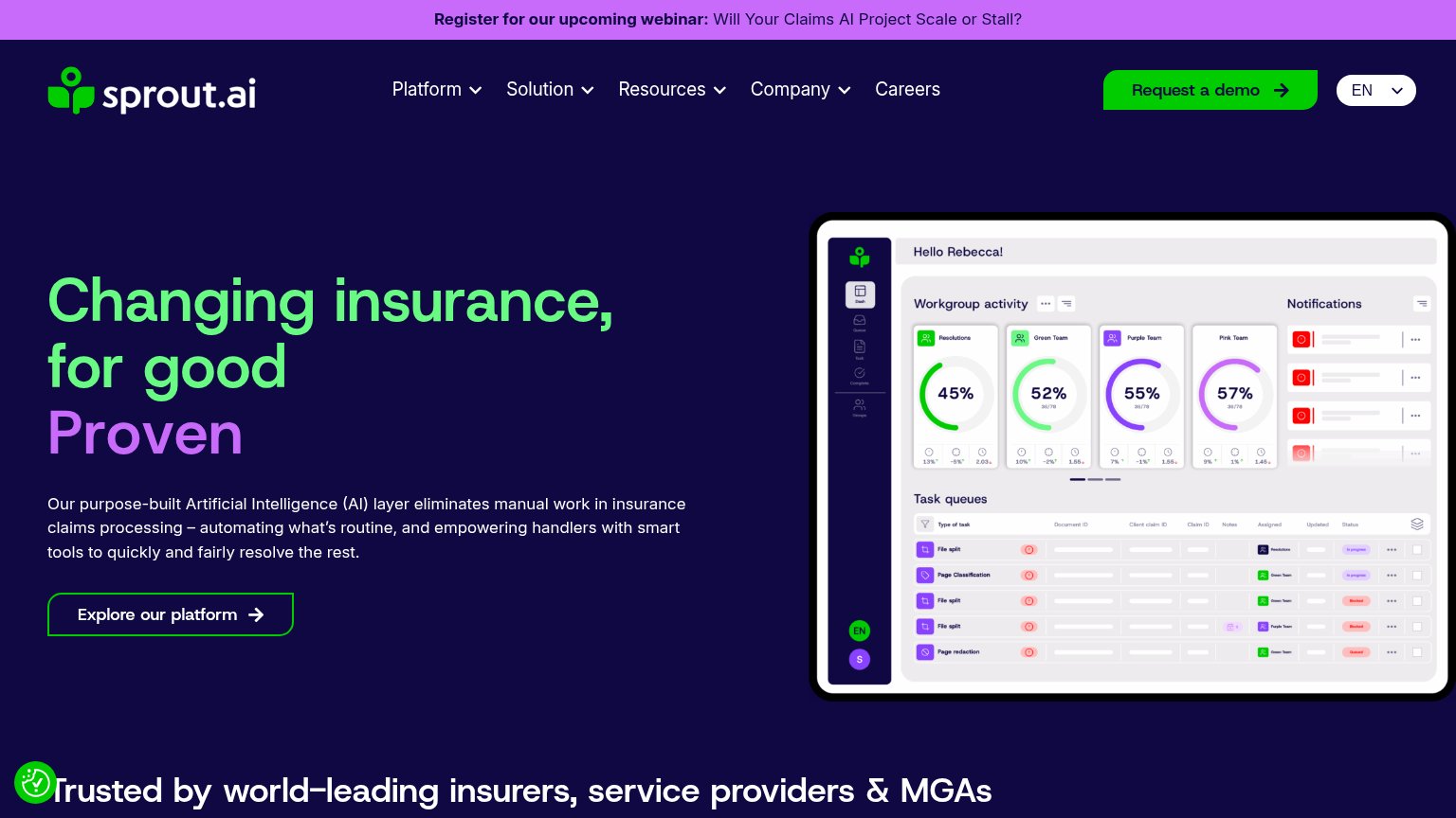
Sprout.ai’s headline
Changing insurance, for good Proven
Our purpose-built Artificial Intelligence (AI) layer eliminates manual work in insurance claims processing – automating what's routine, and empowering handlers with smart tools to quickly and fairly resolve the rest.
Working
Could improve
CTA
68FairCopy, size, verb, cost-feel — does the primary CTA earn the click?
How Sprout.ai compares
Recommended rewrites
Information hierarchy
76FairDoes the design help or inhibit what the page is trying to say?
What works
What to improve