
Your landing page’s weakest score is Trust.
How Sixfold AI ranks
Trust
42PoorProof that the product is real, competent, and safe to try.
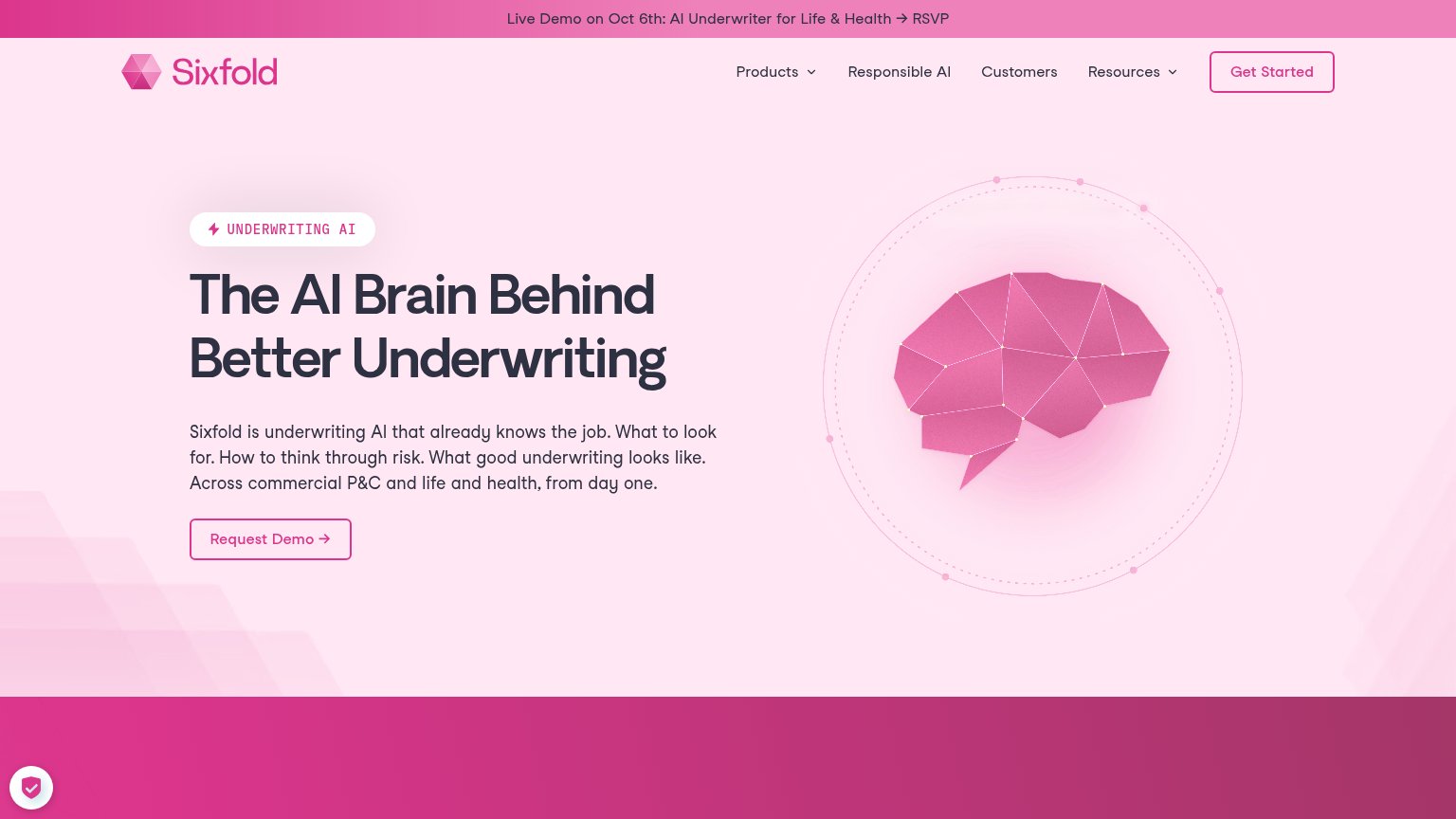
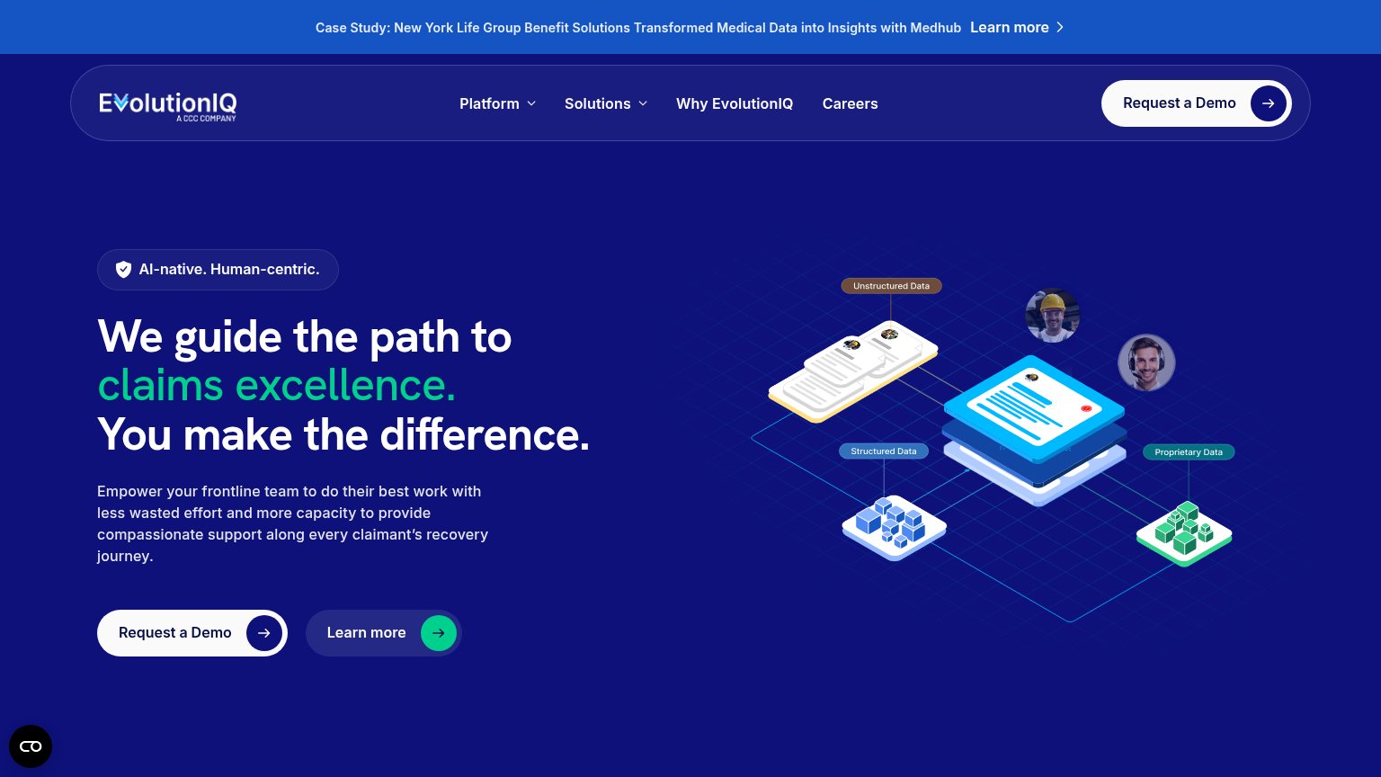
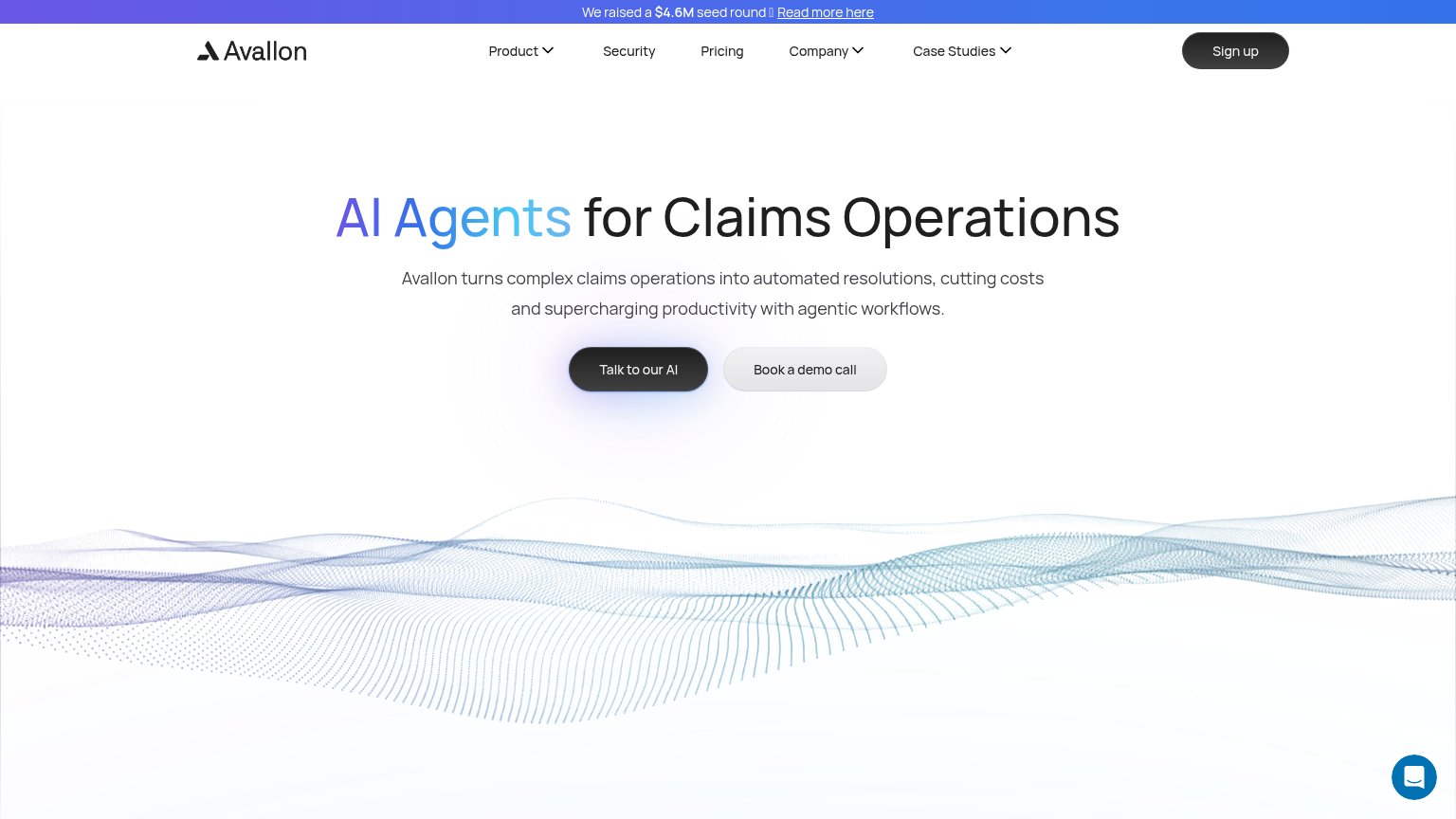
| Trust read | |
|---|---|
| Sixfold AI | Announcement bar: "Live Demo on Oct 6th: AI Underwriter for Life & Health → RSVP" |
| "We raised a $4.6M seed round — Read more here" funding banner | |
| No visible trust signal identified. | |
| Announcement bar: "Case Study: New York Life Group Benefit Solutions Transformed Medical Data into Insights with Medhub" | |
| "Enabling the world's leading claims organizations" section heading (mobile) | |
| No visible trust signal identified. |
CTA
68FairCopy, size, verb, cost-feel — does the primary CTA earn the click?
Problems
- 'Request' feels like sales gatekeeping
- outline style, weak visual weight
- nav says 'Get Started' — label split
- no payoff implied in the copy
Information hierarchy
72FairDoes the design help or inhibit what the page is trying to say?
What works
What to improve
Value props
72FairTitle, subtitle, hero — do they sell the product's true value?
Sixfold AI’s headline
The AI Brain Behind Better Underwriting
Sixfold is underwriting AI that already knows the job. What to look for. How to think through risk. What good underwriting looks like. Across commercial P&C and life and health, from day one.
Working
Could improve
Mobile web
72FairThe phone experience as a first-class citizen.
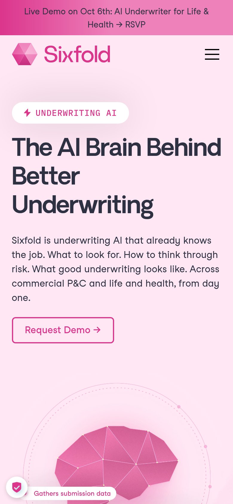
What works
What to improve