
Your landing page’s weakest score is Mobile web.
How Spirit Dental ranks
71Growth scoreupdated
category scores
category scoresShowHide
Mobile web
58FairThe phone experience as a first-class citizen.
 1234
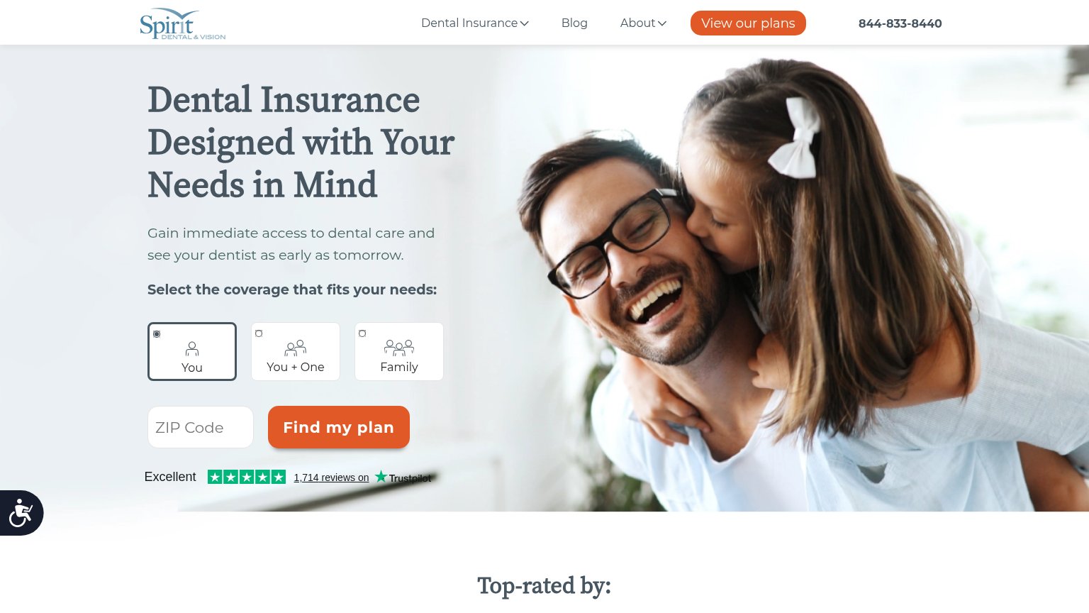
- Find my plan CTA — Pushed below the first viewport and truncated to "Find my" — visitors must scroll past three tall selector cards to reach it.
- Coverage selector cards — Three oversized stacked cards eat most of the fold, displacing the ZIP input and CTA off-screen.
- Hero headline — Desktop-scale serif headline wraps to three heavy lines and consumes a third of the viewport.
- Accessibility widget bubble — Floating wheelchair bubble overlaps the "Spirit Dental + One" card, partially covering tappable content.
Value props
64FairTitle, subtitle, hero — do they sell the product's true value?
Spirit Dental’s headline undersells
Dental Insurance Designed with Your Needs in Mind
Gain immediate access to dental care and see your dentist as early as tomorrow.
Working
- Subhead names urgent outcome: dentist tomorrow
- 1,714 Trustpilot reviews add proof
- Coverage picker clarifies who it's for
Could improve
- H1 is generic filler, could be any insurer
- No price or coverage numbers in fold
- Hero photo decorates, shows no product value
Trust
72FairProof that the product is real, competent, and safe to try.
How Spirit Dental compares
Trust read
Information hierarchy
78FairDoes the design help or inhibit what the page is trying to say?
What works
What to improve
CTA
82StrongCopy, size, verb, cost-feel — does the primary CTA earn the click?
How Spirit Dental compares
Recommended rewrites