
Your landing page’s weakest score is Trust.
How Guardian Direct ranks
58Growth scoreupdated
category scores
category scoresShowHide
Trust
48PoorProof that the product is real, competent, and safe to try.
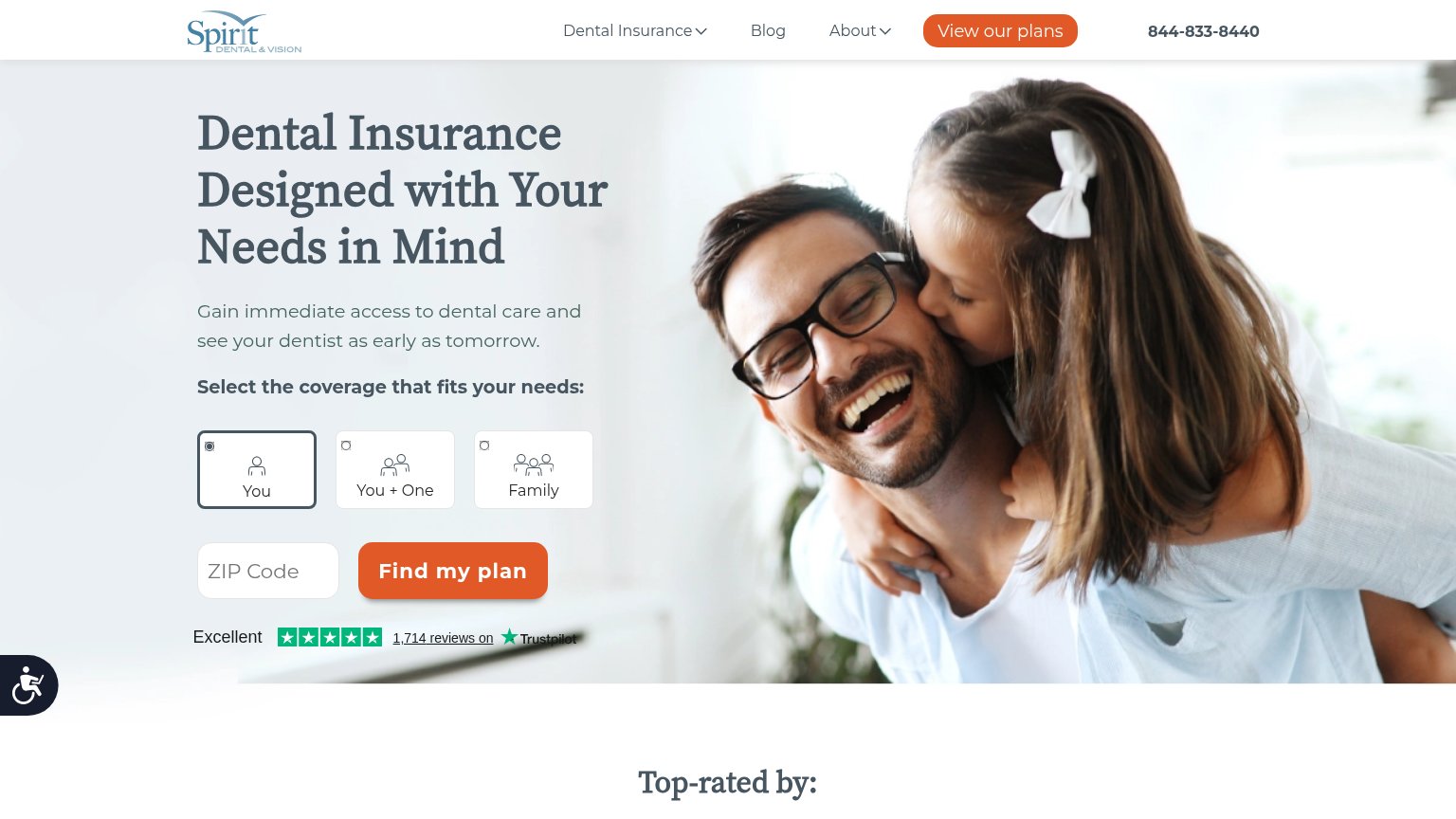
| Trust read | |
|---|---|
| Guardian Direct | implicit context Guardian Direct may benefit from pre-existing familiarity among its target audience. |
| No visible trust signal identified. | |
| No visible trust signal identified. | |
| "a Sun Life company" parent-brand lockup in the header logo | |
| implicit context Delta Dental may benefit from pre-existing familiarity among its target audience. | |
| Trustpilot widget: "Excellent" five-star rating with "1,714 reviews on Trustpilot" |
Value props
52FairTitle, subtitle, hero — do they sell the product's true value?
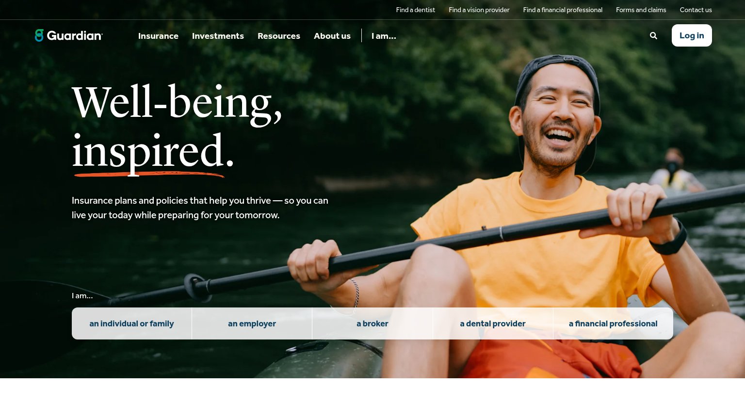
Guardian Direct’s headline vague
Well-being, inspired.
Insurance plans and policies that help you thrive — so you can live your today while preparing for your tomorrow.
Working
- Warm, emotional tone fits insurance category
- Subhead names the category (insurance plans)
- "I am..." row routes each audience fast
Could improve
- Headline could caption any wellness brand
- No product types named (dental, vision, life)
- Zero numbers, prices, or proof points
CTA
56FairCopy, size, verb, cost-feel — does the primary CTA earn the click?
How Guardian Direct compares
Recommended rewrites
Information hierarchy
62FairDoes the design help or inhibit what the page is trying to say?
What works
What to improve
Mobile web
72FairThe phone experience as a first-class citizen.
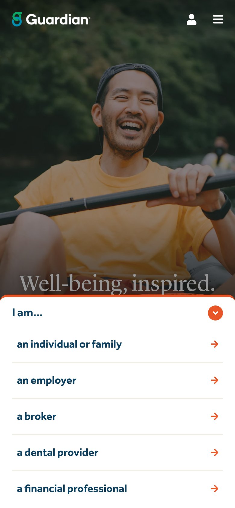
What works
What to improve