
Your landing page’s weakest score is Mobile web.
How SiPhox Health ranks
76Growth scoreupdated
category scores
category scoresShowHide
Mobile web
56FairThe phone experience as a first-class citizen.
 123
- Cookie consent banner — Dead blocker with no conversion CTA sits directly over the primary Start testing button, leaving only its teal edges visible.
- Bottom trust strip — 'powered by Trustpilot' text overlaps the 'CLIA & CAP' label, making both credentials unreadable.
- Truncated benefit list — The checklist under the headline is cut off mid-item by the cookie banner, breaking the value pitch.
Information hierarchy
76FairDoes the design help or inhibit what the page is trying to say?
 123
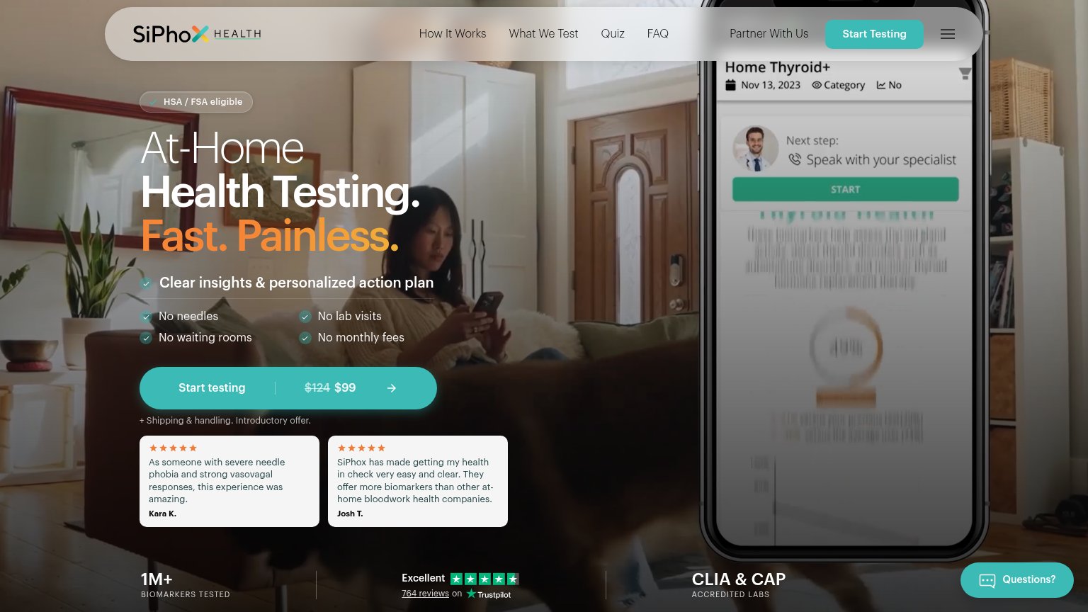
- Phone mockup screen — The app screen's body text is blurred and garbled, so the strongest proof element reads as a broken UI instead of a clear product demo.
- Header nav links — Five links plus a hamburger sit at equal weight above the hero, giving eight exit paths that compete with the single conversion action.
- Trustpilot reviews link — The underlined "764 reviews" link invites an off-site detour to Trustpilot before the visitor reaches the Start testing CTA.
CTA
82StrongCopy, size, verb, cost-feel — does the primary CTA earn the click?
How SiPhox Health compares
Recommended rewrites
Value props
82StrongTitle, subtitle, hero — do they sell the product's true value?
SiPhox Health’s headline
At-Home Health Testing. Fast. Painless.
Clear insights & personalized action plan
Working
Could improve
Trust
82StrongProof that the product is real, competent, and safe to try.
How SiPhox Health compares
Trust read