
Your landing page’s weakest score is Mobile web.
How Sesame ranks
74Growth scoreupdated
category scores
category scoresShowHide
Mobile web
68FairThe phone experience as a first-class citizen.
 12
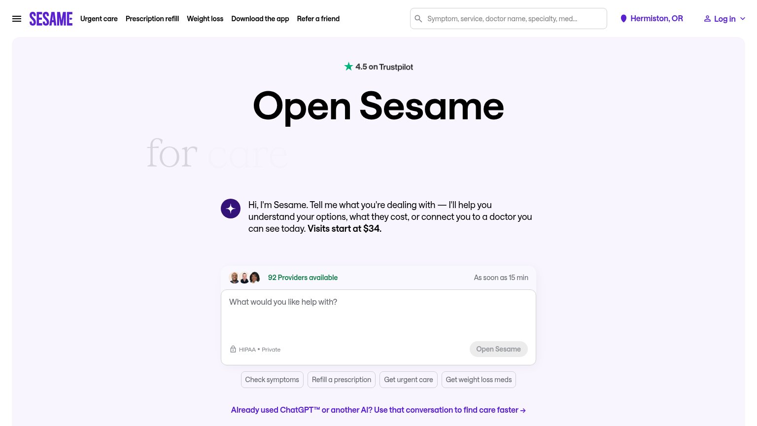
- Disabled Open Sesame button — Grayed-out submit reads as untappable, so the fold shows no active CTA.
- Quick-action chip stack — Four look-alike chips compete with the chat input as the next tap.
Information hierarchy
72FairDoes the design help or inhibit what the page is trying to say?
 1234
- Faded subheadline text — 'for care' renders in near-invisible gray, burying half the value proposition on desktop.
- Grayed Open Sesame button — The primary CTA is styled like a disabled control, weakening the one-second find test.
- ChatGPT handoff link — Bold purple link directly below the CTA competes at equal weight and pulls attention off the input.
- Five-link top nav — Nav items plus search and login open eight exit paths before the visitor reaches the chat box.
Trust
76FairProof that the product is real, competent, and safe to try.
How Sesame compares
Trust read
CTA
78FairCopy, size, verb, cost-feel — does the primary CTA earn the click?
How Sesame compares
Recommended rewrites
Value props
78FairTitle, subtitle, hero — do they sell the product's true value?
Sesame’s headline
Open Sesame for care with no surprises.
Hi, I'm Sesame. Tell me what you're dealing with — I'll help you understand your options, what they cost, or connect you to a doctor you can see today. Visits start at $34.
Working
Could improve