
Your landing page’s weakest score is Trust.
How Ada Health ranks
Trust
44PoorProof that the product is real, competent, and safe to try.
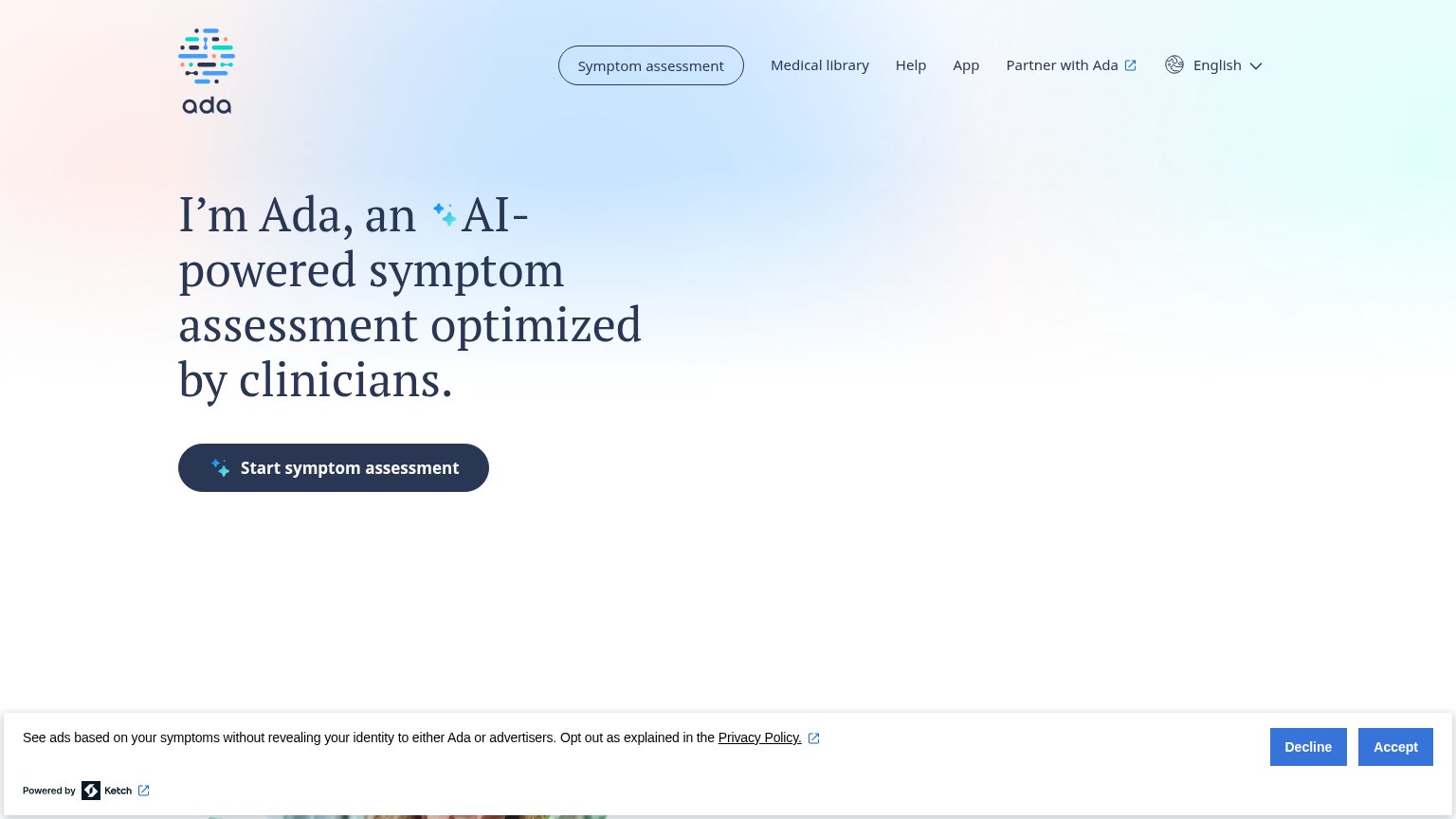
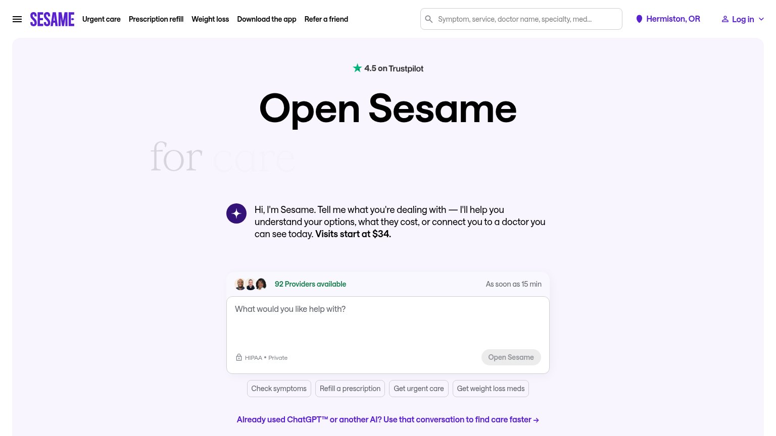
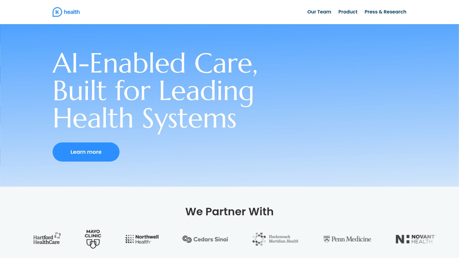
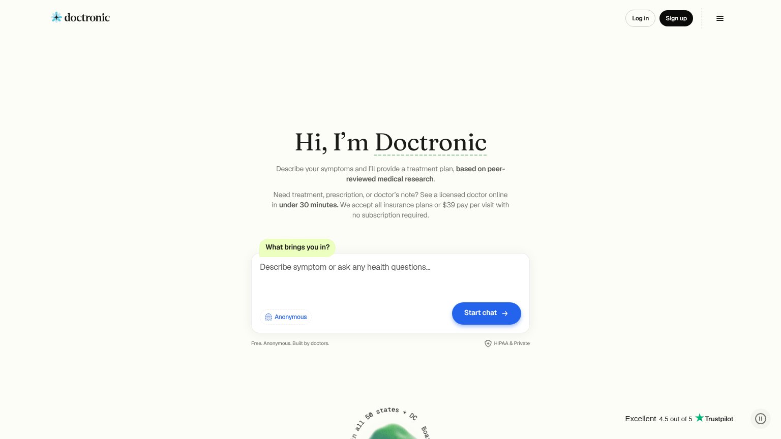
| Trust read | |
|---|---|
| Ada Health | Headline claim "optimized by clinicians" |
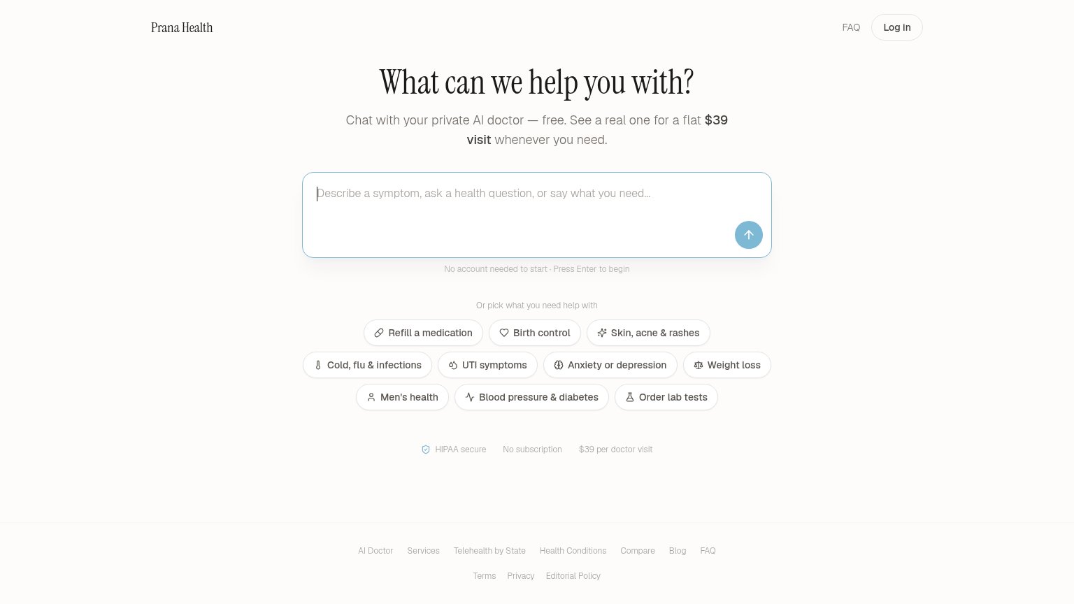
| "HIPAA secure" badge with "No subscription" and "$39 per doctor visit" trust strip | |
| "We Partner With" logo strip: Mayo Clinic, Cedars Sinai, Northwell Health, Penn Medicine, Hartford HealthCare, Hackensac | |
| Trustpilot rating "Excellent 4.5 out of 5" | |
| No visible trust signal identified. | |
| "4.5 on Trustpilot" rating badge above the headline |
Mobile web
58FairThe phone experience as a first-class citizen.
 123
- Ketch consent banner — Full-width consent wall with stacked Accept/Decline buttons eats the bottom third of the fold and delivers no conversion value.
- Hero headline block — Serif headline wraps into six lines with a mid-word break ("opti-mized"), pushing the CTA to the very bottom of the viewport.
- Header assessment pill — Duplicate "Symptom assessment" pill in the header competes with the hero CTA and widens the header past a clean hamburger row.
Value props
64FairTitle, subtitle, hero — do they sell the product's true value?
Ada Health’s headline
I’m Ada, an AI-powered symptom assessment optimized by clinicians.
Working
Could improve
Information hierarchy
72FairDoes the design help or inhibit what the page is trying to say?
What works
What to improve
CTA
80StrongCopy, size, verb, cost-feel — does the primary CTA earn the click?
How Ada Health compares
Recommended rewrites