
Your landing page’s weakest score is Trust.
How Doctronic ranks
82Growth scoreupdated
category scores
category scoresShowHide
Trust
72FairProof that the product is real, competent, and safe to try.
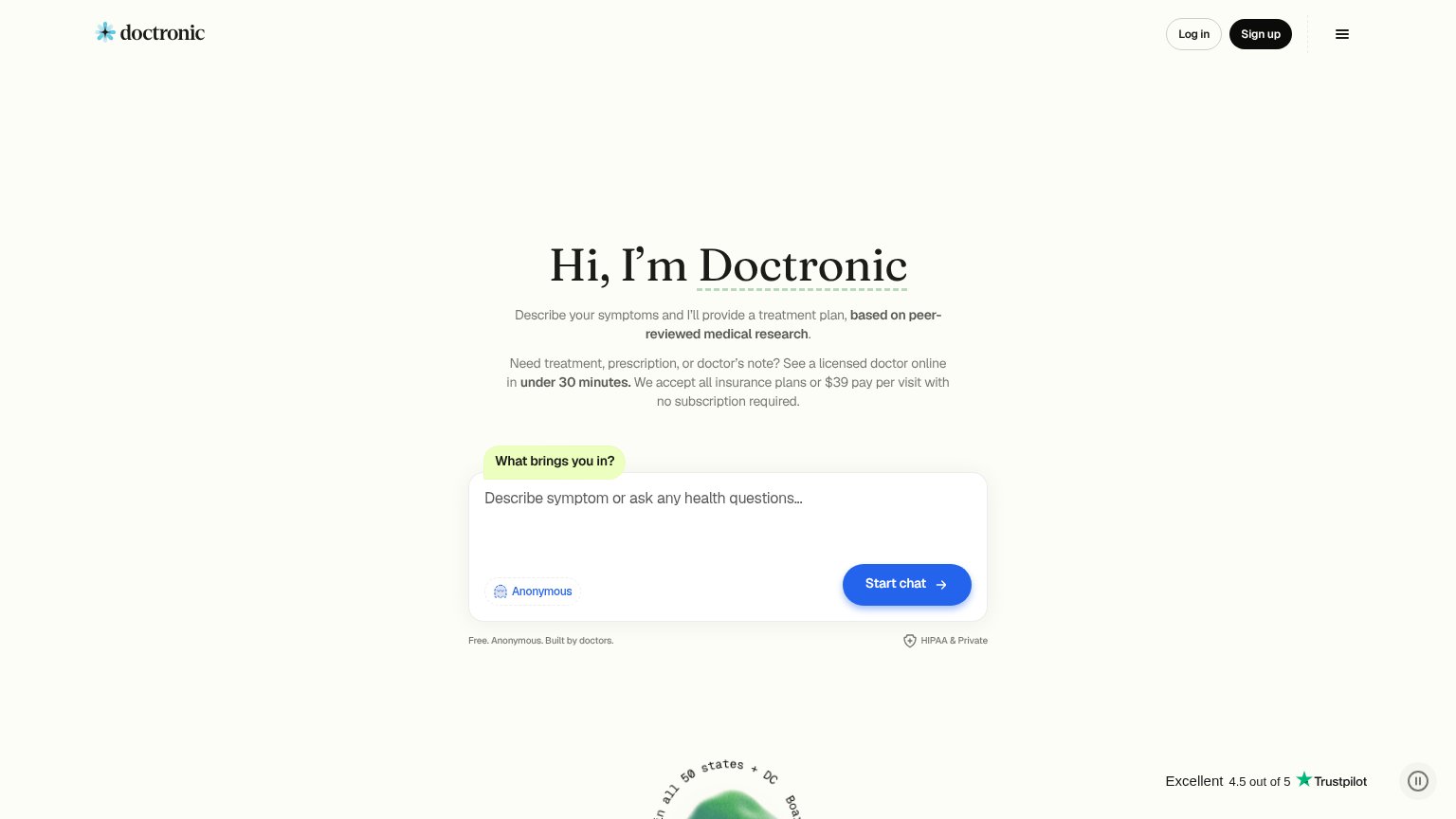
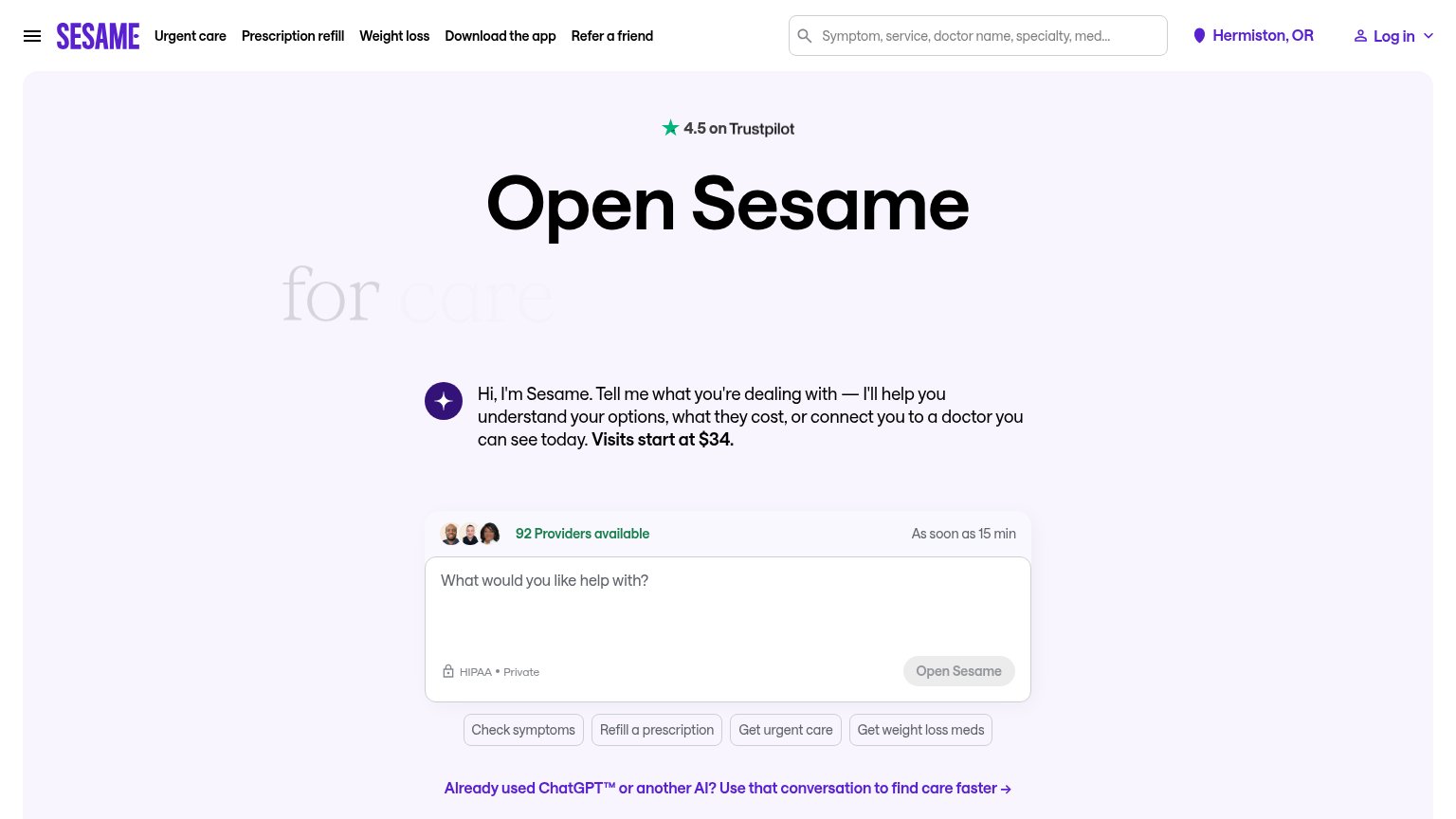
| Trust read | |
|---|---|
| Doctronic | Trustpilot rating "Excellent 4.5 out of 5" |
| "HIPAA secure" badge with "No subscription" and "$39 per doctor visit" trust strip | |
| "We Partner With" logo strip: Mayo Clinic, Cedars Sinai, Northwell Health, Penn Medicine, Hartford HealthCare, Hackensac | |
| Headline claim "optimized by clinicians" | |
| No visible trust signal identified. | |
| "4.5 on Trustpilot" rating badge above the headline |
Information hierarchy
82StrongDoes the design help or inhibit what the page is trying to say?
123- Log in / Sign up buttons — Two account CTAs sit at hero-CTA weight and pull attention from the anonymous 'Start chat' action the copy promises.
- Two stacked paragraphs — Same-size, same-weight subtext blocks merge the AI promise and the $39 telehealth offer into one dense read.
- Trustpilot badge placement — The 'Excellent 4.5' proof sits bottom-right, outside the centered scan path, so it never reinforces the CTA.
Value props
84StrongTitle, subtitle, hero — do they sell the product's true value?
Doctronic’s headline
Hi, I’m Doctronic
Describe your symptoms and I’ll provide a treatment plan, based on peer-reviewed medical research. Need treatment, prescription, or doctor’s note? See a licensed doctor online in under 30 minutes. We accept all insurance plans or $39 pay pe
Working
Could improve
Mobile web
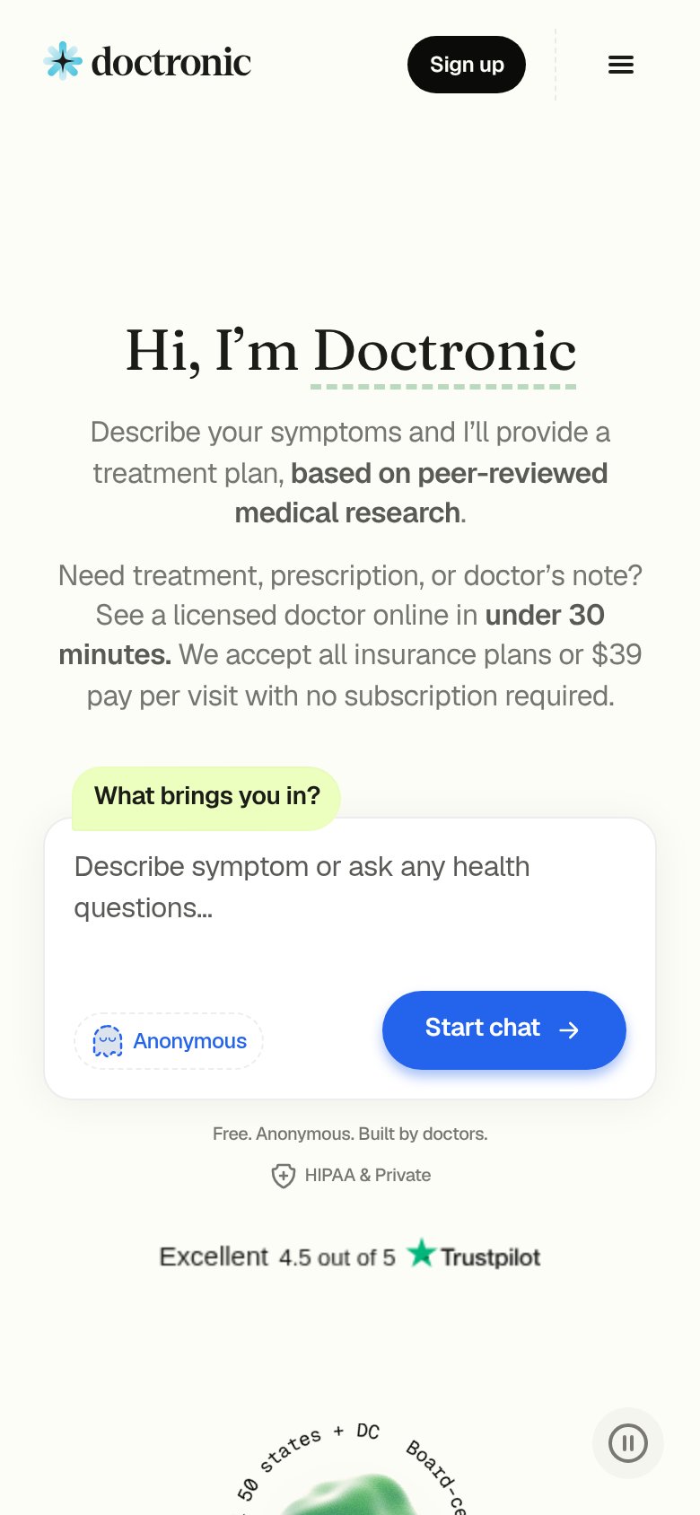
86StrongThe phone experience as a first-class citizen.
What works
What to improve
CTA
88StrongCopy, size, verb, cost-feel — does the primary CTA earn the click?
How Doctronic compares
Recommended rewrites