
Your landing page’s weakest score is Information hierarchy.
How Ro ranks
65Growth scoreupdated
category scores
category scoresShowHide
Information hierarchy
58FairDoes the design help or inhibit what the page is trying to say?
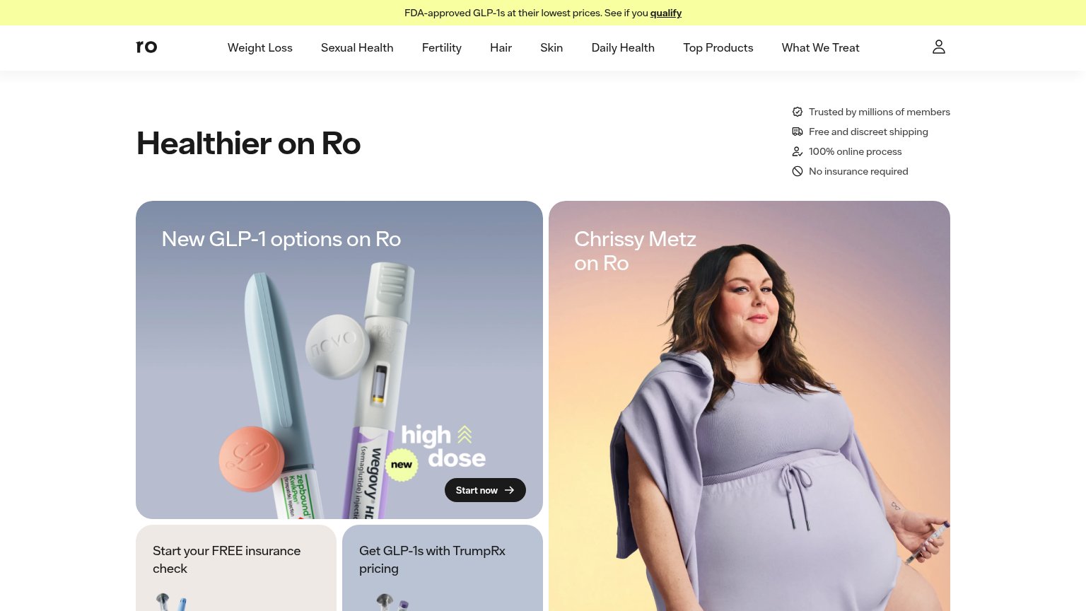 1234
- Equal-weight hero panels — Two same-size cards (GLP-1 and Chrissy Metz) compete at identical visual weight, so no single message wins the first glance.
- Small dark Start now — The only visible CTA is a compact dark pill buried at the bottom of the left card, outside the natural headline-to-action scan path.
- Eight-item nav row — Weight Loss through What We Treat gives eight exit paths styled as prominently as anything else in the fold.
- Healthier on Ro headline — The headline floats alone with no subtitle or CTA attached, so the value prop reads as a label rather than an argument.
Value props
58FairTitle, subtitle, hero — do they sell the product's true value?
Ro’s headline vague
Healthier on Ro
Working
- Outcome-flavored, brand-forward headline
- GLP-1 banner adds price + qualification hook
- Trust chips: online process, no insurance
Could improve
- H1 could caption any health brand
- No subhead explaining what Ro does
- No numbers or proof beyond 'millions'
CTA
68FairCopy, size, verb, cost-feel — does the primary CTA earn the click?
How Ro compares
Recommended rewrites
Trust
68FairProof that the product is real, competent, and safe to try.
How Ro compares
Trust read
Mobile web
72FairThe phone experience as a first-class citizen.
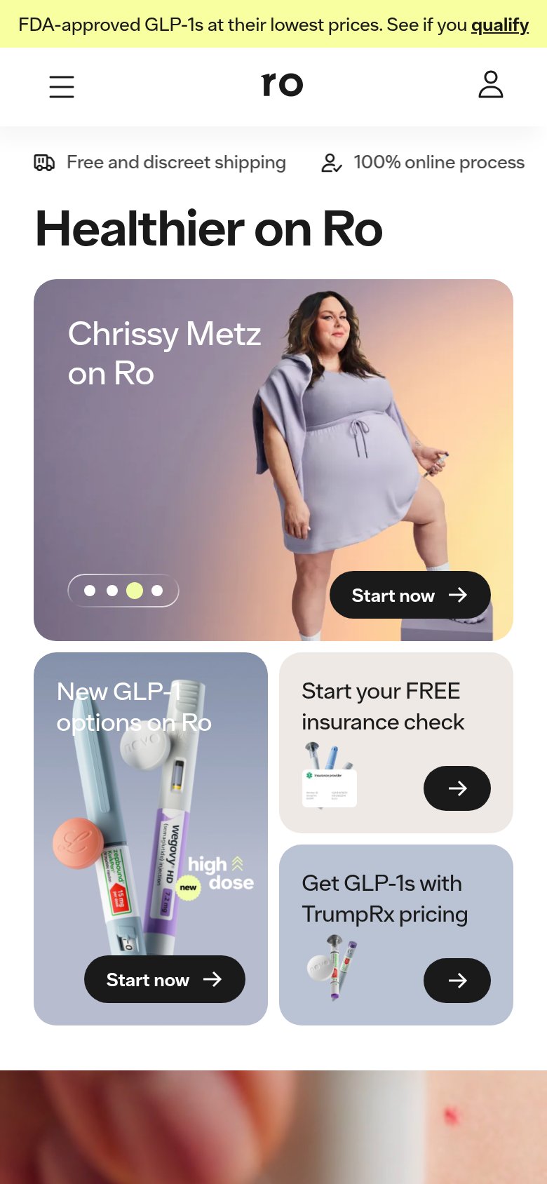
What works
What to improve