
Your landing page’s weakest score is Value props.
How Mochi Health ranks
- 1.
Found74
- 2.
RonanRx Inc.69
- 3.
Ro65
- 4.
Henry Meds63
- 5.
Hims & Hers62
- 6.
Mochi Health57
57Growth scoreupdated
category scores
category scoresShowHide
Value props
48PoorTitle, subtitle, hero — do they sell the product's true value?
Mochi Health’s headline vague
Personalized care. More ways to get there.
Doctor-prescribed treatments. Explore your insurance options and get matched toward care that fits your life.
Working
- Real drug names and prices in banner
- Doctor-prescribed builds trust
- Press logos (Forbes, BI) add proof
Could improve
- H1 could caption any health brand
- Promo modal hides the hero on load
- No outcome or condition named in H1
Information hierarchy
52FairDoes the design help or inhibit what the page is trying to say?
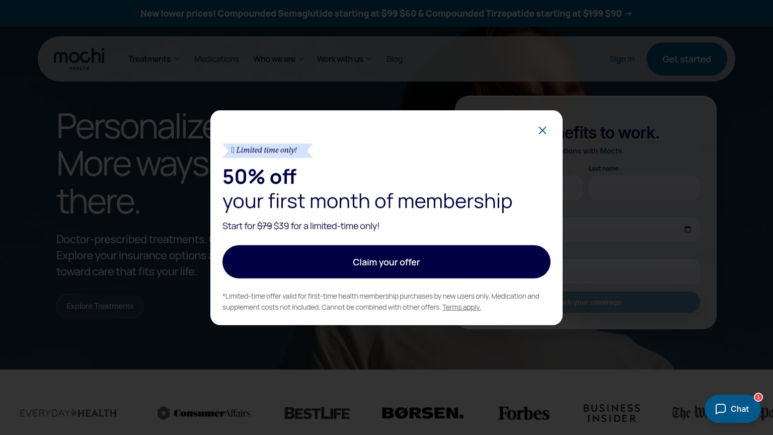 1234
- 50% off modal — Full-screen overlay blocks the headline and coverage form, hijacking the first impression before the value prop lands.
- Truncated hero headline — "Personalized care. More ways there." is half-hidden behind the modal, so the core message is unreadable at a glance.
- Buried coverage form — The "benefits to work" form and its Check-Mochi Health's-coverage CTA sit dimmed behind the overlay, invisible in the scan path.
- Nav dual CTAs — "Sign in" and "Get started" compete at equal prominence with the modal's "Claim Mochi Health's offer," splitting the primary action.
Mobile web
54FairThe phone experience as a first-class citizen.
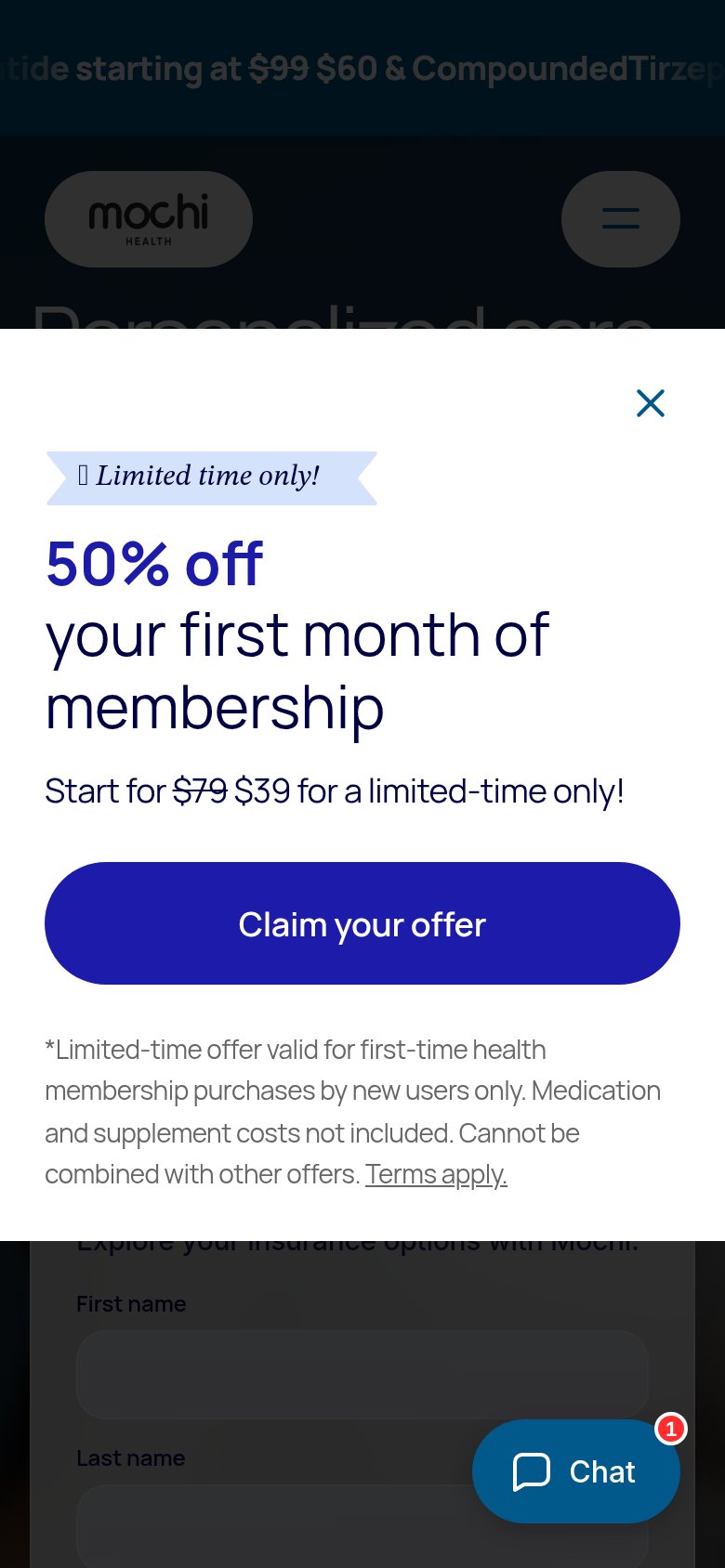
What works
What to improve
Trust
58FairProof that the product is real, competent, and safe to try.
How Mochi Health compares
Trust read
CTA
72FairCopy, size, verb, cost-feel — does the primary CTA earn the click?
How Mochi Health compares
Recommended rewrites