
Your landing page’s weakest score is Trust.
How Henry Meds ranks
63Growth scoreupdated
category scores
category scoresShowHide
Trust
44PoorProof that the product is real, competent, and safe to try.
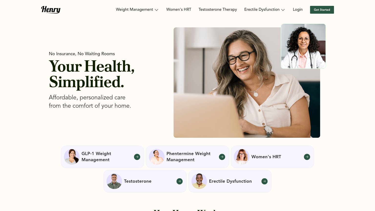
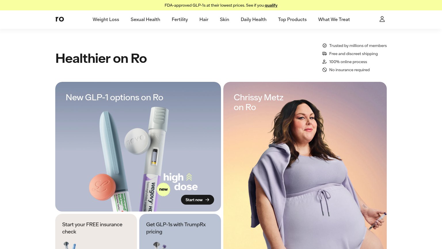
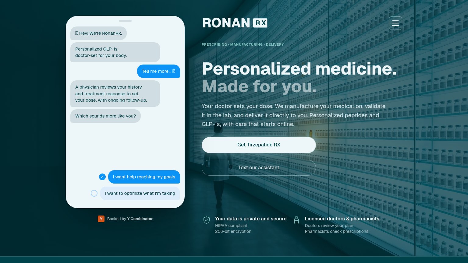
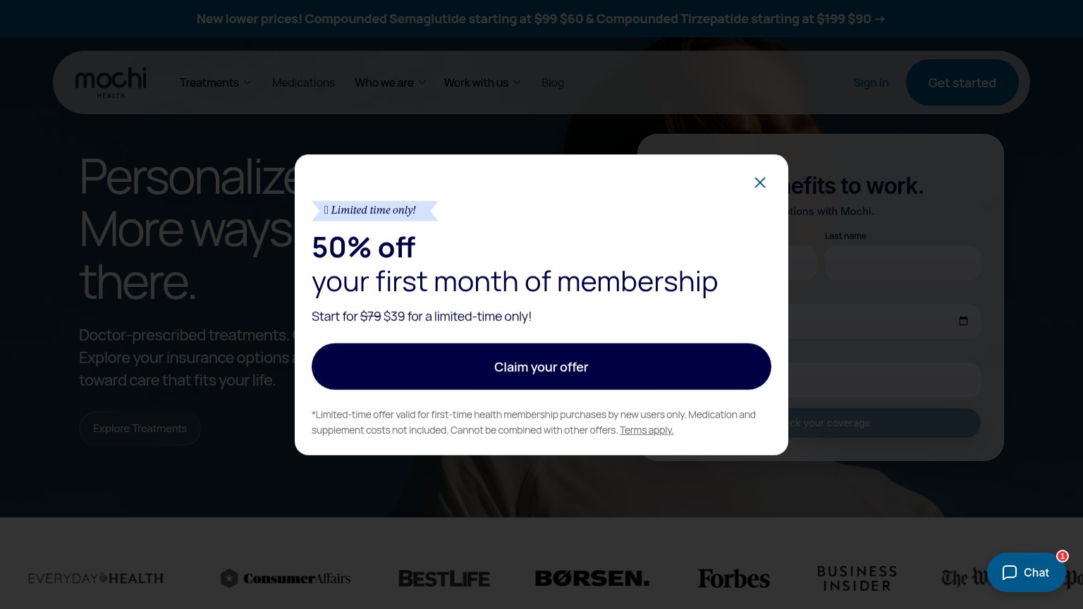
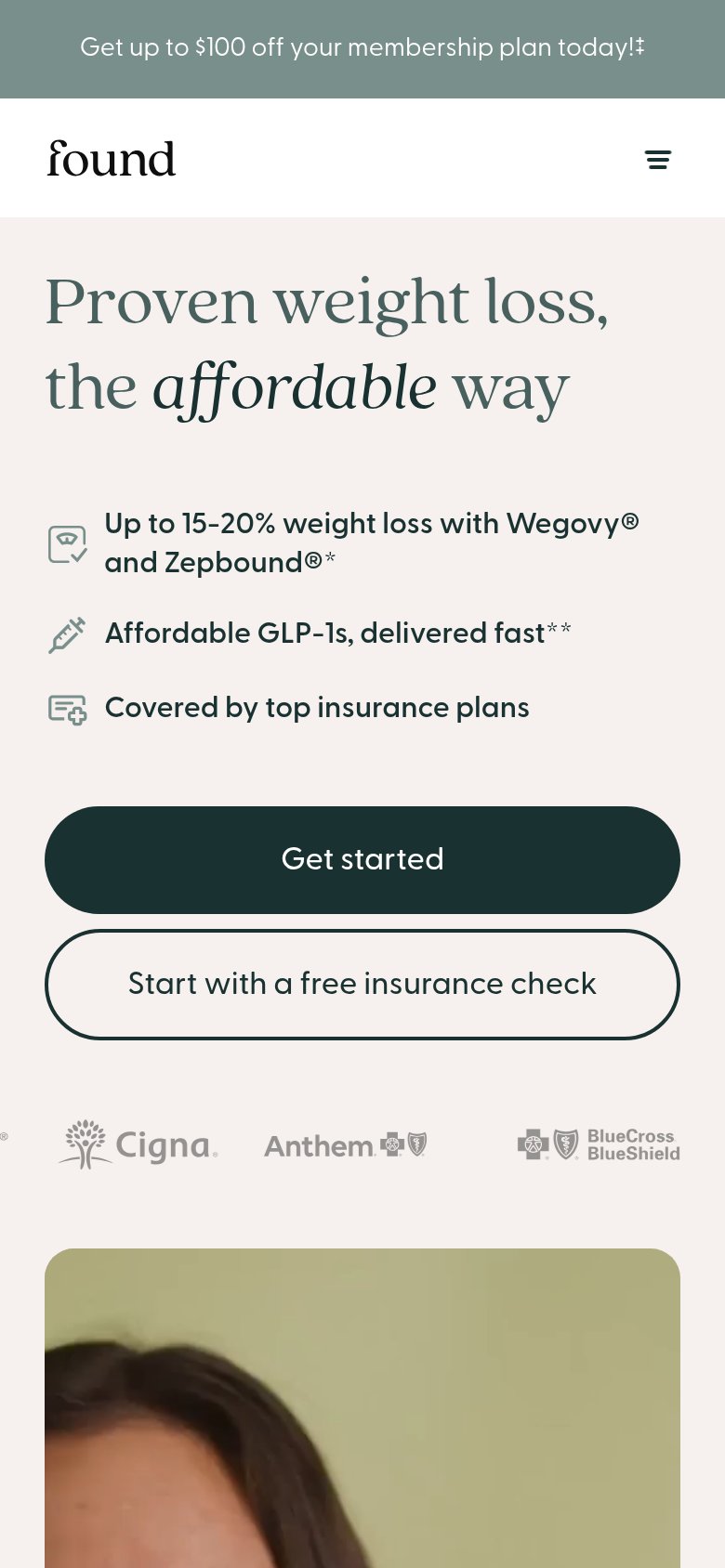
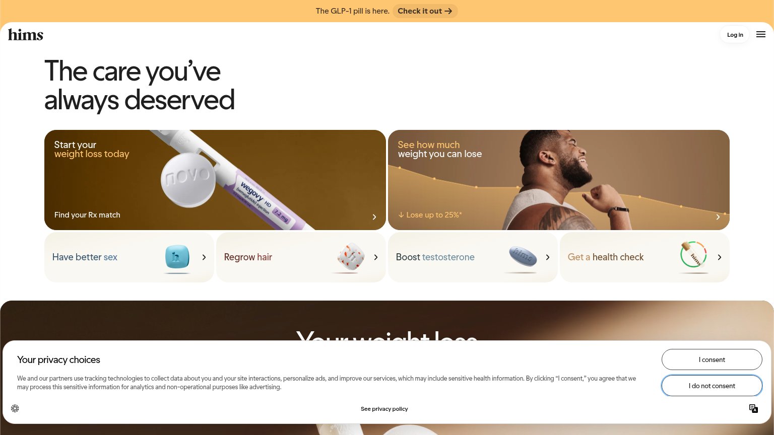
| Trust read | |
|---|---|
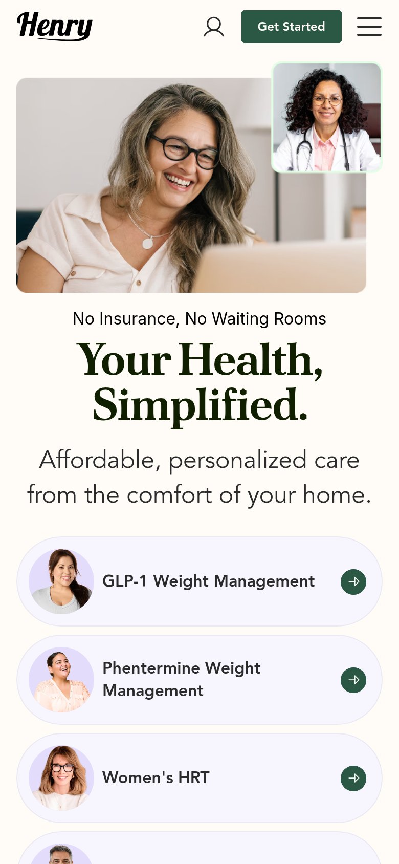
| Henry Meds | Doctor-on-video-call hero imagery depicting the telehealth consult experience |
| "Licensed doctors & pharmacists — Doctors review your plan, Pharmacists check prescriptions" credential strip below the | |
| Real Wegovy injection pen and Novo-stamped pill shown in the "Start your weight loss today" tile | |
| "Trusted by millions of members" bullet list with "Free and discreet shipping," "100% online process," "No insurance req | |
| Press logo bar featuring Forbes, Business Insider, Everyday Health, ConsumerAffairs, BestLife, and Børsen | |
| Cigna, Anthem, and BlueCross BlueShield insurer logos beneath the mobile CTAs |
Value props
64FairTitle, subtitle, hero — do they sell the product's true value?
Henry Meds’s headline undersells
Your Health, Simplified.
Affordable, personalized care from the comfort of your home.
Working
- "No Insurance, No Waiting Rooms" removes real friction
- Hero image shows the telehealth visit in action
- Service chips name concrete treatments (GLP-1, HRT)
Could improve
- Headline could caption any telehealth brand
- "Affordable" claimed with no price or number
- No proof points or outcomes in the fold
CTA
68FairCopy, size, verb, cost-feel — does the primary CTA earn the click?
How Henry Meds compares
Recommended rewrites
Mobile web
68FairThe phone experience as a first-class citizen.
What works
What to improve
Information hierarchy
72FairDoes the design help or inhibit what the page is trying to say?
What works
What to improve