
Your landing page’s weakest score is Trust.
How Ralo ranks
76Growth scoreupdated
category scores
category scoresShowHide
Trust
68FairProof that the product is real, competent, and safe to try.

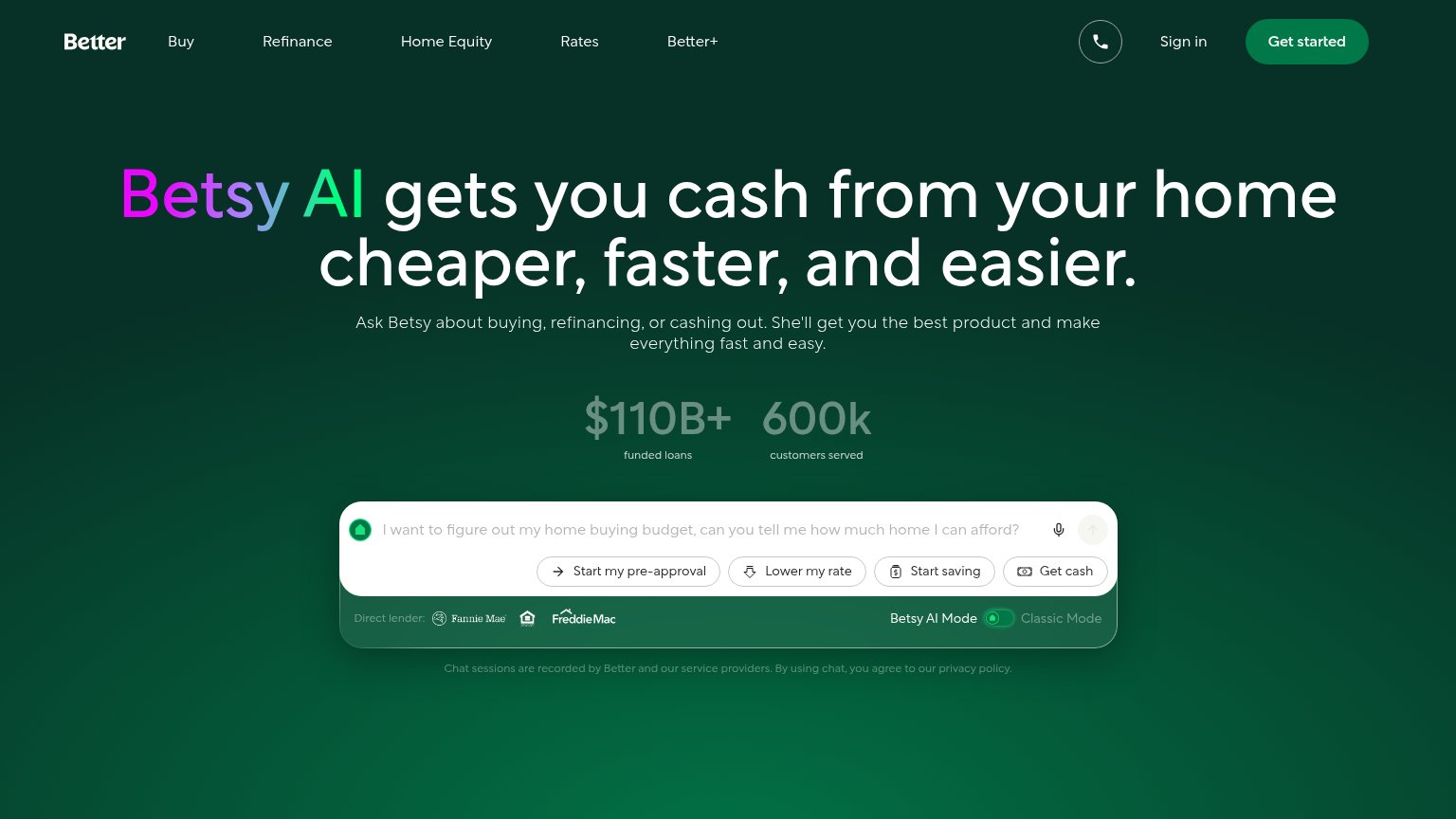

| Trust read | |
|---|---|
| Ralo | "As seen" press logo bar featuring Forbes, Business Insider, and The New York Times |
| "$110B+ funded loans" and "600k customers served" stats above the chat input | |
| "We've helped millions buy a home." subheadline | |
| No visible trust signal identified. | |
| Review strip citing Bankrate ★5.0 (3,100+ reviews), Trustpilot ★4.9 (2,600+), Zillow ★4.9 (9,600+), Google ★4.9 (4,300+) | |
| "4.9 stars 43K+ Reviews" beneath the hero subhead |
Information hierarchy
72FairDoes the design help or inhibit what the page is trying to say?
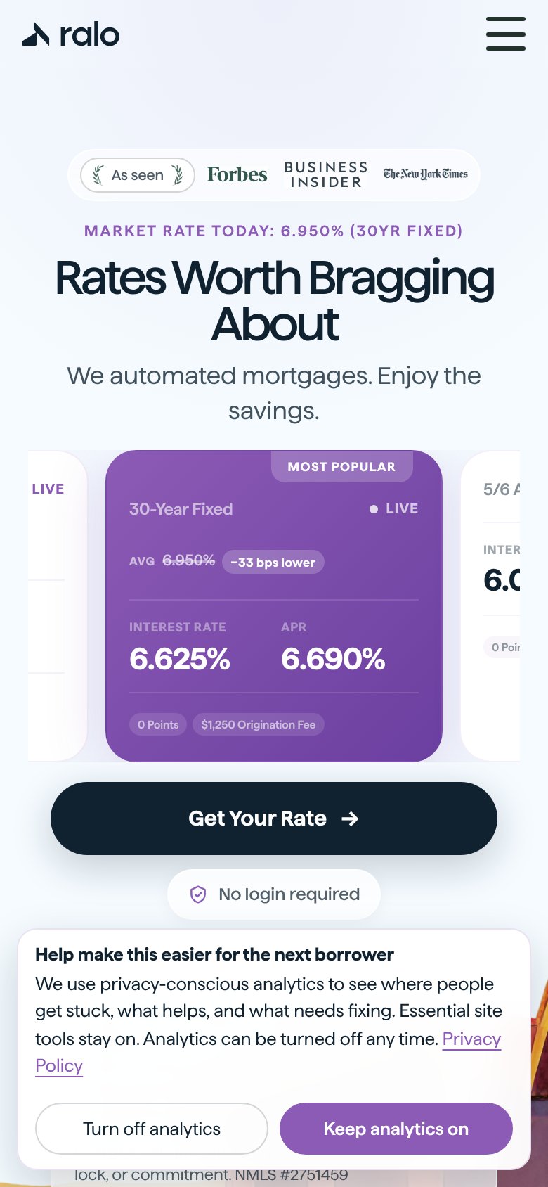
1234- Analytics consent banner — Full-width banner with two equal-weight buttons overlaps the fold and pulls attention off Get Ralo's Rate.
- Fine-print disclosure block — Five-line grey text wall sits directly under the CTA, adding dense legal copy to the primary scan path.
- Sign Up / Login pair — Login is styled as a filled dark pill matching the primary CTA weight, competing top-right in the scan path.
- Three rate cards — Three same-structure cards with six competing percentages force comparison work before the visitor reaches the CTA.
Mobile web
72FairThe phone experience as a first-class citizen.
What works
What to improve
CTA
82StrongCopy, size, verb, cost-feel — does the primary CTA earn the click?
How Ralo compares
Recommended rewrites
Value props
86StrongTitle, subtitle, hero — do they sell the product's true value?
Ralo’s headline
Rates Worth Bragging About
We automated mortgages. Enjoy the savings.
Working
Could improve