
Your landing page’s weakest score is CTA.
How Quantum Health ranks
CTA
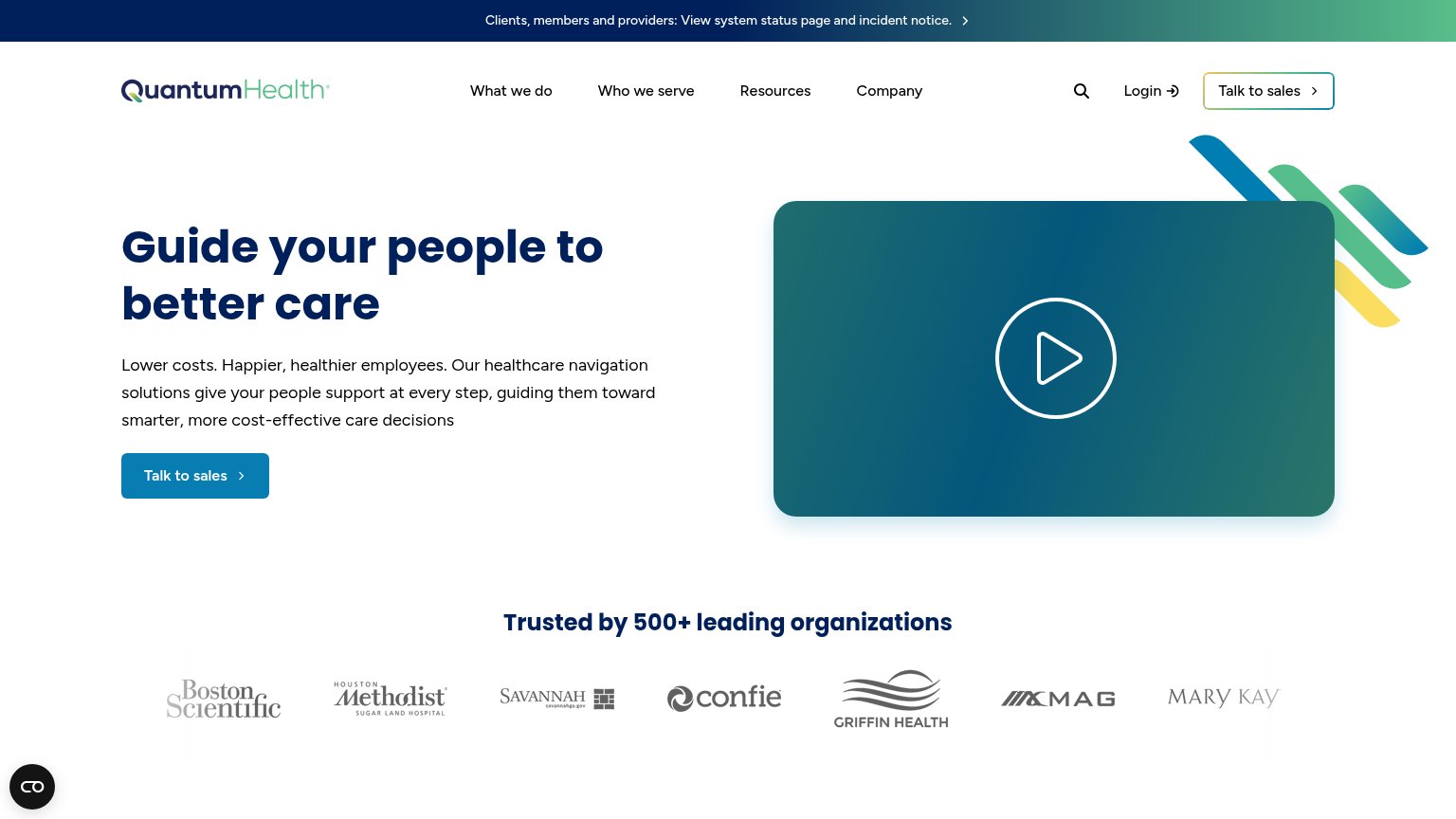
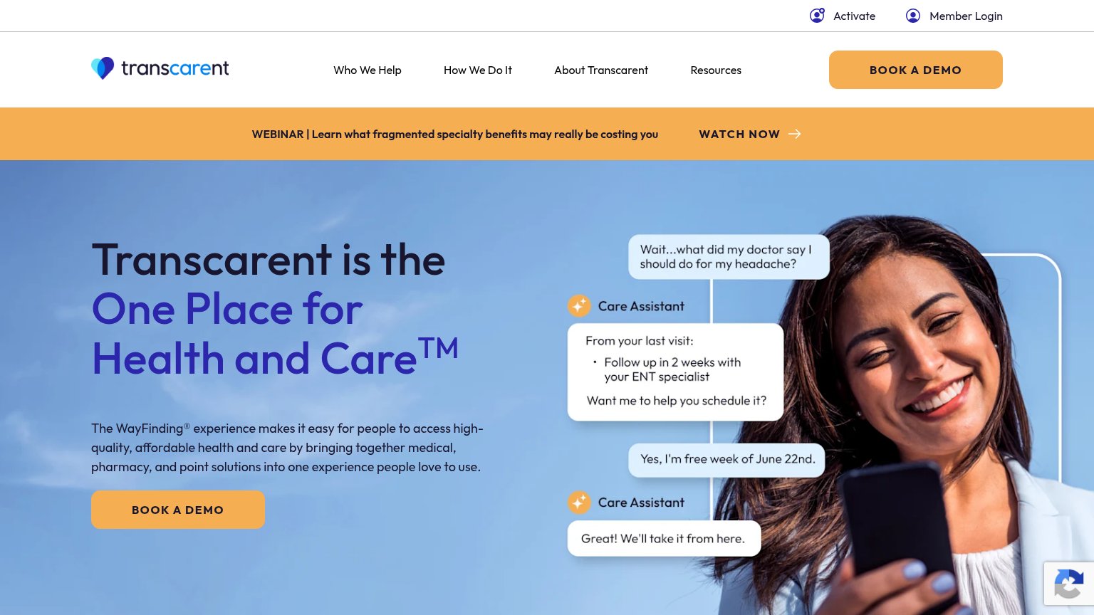
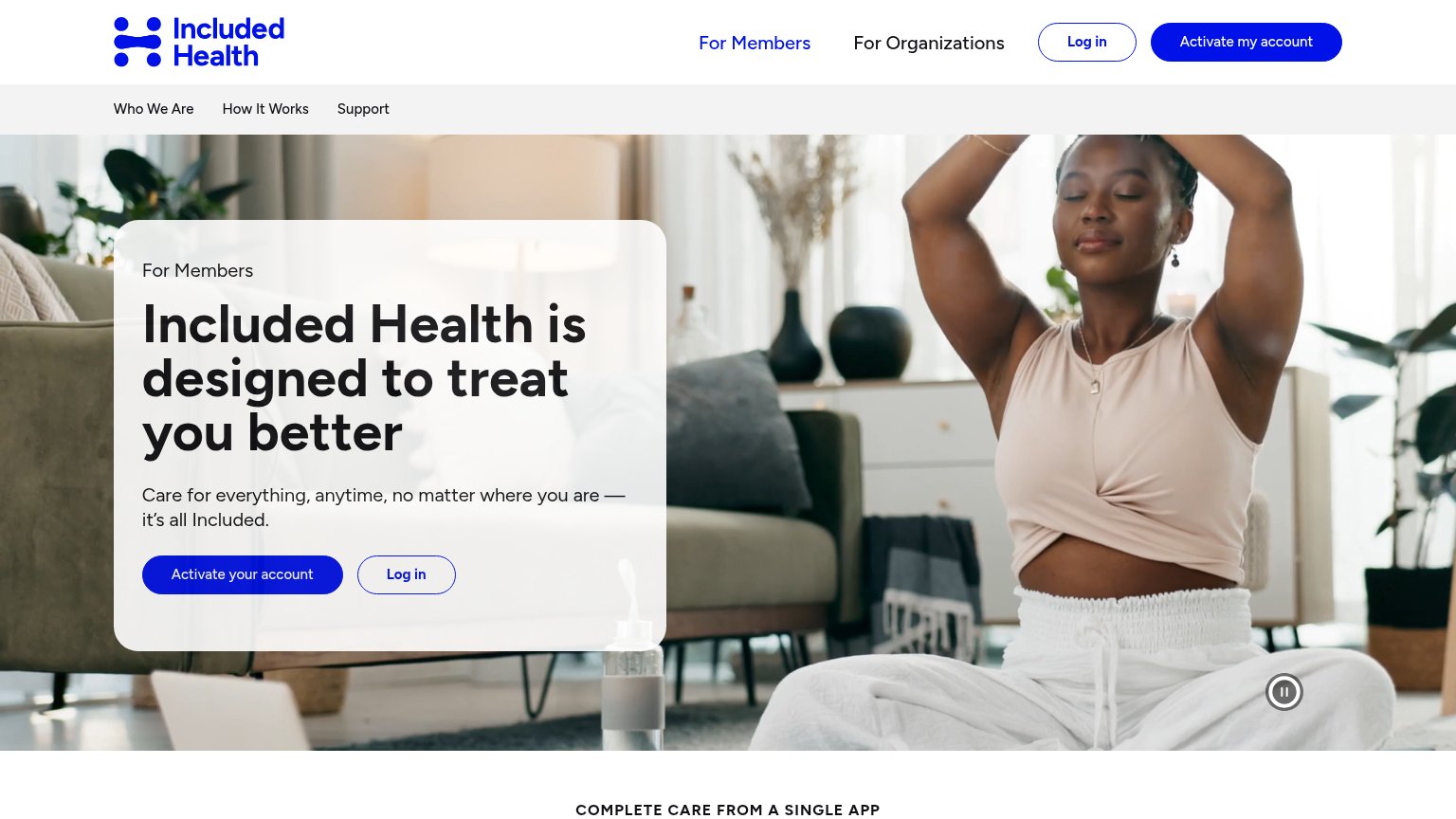
64FairCopy, size, verb, cost-feel — does the primary CTA earn the click?
Problems
- 'sales' makes click feel costly
- small footprint vs hero headline
- no value promised for the click
Value props
68FairTitle, subtitle, hero — do they sell the product's true value?
Quantum Health’s headline sells
Guide your people to better care
Lower costs. Happier, healthier employees. Our healthcare navigation solutions give your people support at every step, guiding them toward smarter, more cost-effective care decisions
Working
- Names real outcomes: lower costs, healthier employees
- Speaks directly to HR/benefits buyer
- 500+ orgs logo bar backs the claim
Could improve
- No numbers anywhere in the hero copy
- Video thumbnail shows nothing about the product
- 'Better care' is soft; savings stat would land harder
Information hierarchy
72FairDoes the design help or inhibit what the page is trying to say?
What works
What to improve
Trust
72FairProof that the product is real, competent, and safe to try.
How Quantum Health compares
Trust read
Mobile web
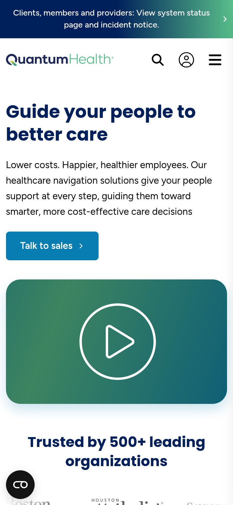
74FairThe phone experience as a first-class citizen.
What works
What to improve