
Your landing page’s weakest score is Value props.
How Poshmark ranks
58Growth scoreupdated
category scores
category scoresShowHide
Value props
48PoorTitle, subtitle, hero — do they sell the product's true value?
Poshmark’s headline vague
Chase What Thrills you
Working
- Aspirational, energetic tone
- Hero shows real fashion in use
- CTA routes straight to shopping
Could improve
- Headline could caption any brand
- No subhead or proof points
- Selling side of marketplace invisible
Information hierarchy
52FairDoes the design help or inhibit what the page is trying to say?
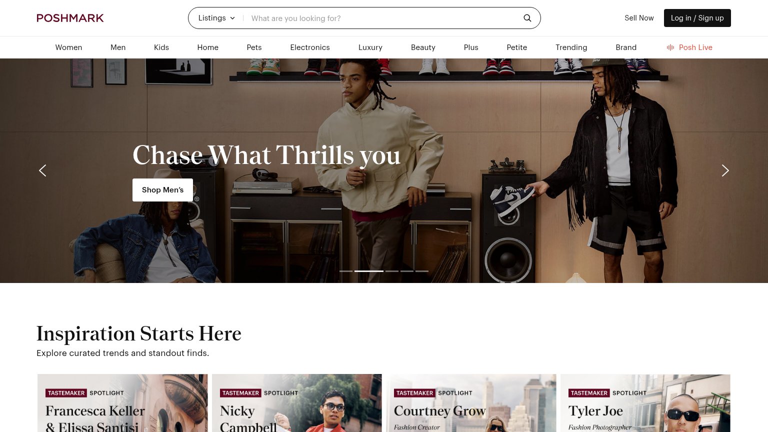 1234
- Category nav bar — Thirteen equal-weight nav links sit directly above the hero, giving the fold a dozen exits before any value message lands.
- Shop Men's button — The only CTA in the hero is small, low-contrast white-on-photo, and promotes a rotating campaign rather than the core sell/buy action.
- Hero carousel dots — Rotating carousel means the headline and CTA change out from under the visitor, diluting the one message the fold communicates.
- Chase What Thrills headline — Campaign slogan over busy photography carries no value proposition — nothing on the fold says what Poshmark is or does.
Trust
58FairProof that the product is real, competent, and safe to try.
How Poshmark compares
Trust read
CTA
62FairCopy, size, verb, cost-feel — does the primary CTA earn the click?
How Poshmark compares
Recommended rewrites
Mobile web
68FairThe phone experience as a first-class citizen.
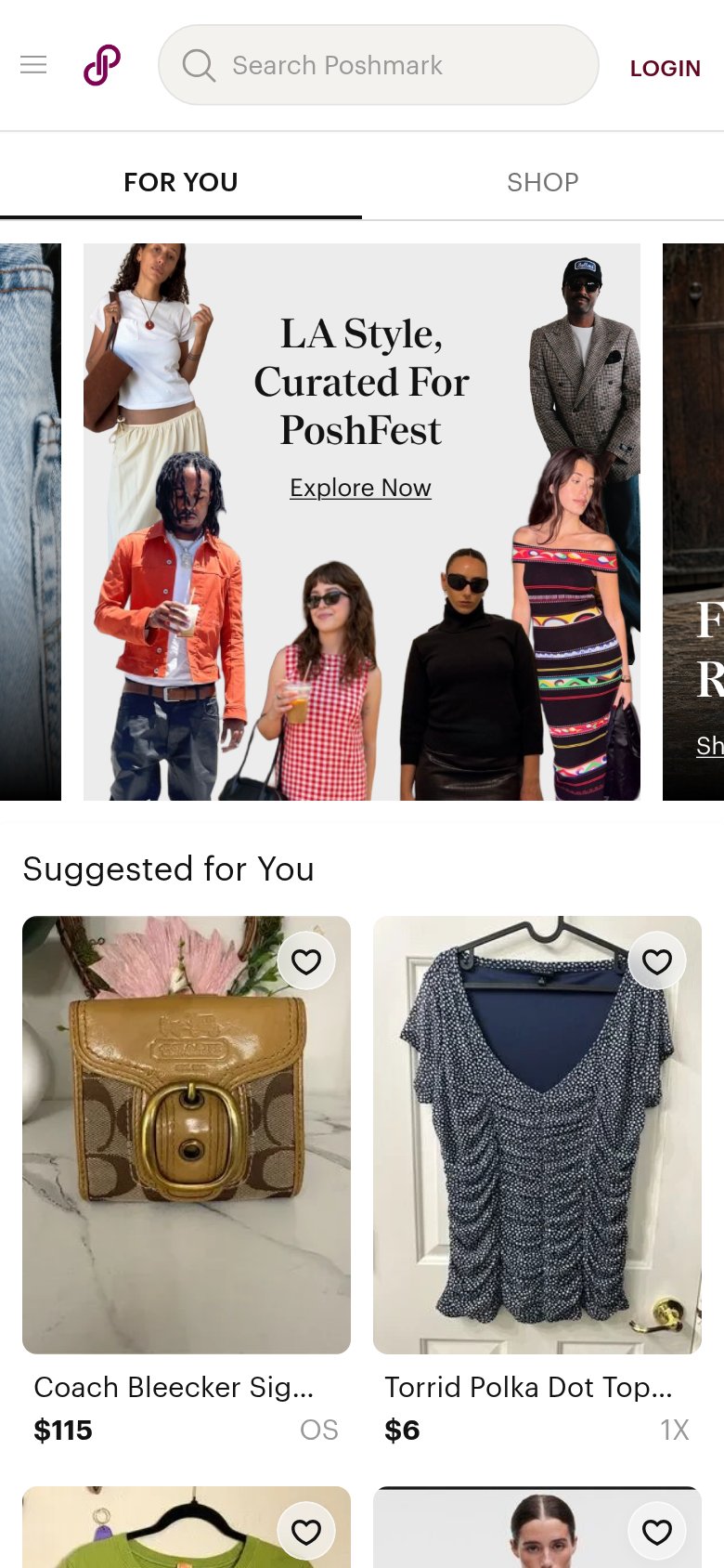
What works
What to improve