
Your landing page’s weakest score is Value props.
How Jeff LeBeau ranks
61Growth scoreupdated
category scores
category scoresShowHide
Value props
52FairTitle, subtitle, hero — do they sell the product's true value?
Jeff LeBeau’s headline undersells
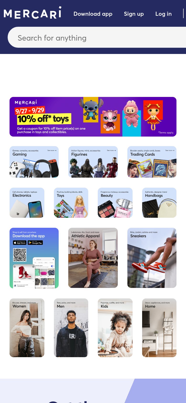
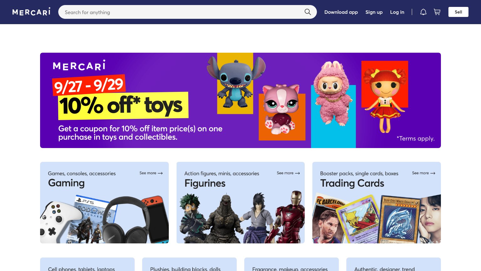
10% off* toys
Get a coupon for 10% off item price(s) on one purchase in toys and collectibles.
Working
- Concrete offer: 10% off, dated 9/27–9/29
- Category tiles clarify what's sold
- Subhead explains the coupon mechanics
Could improve
- No statement of what Mercari is
- Promo banner replaces the value prop
- Sell-side value hidden in a nav button
Trust
56FairProof that the product is real, competent, and safe to try.
| Trust read | |
|---|---|
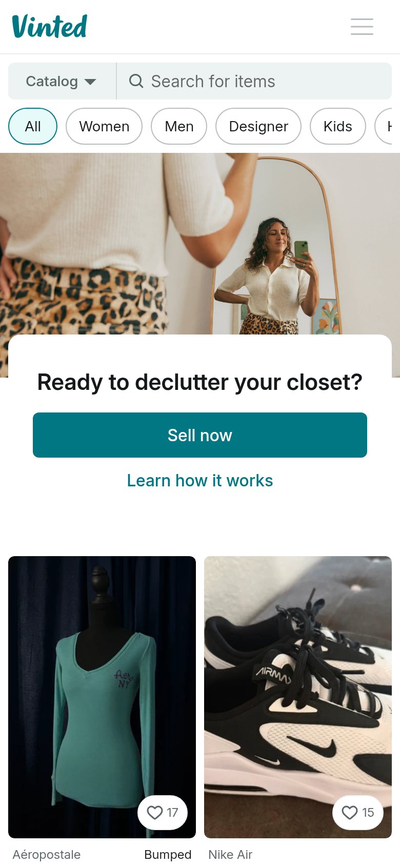
| Jeff LeBeau | App screenshot in the "Download the app" tile showing real marketplace listings UI |
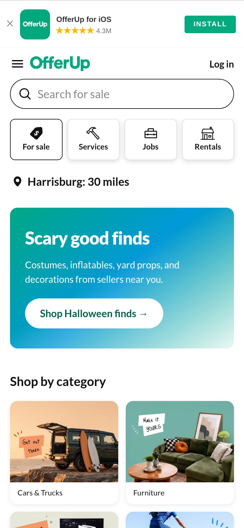
| App-install banner: "OfferUp for iOS" with 5-star rating and "4.3M" review count | |
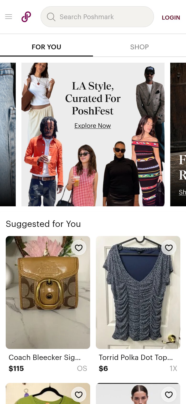
| Real seller listings with prices on mobile ("Coach Bleecker Sig… $115", "Torrid Polka Dot Top… $6") | |
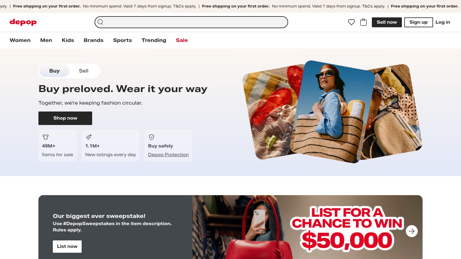
| "49M+ Items for sale" and "1.1M+ New listings every day" stat row beneath the Shop now CTA | |
| Product collage showing feed cards, story timer "16:45", and reaction icons next to "Explore the things you love." | |
| Real user listings with favorite counts ("17", "15") on items like Nike Air Max and Aéropostale top |
Mobile web
58FairThe phone experience as a first-class citizen.
What works
What to improve
Information hierarchy
66FairDoes the design help or inhibit what the page is trying to say?
What works
What to improve
CTA
72FairCopy, size, verb, cost-feel — does the primary CTA earn the click?
How Jeff LeBeau compares
Recommended rewrites