
Your landing page’s weakest score is Information hierarchy.
How Depop ranks
75Growth scoreupdated
category scores
category scoresShowHide
Information hierarchy
66FairDoes the design help or inhibit what the page is trying to say?
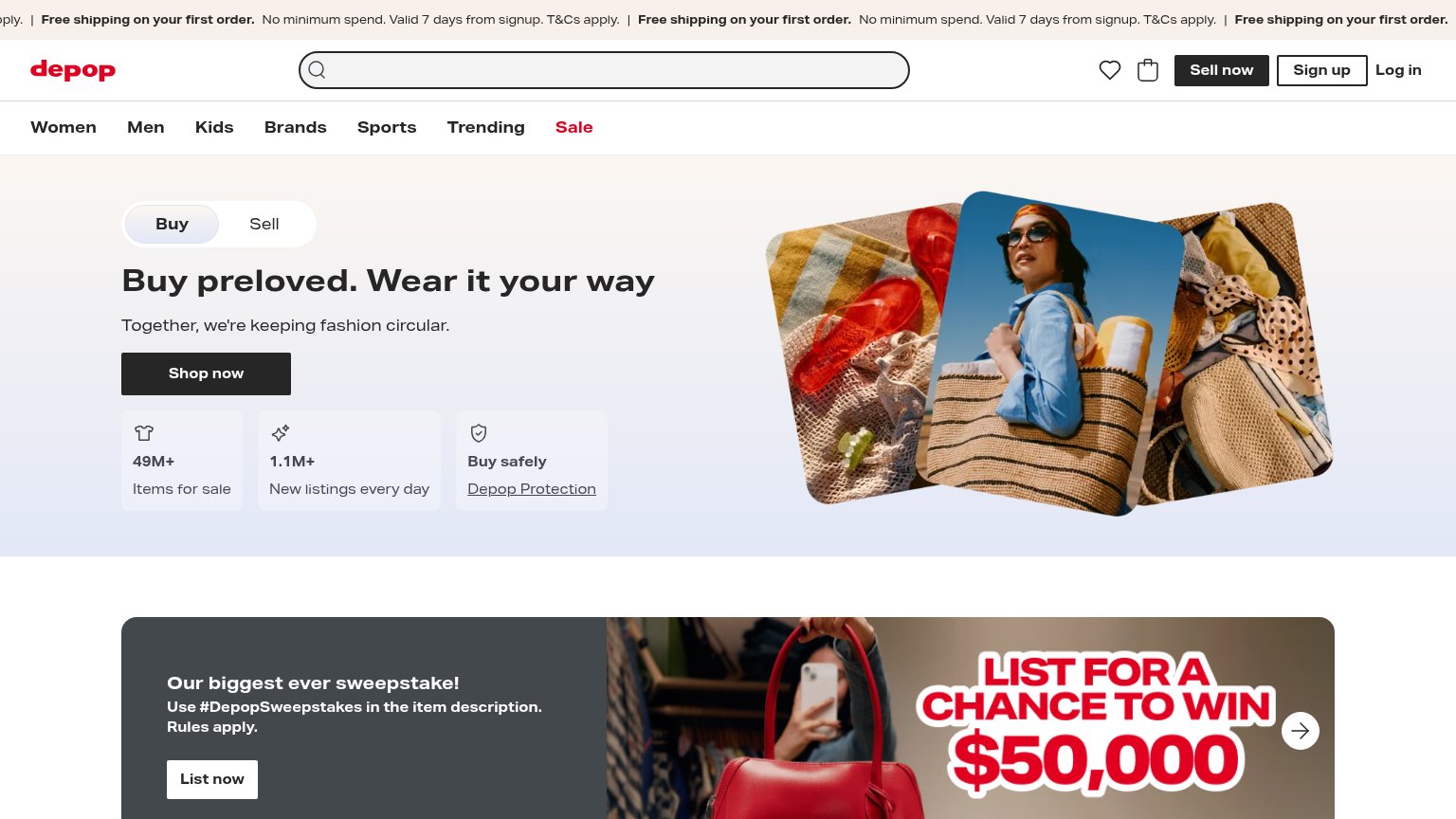 1234
- Sweepstakes banner — Second CTA block "List now" with $50,000 graphic competes at equal weight with the hero's Shop now.
- Top nav row — Seven category links plus wishlist, bag, Sell now, Sign up, Log in — a dozen exits before the primary CTA.
- Shop now button — Small footprint and low placement leave it outranked by the larger Buy/Sell toggle and hero imagery above it.
- Free shipping ticker — Scrolling repeated banner text is truncated and repeats three times, adding noise at the top of the scan path.
Trust
74FairProof that the product is real, competent, and safe to try.
| Trust read | |
|---|---|
| Depop | "49M+ Items for sale" and "1.1M+ New listings every day" stat row beneath the Shop now CTA |
| App screenshot in the "Download the app" tile showing real marketplace listings UI | |
| App-install banner: "OfferUp for iOS" with 5-star rating and "4.3M" review count | |
| Real seller listings with prices on mobile ("Coach Bleecker Sig… $115", "Torrid Polka Dot Top… $6") | |
| Product collage showing feed cards, story timer "16:45", and reaction icons next to "Explore the things you love." | |
| Real user listings with favorite counts ("17", "15") on items like Nike Air Max and Aéropostale top |
CTA
78FairCopy, size, verb, cost-feel — does the primary CTA earn the click?
How Depop compares
Recommended rewrites
Value props
78FairTitle, subtitle, hero — do they sell the product's true value?
Depop’s headline
Buy preloved. Wear it your way
Together, we're keeping fashion circular.
Working
Could improve
Mobile web
78FairThe phone experience as a first-class citizen.
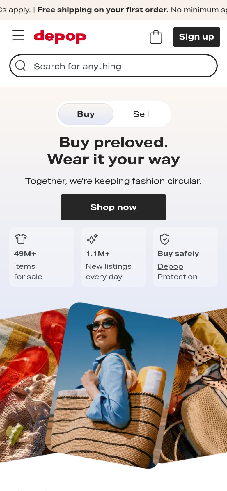
What works
What to improve