
Your landing page’s weakest score is Information hierarchy.
How Ocelot ranks
51Growth scoreupdated
category scores
category scoresShowHide
Information hierarchy
38PoorDoes the design help or inhibit what the page is trying to say?
 123
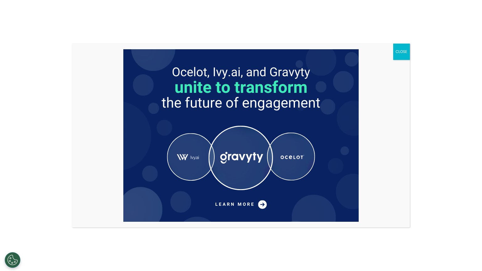
- Interstitial announcement modal — A merger-announcement popup fully replaces the fold, hiding Ocelot's headline, value prop, and product CTA behind an extra step.
- Learn More link — The only visible action routes to acquisition news, not to Ocelot's product conversion, and is styled as a low-weight text link.
- Close button placement — The teal CLOSE sits detached in the top-right outside the modal artwork, easy to miss and mismatched with the banner's palette.
Value props
48PoorTitle, subtitle, hero — do they sell the product's true value?
Ocelot’s headline vague
Ocelot, Ivy.ai, and Gravyty unite to transform the future of engagement
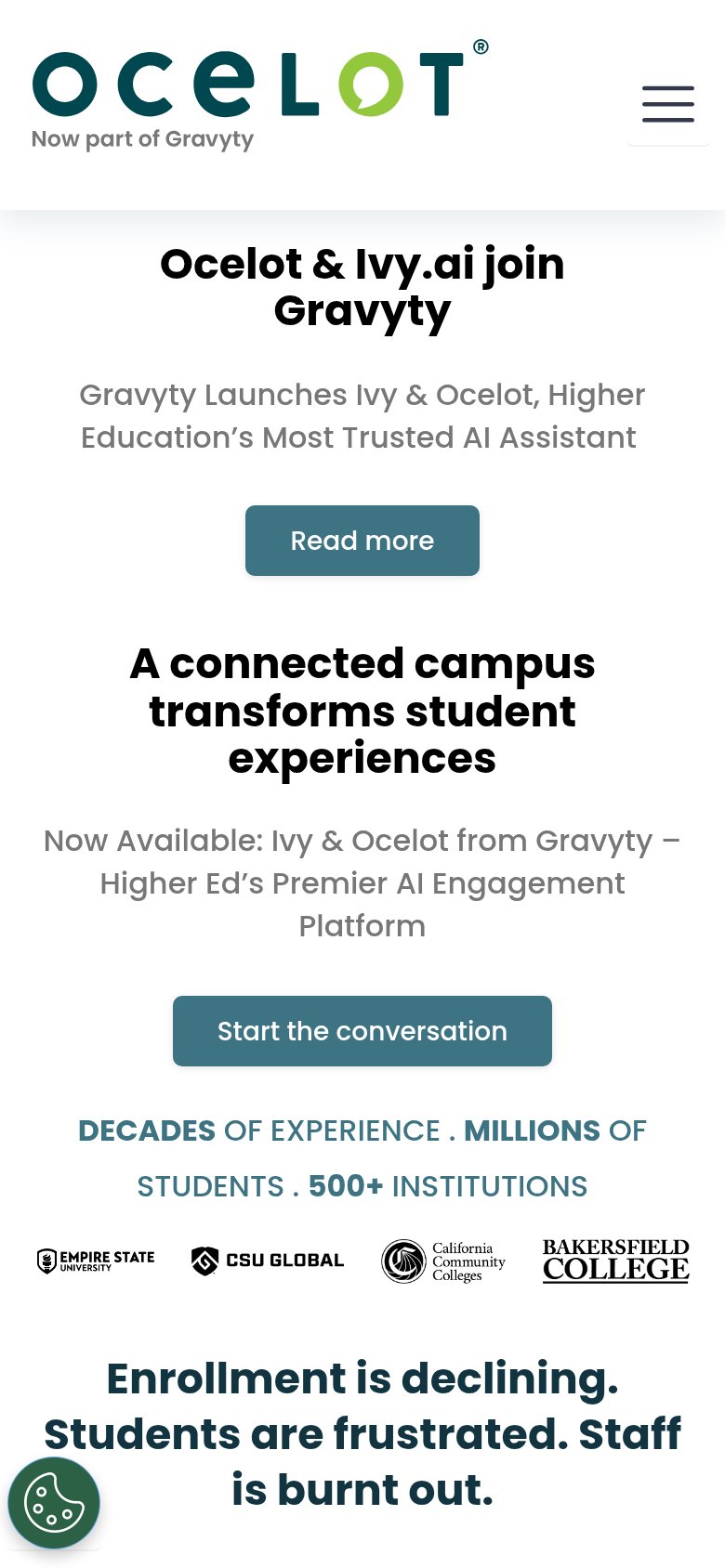
Gravyty Launches Ivy & Ocelot, Higher Education's Most Trusted AI Assistant
Working
- Strong proof strip: 500+ institutions
- Pain copy names staff burnout
- Real university logos add trust
Could improve
- Desktop fold is a merger popup
- Announcement copy, not value prop
- Product's job never shown or stated
CTA
52FairCopy, size, verb, cost-feel — does the primary CTA earn the click?
How Ocelot compares
Recommended rewrites
Trust
58FairProof that the product is real, competent, and safe to try.
How Ocelot compares
Trust read
Mobile web
58FairThe phone experience as a first-class citizen.
What works
What to improve