
Your landing page’s weakest score is Value props.
How Mainstay ranks
61Growth scoreupdated
category scores
category scoresShowHide
Value props
54FairTitle, subtitle, hero — do they sell the product's true value?
Mainstay’s headline vague
Human-centered, AI-enhanced
Conversation that builds connection Engagement that drives outcomes
Working
- Warm student imagery matches audience
- Credible higher-ed logos in the fold
- Mobile eyebrow "Student Success" adds context
Could improve
- Headline never says what Mainstay does
- "Outcomes" unnamed — no metric or noun
- Zero numbers anywhere in the fold
Information hierarchy
62FairDoes the design help or inhibit what the page is trying to say?
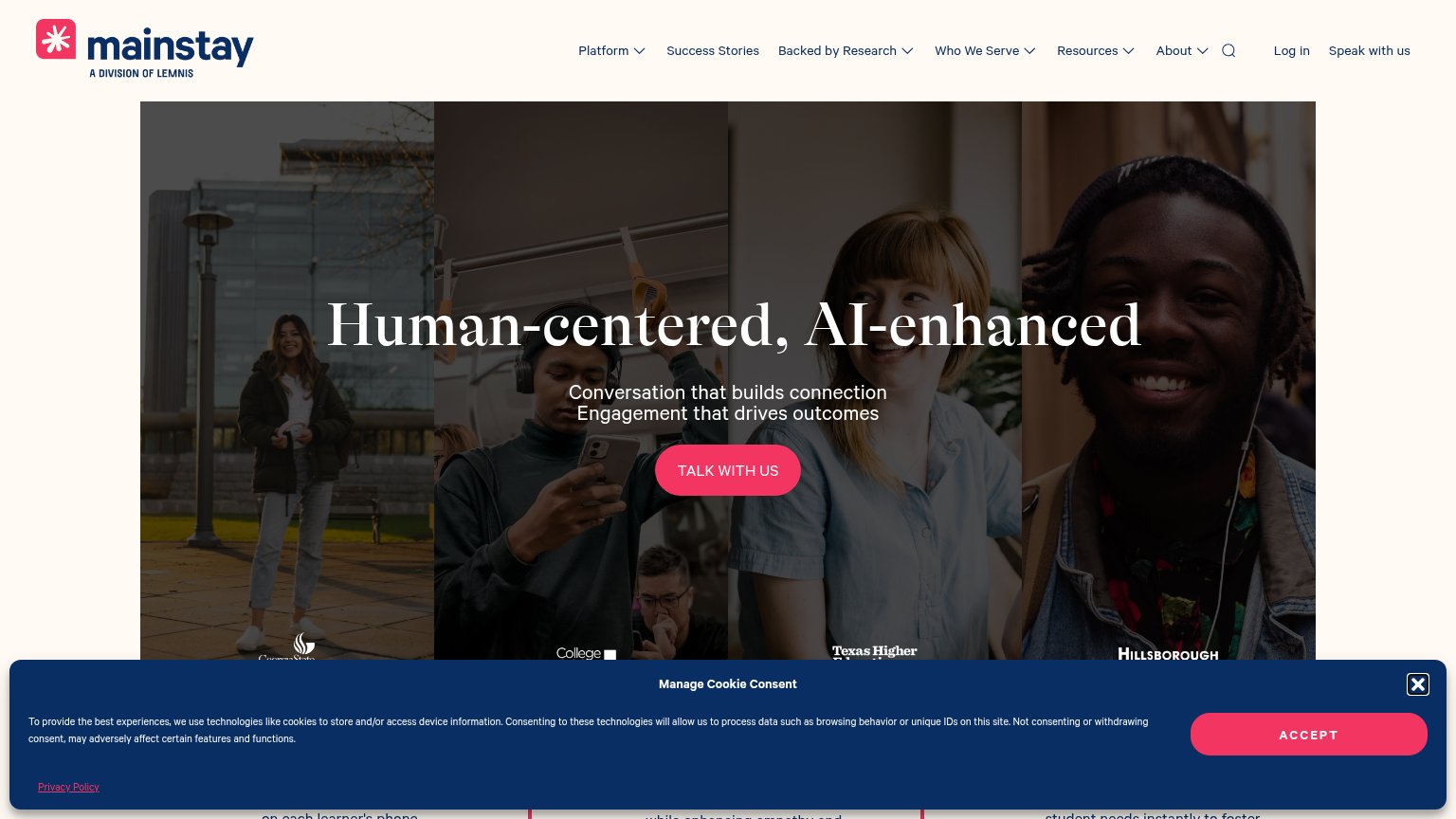 1234
- Cookie consent banner — Full-width overlay with red ACCEPT button styled at the same weight as the hero CTA, hijacking the bottom of the fold.
- Nav dropdown menus — Six top-level items, five with dropdowns, plus Log in and search — roughly a dozen exit paths outranking one conversion.
- Hero headline contrast — White serif 'Human-centered, AI-enhanced' sits over four busy photo panels, thinning legibility at the seams.
- Partner logos strip — Logos are half-cropped by the fold and overlapped by the cookie banner, reading as clutter rather than proof.
Trust
62FairProof that the product is real, competent, and safe to try.
How Mainstay compares
Trust read
Mobile web
62FairThe phone experience as a first-class citizen.
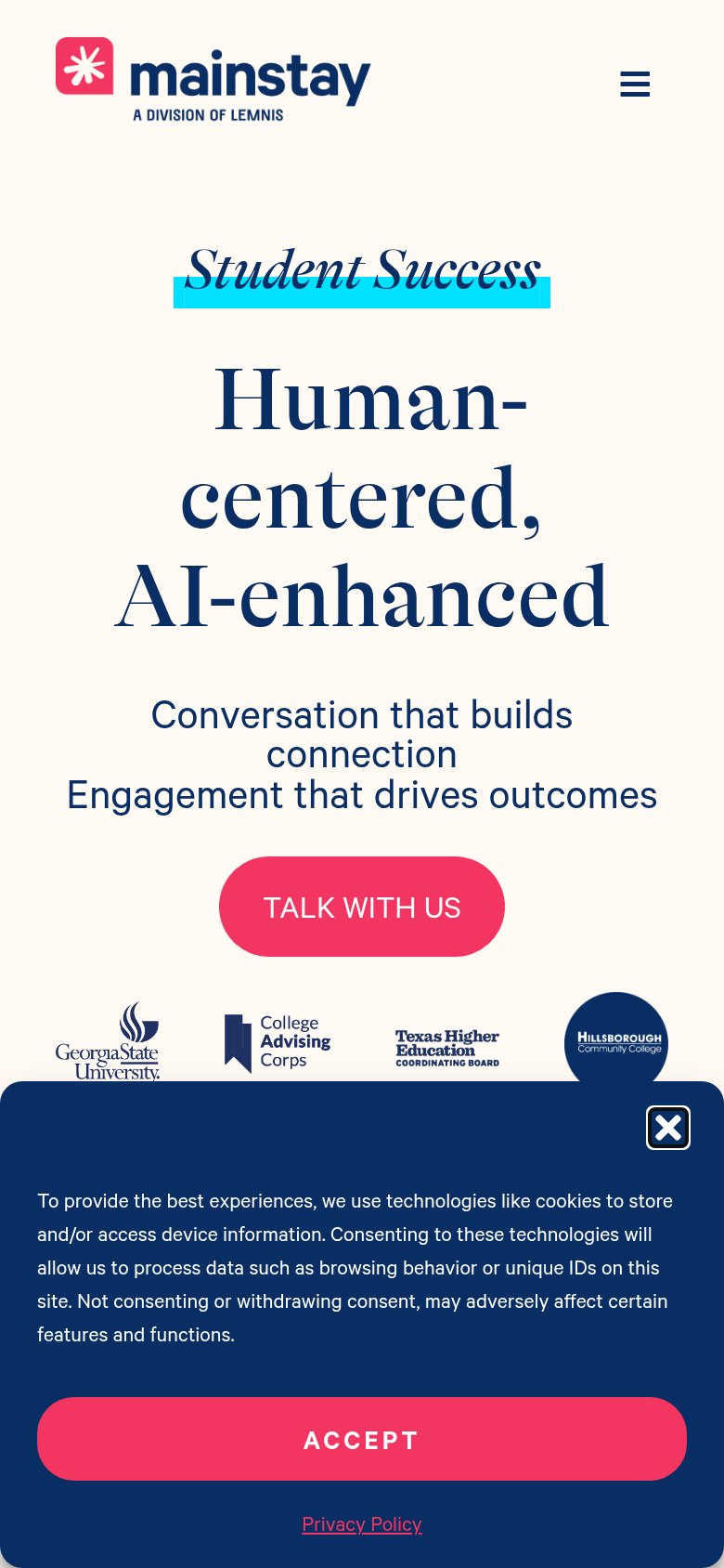
What works
What to improve
CTA
64FairCopy, size, verb, cost-feel — does the primary CTA earn the click?
How Mainstay compares
Recommended rewrites