
Your landing page’s weakest score is Mobile web.
How Mixpanel ranks
Mobile web
22PoorThe phone experience as a first-class citizen.
 123
- Stock photo header — Hero-sized avatar photo spends the top third of the viewport on a chatbot portrait.
- Request a Demo button — The only conversion action is a small pill buried near the bottom, not a full-width primary CTA.
- Suggested prompts list — Four grey prompt lines compete with the demo button at the exact thumb zone.
Trust
52FairProof that the product is real, competent, and safe to try.
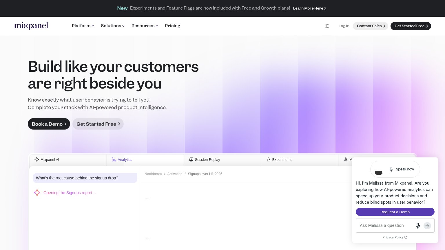
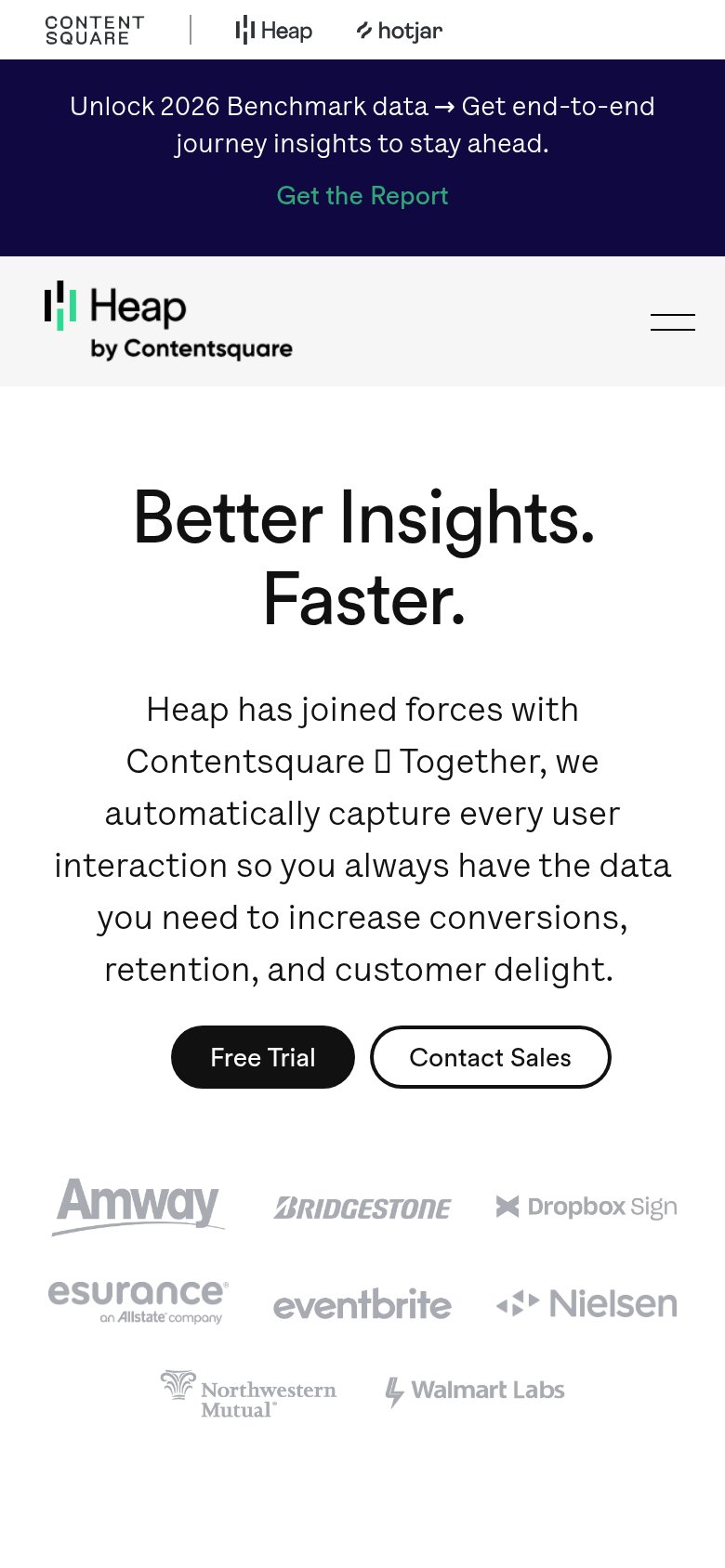
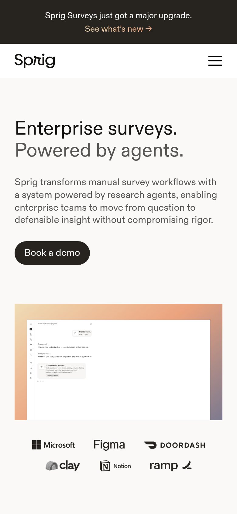
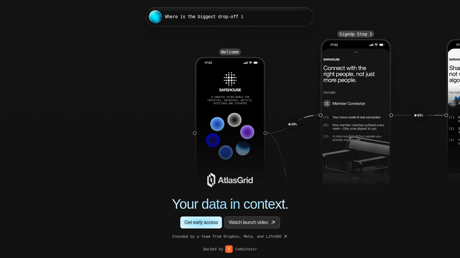
| Trust read | |
|---|---|
| Mixpanel | Embedded product UI showing Mixpanel AI answering "What's the root cause behind the signup drop?" alongside an Analytics |
| Founded by a team from Dropbox, Meta, and Life360 | |
| Customer logo row: Microsoft, Figma, DoorDash, Clay, Notion, Ramp (mobile fold) | |
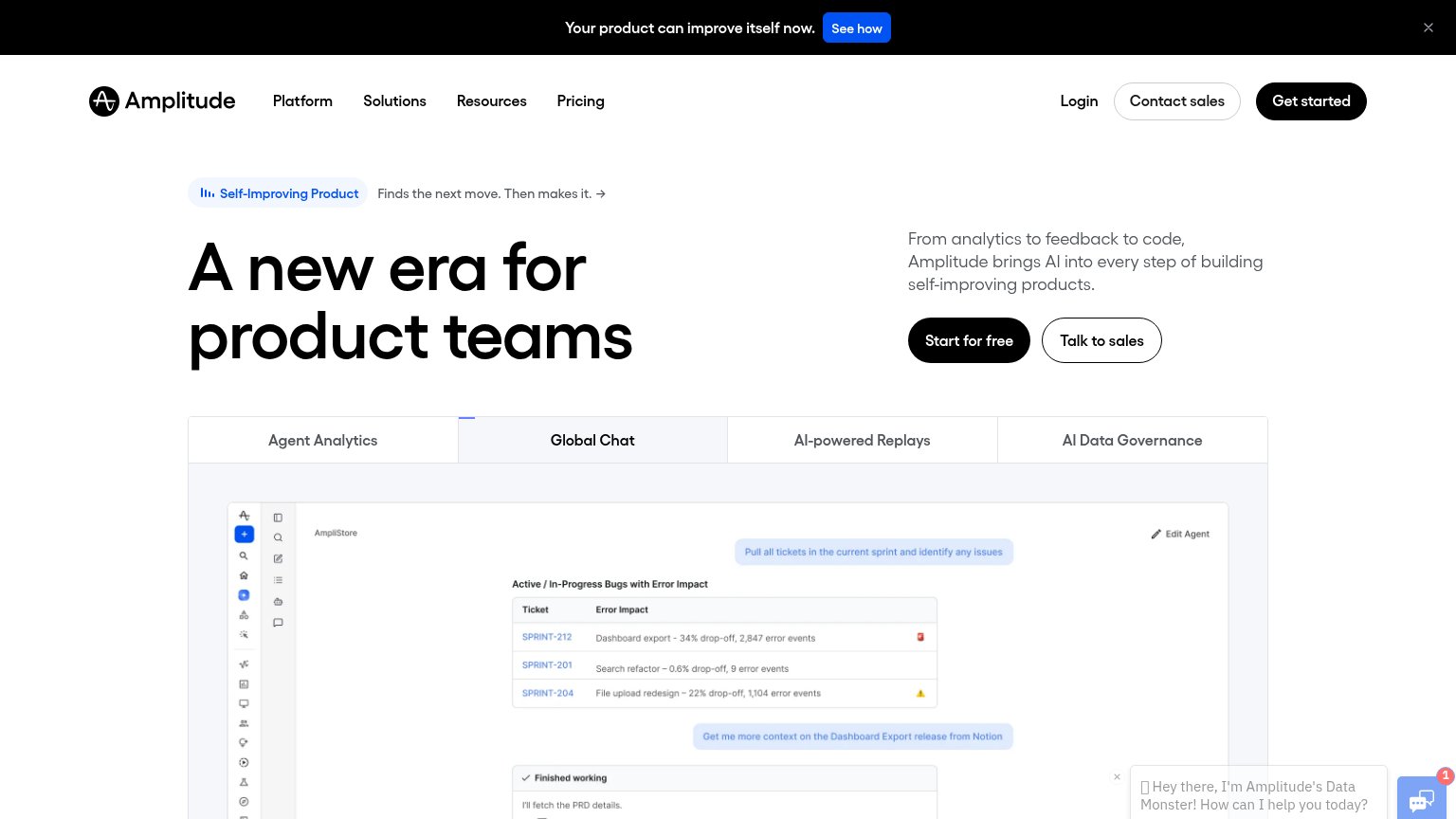
| Tabbed product demo showing real Amplitude UI ("Global Chat" agent view with sprint tickets and error-impact data) | |
| "Over the past 5 years we've gone from zero to profitable" | |
| Customer logo wall (Amway, Bridgestone, Dropbox Sign, Esurance, Eventbrite, Nielsen, Northwestern Mutual, Walmart Labs) |
Information hierarchy
62FairDoes the design help or inhibit what the page is trying to say?
What works
What to improve
Value props
68FairTitle, subtitle, hero — do they sell the product's true value?
Mixpanel’s headline
Build like your customers are right beside you
Know exactly what user behavior is trying to tell you. Complete your stack with AI-powered product intelligence.
Working
Could improve
CTA
78FairCopy, size, verb, cost-feel — does the primary CTA earn the click?
How Mixpanel compares
Recommended rewrites