
Your landing page’s weakest score is Value props.
How AtlasGrid ranks
55Growth scoreupdated
category scores
category scoresShowHide
Value props
34PoorTitle, subtitle, hero — do they sell the product's true value?
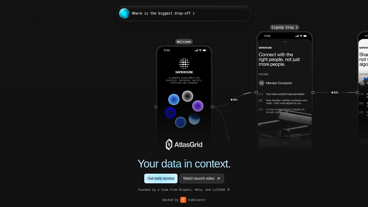
AtlasGrid’s headline vague
Your data in context.
Working
- Strong founder and YC proof points
- Hero mockups hint at real product use
- Clean single primary CTA pairing
Could improve
- Headline could caption any data product
- No subhead explains what AtlasGrid does
- Mobile hero overlaps logo over mockup
Mobile web
48PoorThe phone experience as a first-class citizen.
 123
- Headline overlaps mockup — "AtlasGrid's data in context." and the AtlasGrid logo render on top of the phone's feature list, making both unreadable.
- SAFEHOUSE demo phone — A full-height example screen fills the fold and pushes the value statement and primary CTA below the viewport.
- Truncated chat card — The top card cuts off mid-sentence at "How many peo", eating hero space with no readable message or action.
Information hierarchy
58FairDoes the design help or inhibit what the page is trying to say?
What works
What to improve
Trust
58FairProof that the product is real, competent, and safe to try.
How AtlasGrid compares
Trust read
CTA
76FairCopy, size, verb, cost-feel — does the primary CTA earn the click?
How AtlasGrid compares
Recommended rewrites