
Your landing page’s weakest score is Mobile web.
How Memcyco ranks
Mobile web
42PoorThe phone experience as a first-class citizen.
 1234
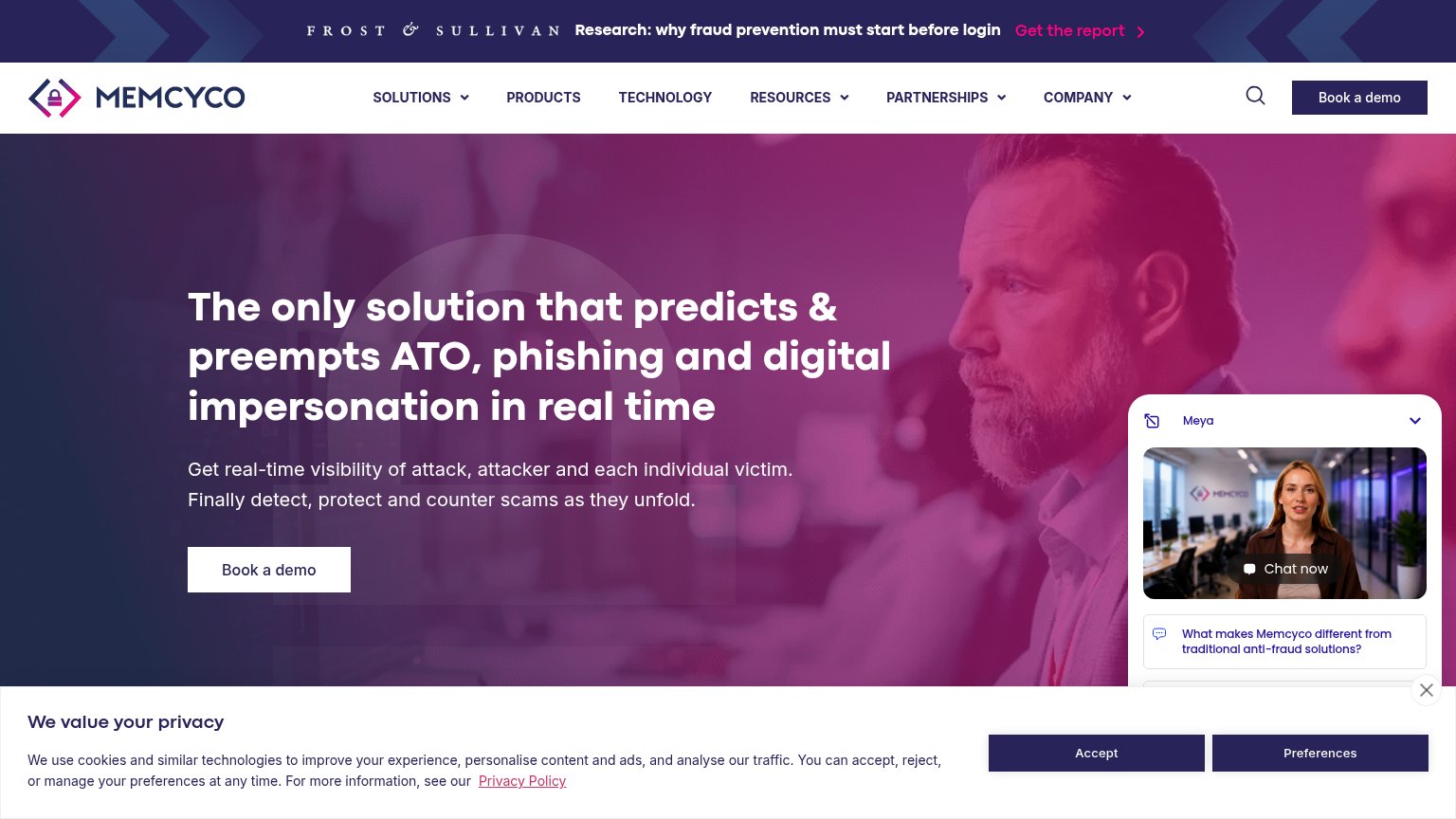
- Cookie consent banner — Dead blocker covers the bottom half of the first viewport, burying the subhead and the 'Book a demo' CTA.
- Frost & Sullivan bar — Promo banner consumes roughly the top 15% of the viewport before the logo or nav even appears, pushing the hero and CTA down.
- Chat avatar bubble — Floating video-chat widget overlaps the 'Preferences' consent button, stacking two interruptions on one tap zone.
- Six-line hero headline — Headline wraps into six oversized lines, eating most of the visible hero and pushing the CTA off-screen.
Trust
48PoorProof that the product is real, competent, and safe to try.

| Trust read | |
|---|---|
| Memcyco | Frost & Sullivan research banner: "Research: why fraud prevention must start before login" |
| No visible trust signal identified. | |
| Illustrated threat-detection diagram with labeled attack vectors ("DOP-42 VOICEMAIL", "DOP-25 EMAIL", "DOP-23 MESSENGER" | |
| implicit context ZeroFox may benefit from pre-existing familiarity among its target audience. | |
| Nora chat widget claim: "taking down phishing sites quickly, often within 33 minutes" | |
| "NEW! Fraudulent Ads Monitoring, Inside Your Platform" announcement link |
Information hierarchy
58FairDoes the design help or inhibit what the page is trying to say?
What works
What to improve
CTA
58FairCopy, size, verb, cost-feel — does the primary CTA earn the click?
How Memcyco compares
Recommended rewrites
Value props
72FairTitle, subtitle, hero — do they sell the product's true value?
Memcyco’s headline
The only solution that predicts & preempts ATO, phishing and digital impersonation in real time
Get real-time visibility of attack, attacker and each individual victim. Finally detect, protect and counter scams as they unfold.
Working
Could improve