
Your landing page’s weakest score is Trust.
How MedRez ranks
Trust
44PoorProof that the product is real, competent, and safe to try.

| Trust read | |
|---|---|
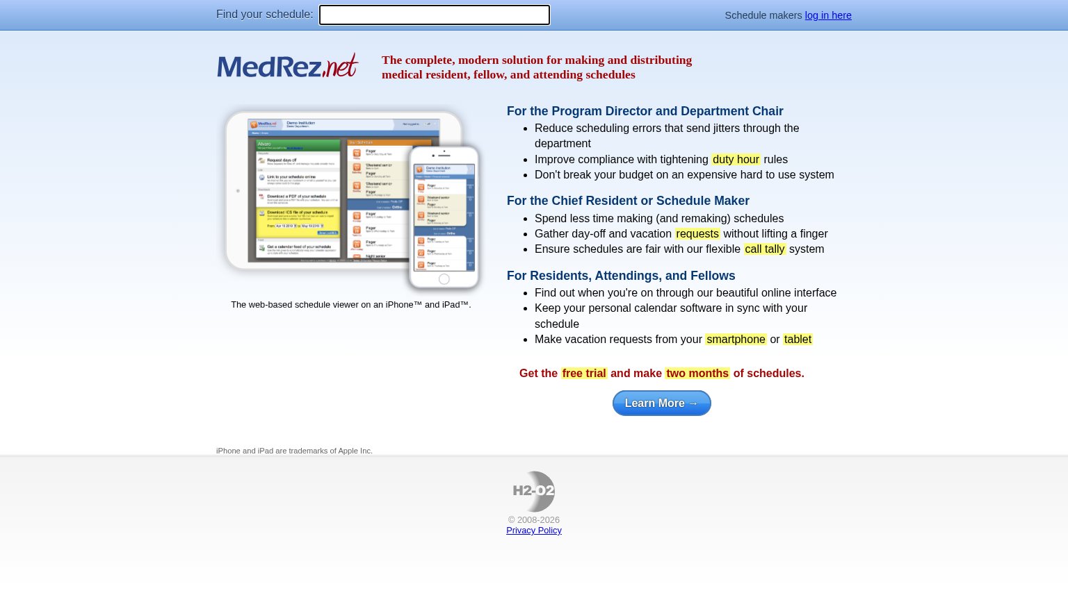
| MedRez | Detailed schedule-viewer screenshot on iPad and iPhone showing real UI ("Request days off", "Download a PDF of your sche |
| "Backed by Y Combinator" badge above the hero headline | |
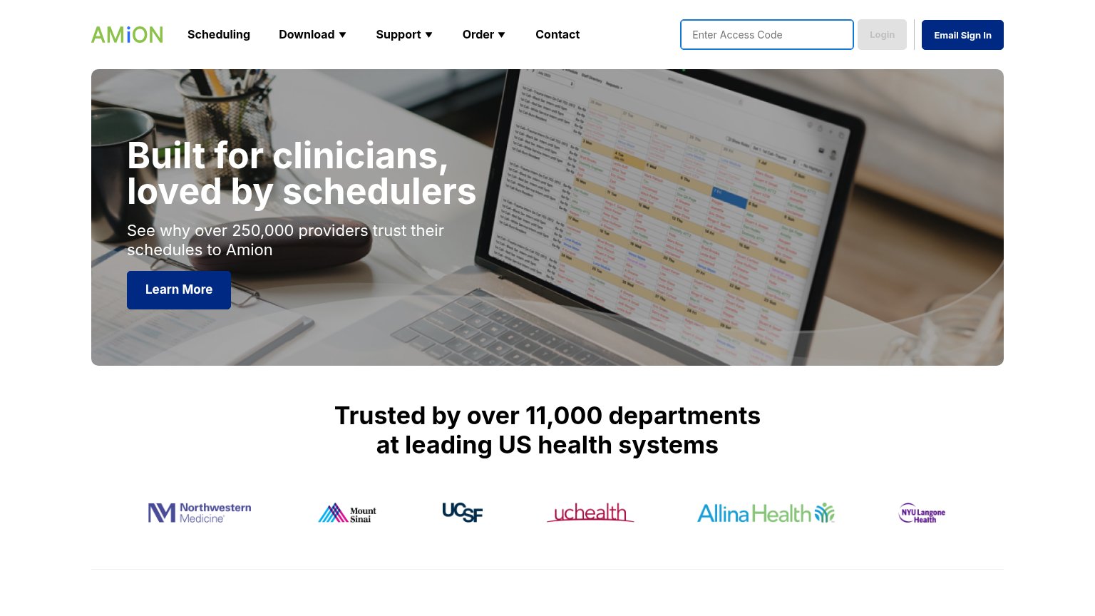
| "Trusted by over 11,000 departments at leading US health systems" with logos of Northwestern Medicine, Mount Sinai, UCSF | |
| No visible trust signal identified. | |
| No visible trust signal identified. | |
| "A QGENDA COMPANY" tagline under the ShiftAdmin logo plus the 1-888-SHIFT40 phone line |
Mobile web
44PoorThe phone experience as a first-class citizen.
 123
- Double-decker sticky header — The search field and the "Schedule makers log in here" row stack into a two-tier header that eats the top of the fold with two competing actions.
- Desktop screenshot illegible — The tablet/phone product screenshot scales its UI text down to unreadable size on a phone, spending half the fold on pixels no one can parse.
- Unlabeled search field — The bare text input next to "Find MedRez's schedule:" has no placeholder or submit button, so its purpose and how to act on it are unclear on tap.
CTA
58FairCopy, size, verb, cost-feel — does the primary CTA earn the click?
How MedRez compares
Recommended rewrites
Information hierarchy
62FairDoes the design help or inhibit what the page is trying to say?
What works
What to improve
Value props
68FairTitle, subtitle, hero — do they sell the product's true value?
MedRez’s headline
The complete, modern solution for making and distributing medical resident, fellow, and attending schedules
Working
Could improve