
Your landing page’s weakest score is CTA.
How Amion ranks
70Growth scoreupdated
category scores
category scoresShowHide
CTA
58FairCopy, size, verb, cost-feel — does the primary CTA earn the click?

Problems
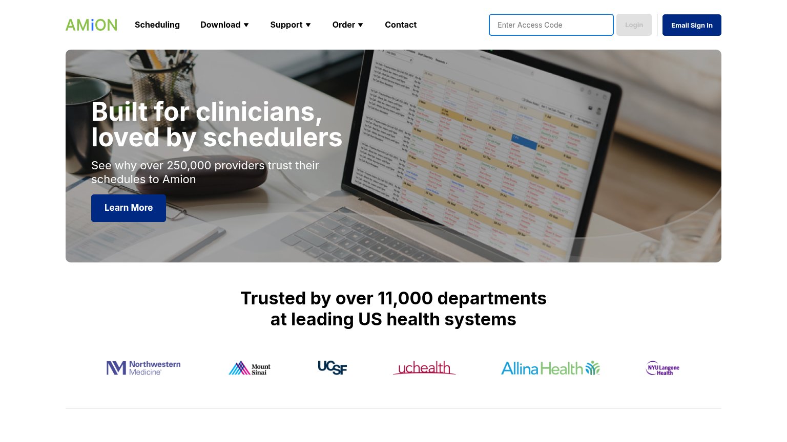
- 'Learn More' promises reading, not value
- ignores headline's scheduling promise
- header login fields compete for attention
Information hierarchy
68FairDoes the design help or inhibit what the page is trying to say?
1234- Learn More CTA — Vague label styled identically to Email Sign In, so the fold has two navy buttons and no clear primary action.
- Access code login cluster — Three same-row controls (input, Login, Email Sign In) compete with the hero CTA and confuse first-time visitors vs returning users.
- Nav with three dropdowns — Six nav items plus dropdown carets offer many exit paths before the visitor reaches the hero promise.
- Hero screenshot laptop photo — The dense schedule screenshot is too small and angled to communicate the product; it adds visual noise behind the headline.
Value props
72FairTitle, subtitle, hero — do they sell the product's true value?
Amion’s headline
Built for clinicians, loved by schedulers
See why over 250,000 providers trust their schedules to Amion
Working
Could improve
Mobile web
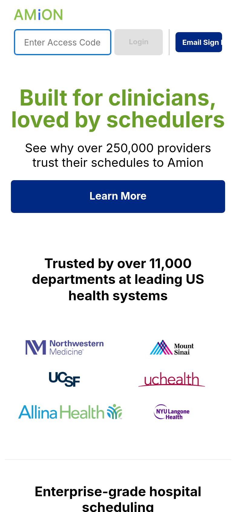
72FairThe phone experience as a first-class citizen.
What works
What to improve
Trust
82StrongProof that the product is real, competent, and safe to try.
How Amion compares
Trust read