
Your landing page’s weakest score is Information hierarchy.
How Manifold ranks
55Growth scoreupdated
category scores
category scoresShowHide
Information hierarchy
38PoorDoes the design help or inhibit what the page is trying to say?
 1234
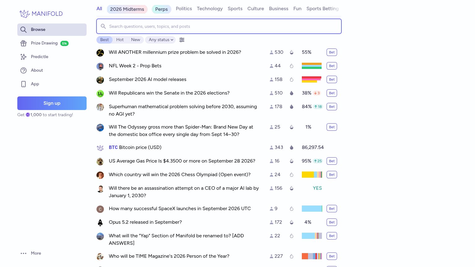
- Repeated Bet buttons — A dozen identically-styled 'Bet' buttons compete at equal weight, so no single primary action wins the scan.
- Sign up button — The conversion CTA is buried mid-sidebar below Browse links, styled no stronger than the search bar it competes with.
- Topic nav row — Ten-plus topic chips and links sit at the very top, siphoning attention before any value proposition or CTA registers.
- Market list feed — Fourteen same-weight rows with mixed icons, percentages, and mini-charts present as a data dump with no headline explaining what Manifold is.
Value props
38PoorTitle, subtitle, hero — do they sell the product's true value?
Working
- Live feed shows real markets and odds
- Trader counts add social proof (530, 510)
- Free M1,000 incentive near sign-up
Could improve
- No headline stating what Manifold is
- Zero explanation of prediction markets
- Value hinges on prior product knowledge
CTA
63FairCopy, size, verb, cost-feel — does the primary CTA earn the click?
How Manifold compares
Recommended rewrites
Trust
68FairProof that the product is real, competent, and safe to try.
How Manifold compares
Trust read
Mobile web
68FairThe phone experience as a first-class citizen.

What works
What to improve