
Your landing page’s weakest score is Value props.
How Polymarket ranks
- 1.
Oddpool68
- 2.
Adjacent66
- 3.
Kalshi API (Kalshi)60
- 4.
Polymarket58
58Growth scoreupdated
category scores
category scoresShowHide
Value props
42PoorTitle, subtitle, hero — do they sell the product's true value?
Polymarket’s headline vague
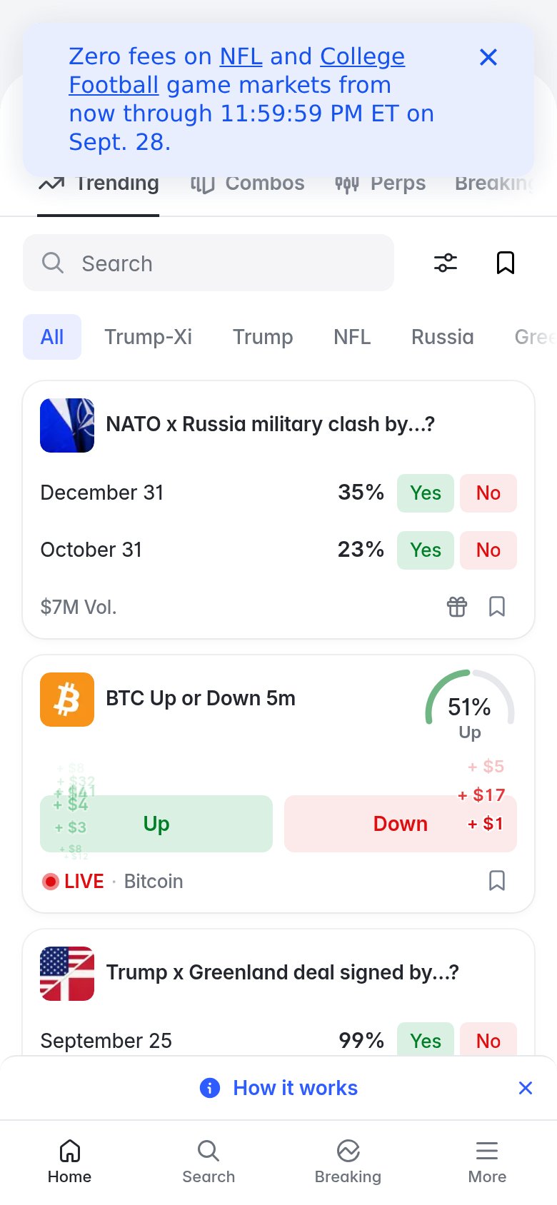
Zero fees on NFL and College Football game markets from now through 11:59:59 PM ET on Sept. 28.
Working
- Live odds and $ volumes prove real activity
- Timely, newsy markets create urgency
- Promo names a concrete deadline and offer
Could improve
- No headline explaining what Polymarket is
- Fold assumes prior product knowledge
- Promo banner occupies the hero slot
Information hierarchy
52FairDoes the design help or inhibit what the page is trying to say?
 1234
- Featured market carousel — Hero market card is truncated on the left, cutting off the market title and question text so the fold's centerpiece reads as broken.
- Promo banner overlap — The 'Zero fees' banner floats over the search bar, obscuring the primary discovery tool and adding a competing message at the top of the scan path.
- Category nav row — 18+ same-weight tabs from Trending to Weather present a wall of equal choices with no visual priority.
- US redirect strip — A second full-width banner ('To trade in the US, go to polymarket.us') stacks a third horizontal band before any market content, pushing exits above the product.
Mobile web
58FairThe phone experience as a first-class citizen.
What works
What to improve
CTA
68FairCopy, size, verb, cost-feel — does the primary CTA earn the click?
How Polymarket compares
Recommended rewrites
Trust
72FairProof that the product is real, competent, and safe to try.
How Polymarket compares
Trust read