
Your landing page’s weakest score is Value props.
How PredictIt ranks
- 1.
Valence70
- 2.
PredictIt60
- 3.
Kalshi60
- 4.
Polymarket58
60Growth scoreupdated
category scores
category scoresShowHide
Value props
48PoorTitle, subtitle, hero — do they sell the product's true value?
PredictIt’s headline undersells
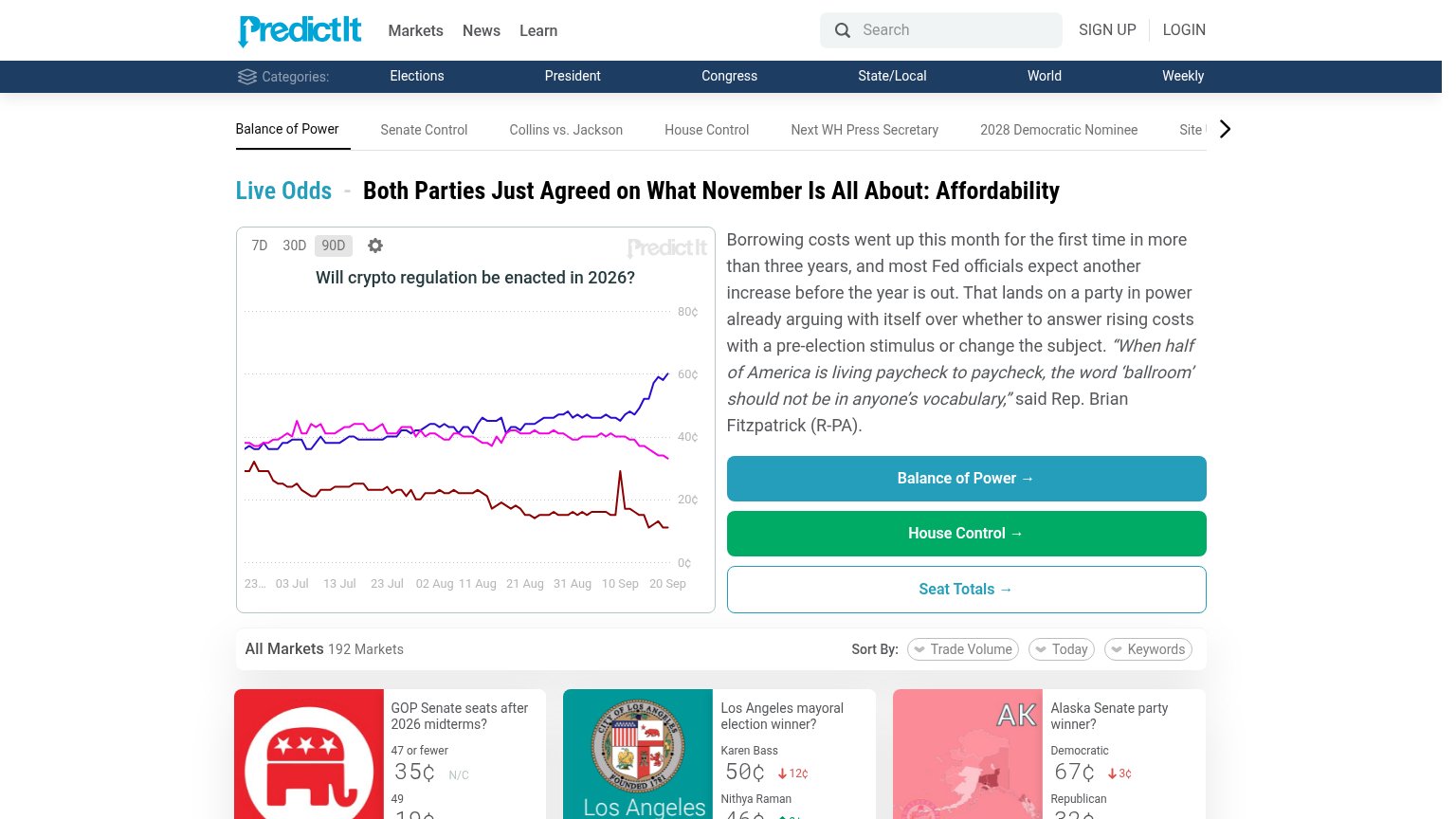
Both Parties Just Agreed on What November Is All About: Affordability
Borrowing costs went up this month for the first time in more than three years, and most Fed officials expect another increase before the year is out.
Working
- Live odds and prices demonstrate the product
- "192 Markets" gives concrete scale
- Chart shows real market data, not decoration
Could improve
- Headline is a news story, not a value prop
- No mention of API or data access anywhere
- Visitor must already know what PredictIt is
Information hierarchy
54FairDoes the design help or inhibit what the page is trying to say?
 1234
- Three stacked CTAs — "Balance of Power", "House Control", and "Seat Totals" sit at near-equal weight with no single primary action.
- Chart headline mismatch — The chart shows "Will crypto regulation be enacted in 2026?" while the headline discusses affordability — the fold's two anchor elements argue different topics.
- Triple navigation rows — Main nav, category bar, and market-tab strip stack ~20 exit links before any content, diluting the scan path.
- Unlabeled chart lines — Three colored lines carry no legend, so the fold's central visual communicates nothing at a glance.
CTA
62FairCopy, size, verb, cost-feel — does the primary CTA earn the click?
How PredictIt compares
Recommended rewrites
Trust
62FairProof that the product is real, competent, and safe to try.
How PredictIt compares
Trust read
Mobile web
72FairThe phone experience as a first-class citizen.
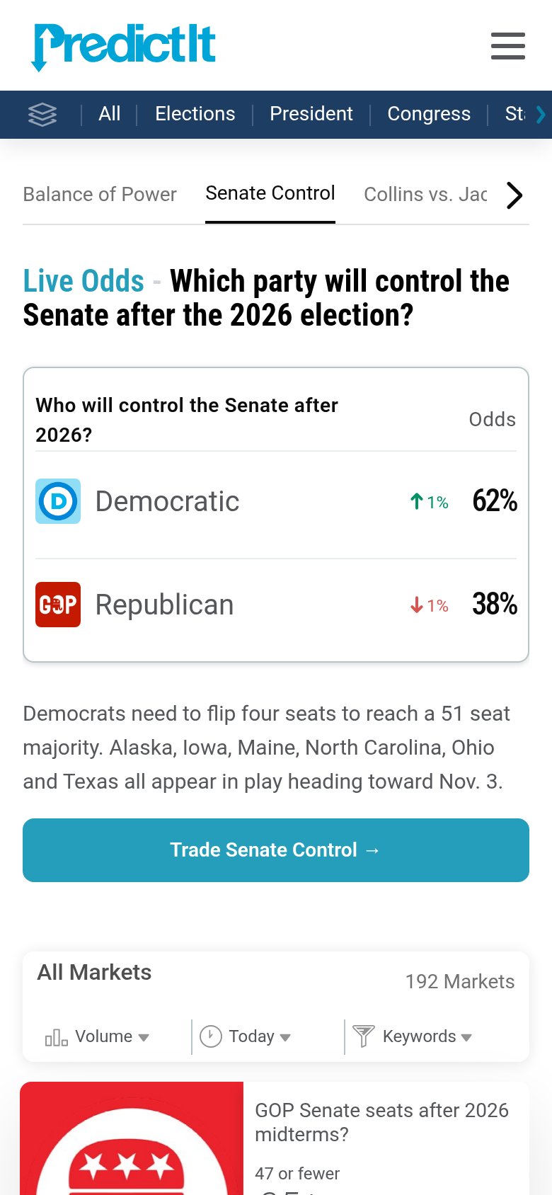
What works
What to improve