
Your landing page’s weakest score is Value props.
How Kraken ranks
78Growth scoreupdated
category scores
category scoresShowHide
Value props
72FairTitle, subtitle, hero — do they sell the product's true value?
Kraken’s headline vague
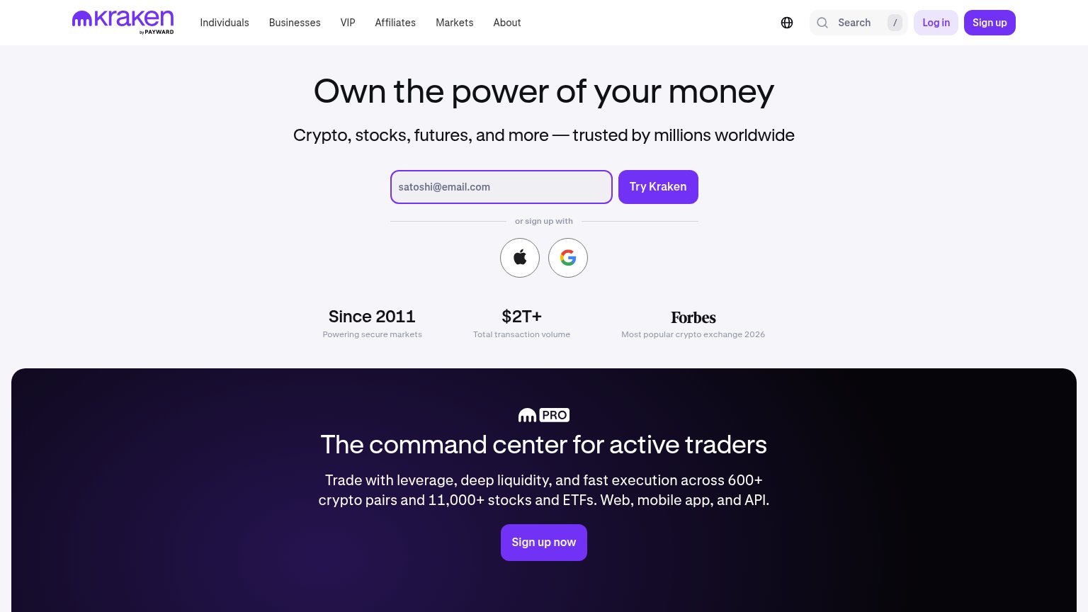
Own the power of your money
Crypto, stocks, futures, and more — trusted by millions worldwide
Working
- Subhead names real asset classes
- $2T+ and Since 2011 proof points
- Forbes citation adds authority
Could improve
- H1 could caption any fintech
- No product shown in hero visual
- Emotion generic, not trader-specific
Information hierarchy
76FairDoes the design help or inhibit what the page is trying to say?
 1234
- Header Sign up buttons — Two filled-purple sign-up buttons ('Sign up' in nav, 'Try Kraken' in hero) split primary-action weight in the fold.
- Apple/Google sign-up icons — The 'or sign up with' row adds a second decision branch directly under the email CTA, diluting the single path.
- Pro section CTA — 'Sign up now' inside the dark Pro band is a third full-weight purple button competing in the same viewport.
- Six-item top nav — Individuals, Businesses, VIP, Affiliates, Markets, About plus search offer eight exits before the email field.
CTA
78FairCopy, size, verb, cost-feel — does the primary CTA earn the click?
How Kraken compares
Recommended rewrites
Trust
78FairProof that the product is real, competent, and safe to try.
How Kraken compares
Trust read
Mobile web
86StrongThe phone experience as a first-class citizen.
What works
What to improve