
Your landing page’s weakest score is Mobile web.
How Binance ranks
70Growth scoreupdated
category scores
category scoresShowHide
Mobile web
62FairThe phone experience as a first-class citizen.
 123
- App download bar — Sticky install interstitial covers the SPCXB price row and adds a competing Download CTA.
- Binance.US geo banner — Three-line region banner eats the top of the fold and routes traffic off the page.
- Sign Up button — Desktop-proportioned width leaves thumb-friendly full-bleed space unused.
Information hierarchy
68FairDoes the design help or inhibit what the page is trying to say?
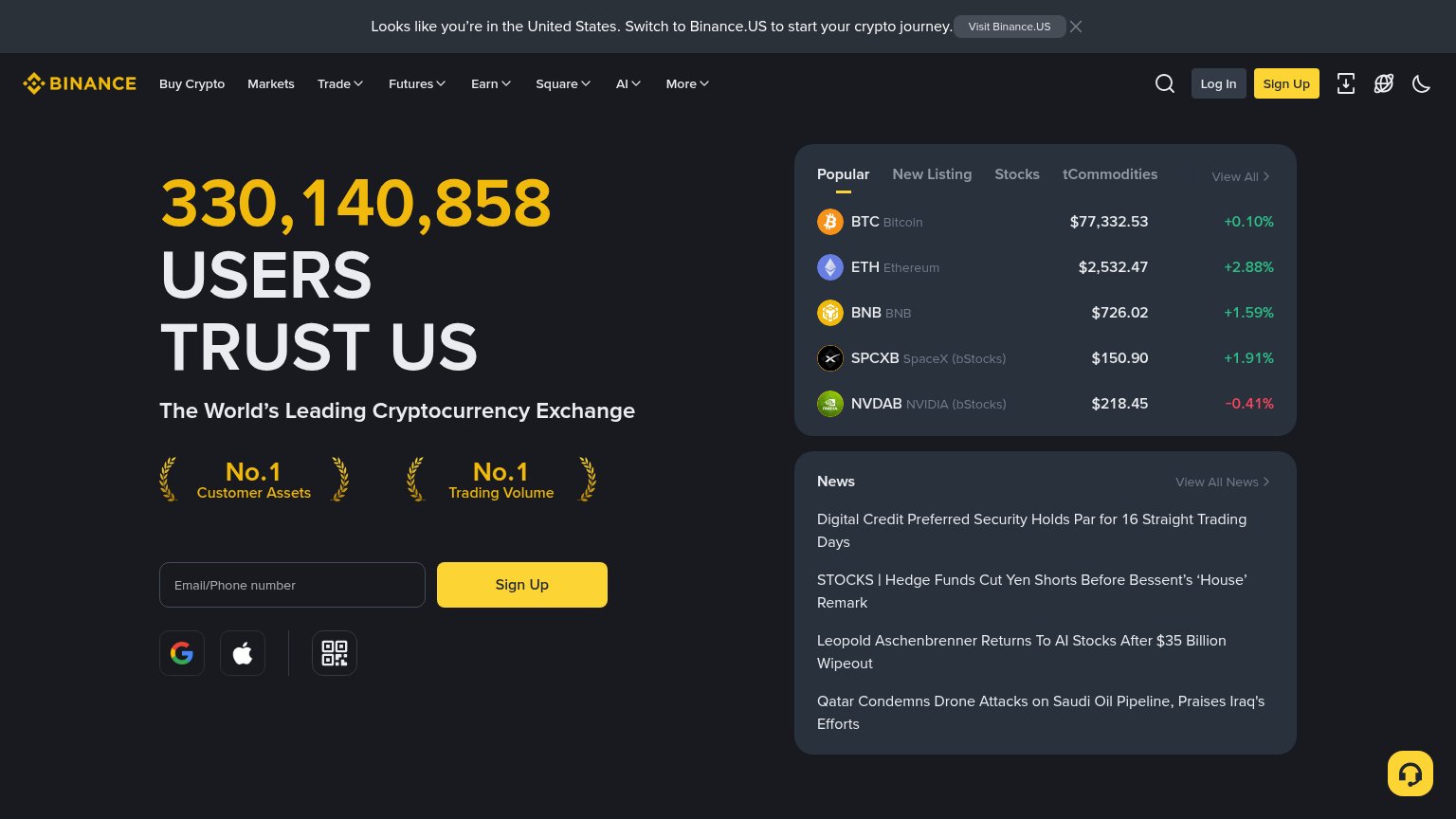 1234
- News headline panel — Four outbound headlines about drone attacks and hedge funds pull attention away from sign-up with off-message content.
- Binance.US geo banner — Top-of-page banner routes US visitors off-site before they see the value prop or CTA.
- Nine-item nav row — Nine links with dropdowns plus Log In offer exits at equal scan priority to the conversion path.
- Coin ticker rows — Five clickable price rows sit at the same visual weight as the hero, competing with the Sign Up form.
CTA
68FairCopy, size, verb, cost-feel — does the primary CTA earn the click?
How Binance compares
Recommended rewrites
Trust
74FairProof that the product is real, competent, and safe to try.
How Binance compares
Trust read
Value props
78FairTitle, subtitle, hero — do they sell the product's true value?
Binance’s headline
330,140,858 USERS TRUST US
The World’s Leading Cryptocurrency Exchange
Working
Could improve