
Your landing page’s weakest score is Trust.
How Crypto.com ranks
74Growth scoreupdated
category scores
category scoresShowHide
Trust
68FairProof that the product is real, competent, and safe to try.
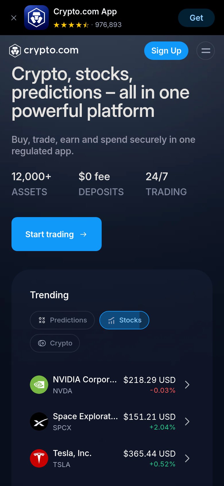
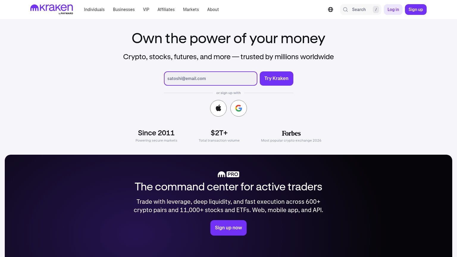

| Trust read | |
|---|---|
| Crypto.com | App-store banner rating "976,893" reviews with 4.5 stars on the mobile capture |
| 330,140,858 USERS TRUST US | |
| Product UI showing "Trending crypto" with live prices ("Bitcoin $90,238.11") | |
| Forbes — "Most popular crypto exchange 2026" beneath the signup form | |
| Live "Place a prediction" widget with real market "Alexander Zverev vs Karen Khachanov", odds and "Updated 5m ago" feed | |
| "Your trusted exchange since 2011." longevity claim paired with the Quick buy product screenshot showing real asset pric |
Information hierarchy
72FairDoes the design help or inhibit what the page is trying to say?
 1234
- Sign Up vs Start trading — Two same-blue primary buttons split the fold's single action between header and hero.
- Trending stocks widget — Five clickable ticker rows with chevrons pull attention off the CTA and offer exits before conversion.
- Header nav cluster — Markets, Individuals, Businesses, Discover plus search, download and locale icons stack seven exit paths above the CTA.
- Log In button — Styled at near-equal weight beside Sign Up, adding a third competing button in the top-right scan zone.
Mobile web
76FairThe phone experience as a first-class citizen.
What works
What to improve
CTA
78FairCopy, size, verb, cost-feel — does the primary CTA earn the click?
How Crypto.com compares
Recommended rewrites
Value props
78FairTitle, subtitle, hero — do they sell the product's true value?
Crypto.com’s headline
Crypto, stocks, predictions – all in one powerful platform
Buy, trade, earn and spend securely in one regulated app.
Working
Could improve