
Your landing page’s weakest score is Trust.
How Bitstamp ranks
67Growth scoreupdated
category scores
category scoresShowHide
Trust
54FairProof that the product is real, competent, and safe to try.

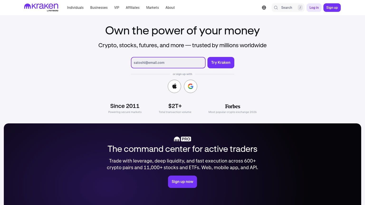
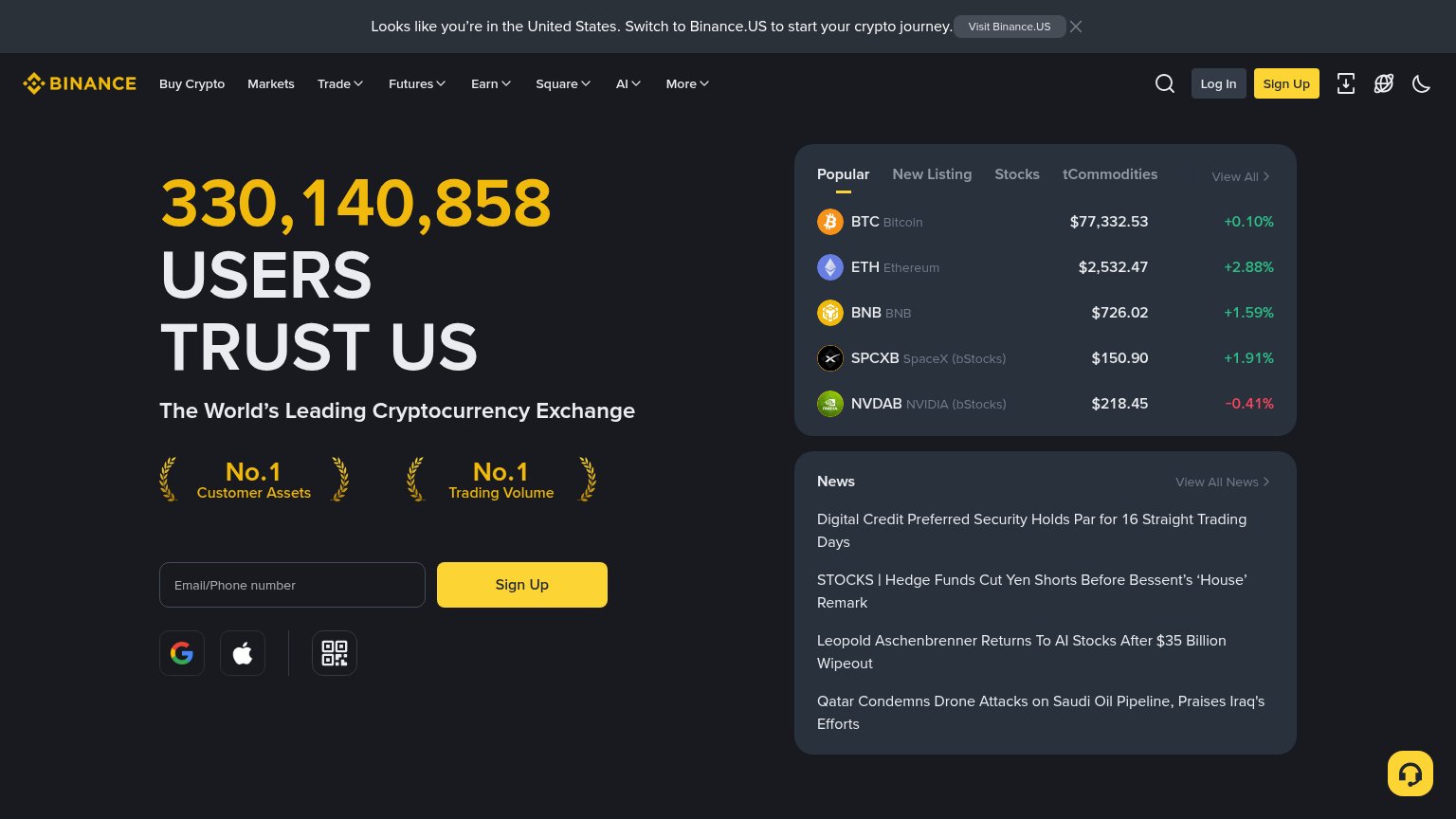
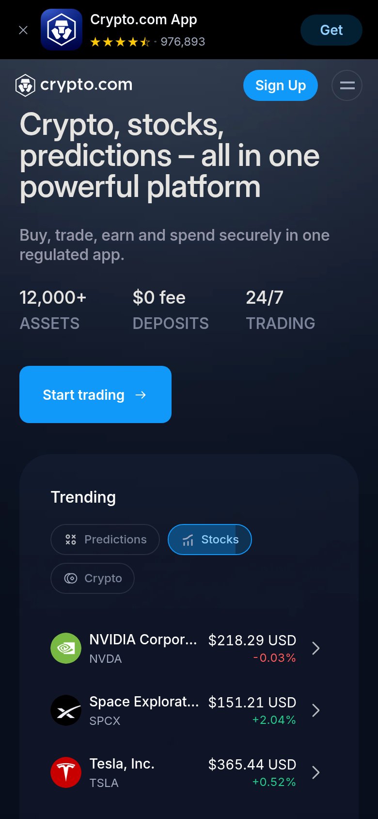
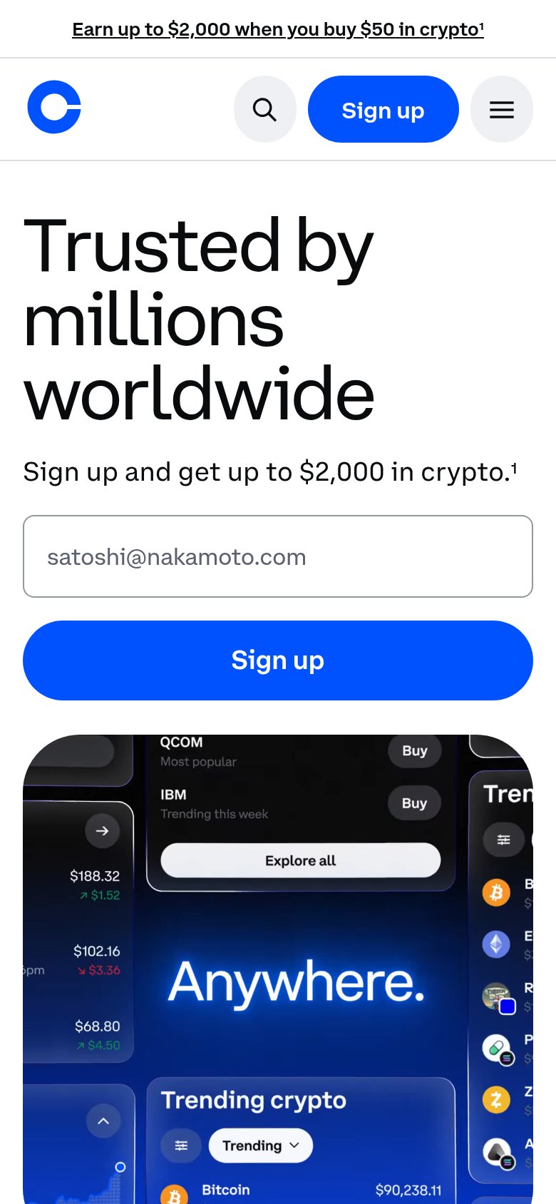
| Trust read | |
|---|---|
| Bitstamp | "Your trusted exchange since 2011." longevity claim paired with the Quick buy product screenshot showing real asset pric |
| 330,140,858 USERS TRUST US | |
| Product UI showing "Trending crypto" with live prices ("Bitcoin $90,238.11") | |
| Forbes — "Most popular crypto exchange 2026" beneath the signup form | |
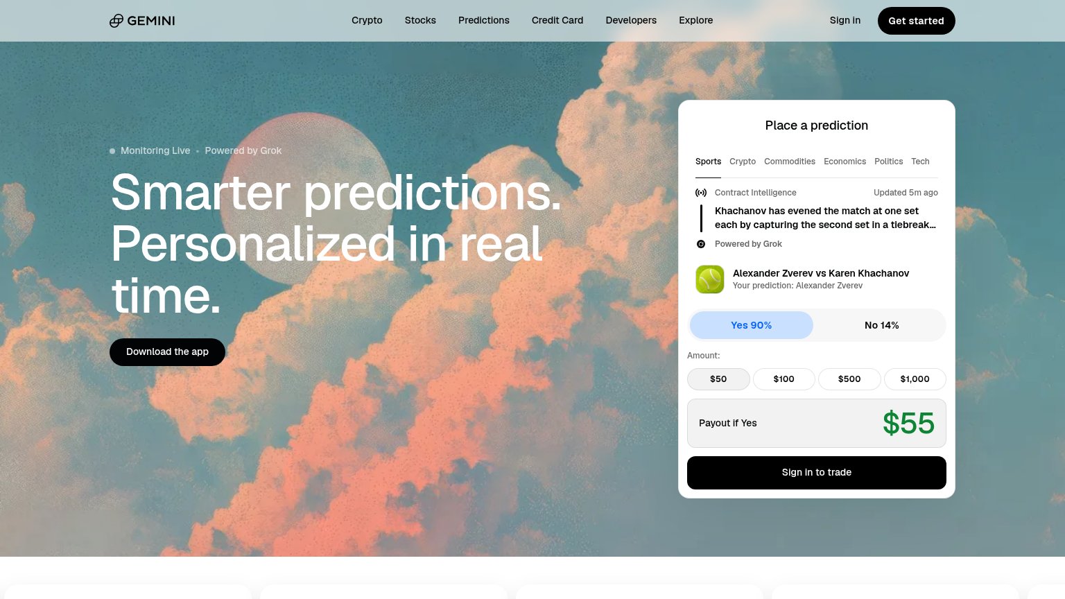
| Live "Place a prediction" widget with real market "Alexander Zverev vs Karen Khachanov", odds and "Updated 5m ago" feed | |
| App-store banner rating "976,893" reviews with 4.5 stars on the mobile capture |
Information hierarchy
66FairDoes the design help or inhibit what the page is trying to say?
 1234
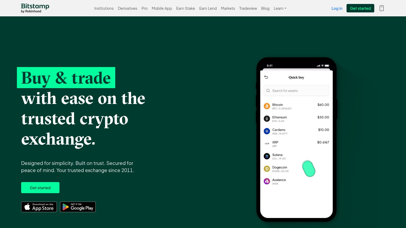
- Eleven-item nav bar — Eleven equal-weight links (Institutions, Derivatives, Pro, Blog, Learn…) leak attention before the hero CTA is read.
- Duplicate Get started — Header 'Get started' in dark green competes with the hero's mint button, splitting the primary action across two weights.
- App store badges — App Store and Google Play badges sit directly under the primary CTA, offering two exits at the moment of decision.
- Truncated phone mockup — The Quick buy phone screen is clipped at the top-right and its list carries a typo ('Avalance'), weakening the trust message.
CTA
72FairCopy, size, verb, cost-feel — does the primary CTA earn the click?
How Bitstamp compares
Recommended rewrites
Value props
72FairTitle, subtitle, hero — do they sell the product's true value?
Bitstamp’s headline
Buy & trade with ease on the trusted crypto exchange.
Designed for simplicity. Built on trust. Secured for peace of mind. Your trusted exchange since 2011.
Working
Could improve
Mobile web
72FairThe phone experience as a first-class citizen.
What works
What to improve