
Your landing page’s weakest score is Trust.
How Hubble ranks
Trust
72FairProof that the product is real, competent, and safe to try.
| Trust read | |
|---|---|
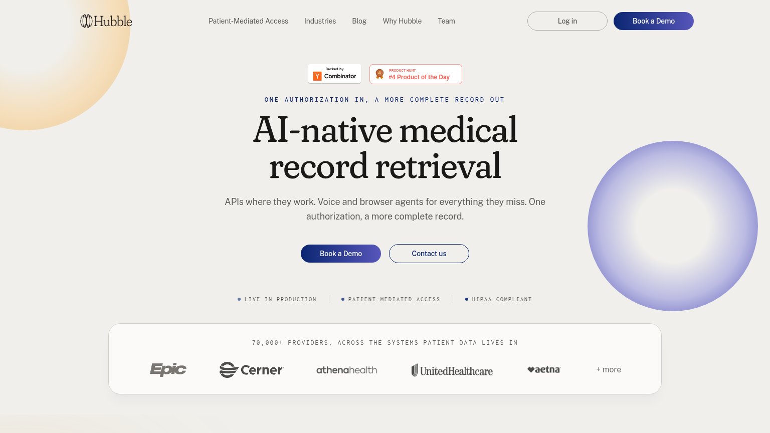
| Hubble | "70,000+ PROVIDERS, ACROSS THE SYSTEMS PATIENT DATA LIVES IN" bar with Epic, Cerner, athenahealth, UnitedHealthcare, and |
| 320+ million patients' medical records piped from the largest healthcare networks | |
| "TRUSTED BY LEADERS IN HEALTHCARE" logo strip with Humana, Oscar, and Virta | |
| No visible trust signal identified. | |
| "Datavant and Savant Bio Partner to Deliver End-to-End Clinical Record Retrieval and Abstraction" partnership banner | |
| "Powered by a 3-in-1 network: CMS-9115, ONC (g)(10), TEFCA IAS. With patient consent, IAL2 identity proofing, SMART Heal |
CTA
74FairCopy, size, verb, cost-feel — does the primary CTA earn the click?
Problems
- click feels like a sales commitment
- no self-serve or product entry
- secondary 'Contact us' is redundant
Value props
78FairTitle, subtitle, hero — do they sell the product's true value?
Hubble’s headline
AI-native medical record retrieval
APIs where they work. Voice and browser agents for everything they miss. One authorization, a more complete record.
Working
Could improve
Mobile web
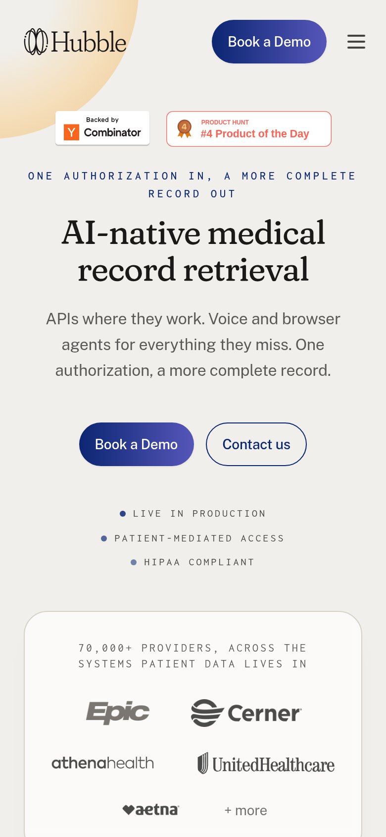
78FairThe phone experience as a first-class citizen.
What works
What to improve
Information hierarchy
82StrongDoes the design help or inhibit what the page is trying to say?
What works
What to improve