
Your landing page’s weakest score is Trust.
How Garmin ranks
66Growth scoreupdated
category scores
category scoresShowHide
Trust
58FairProof that the product is real, competent, and safe to try.
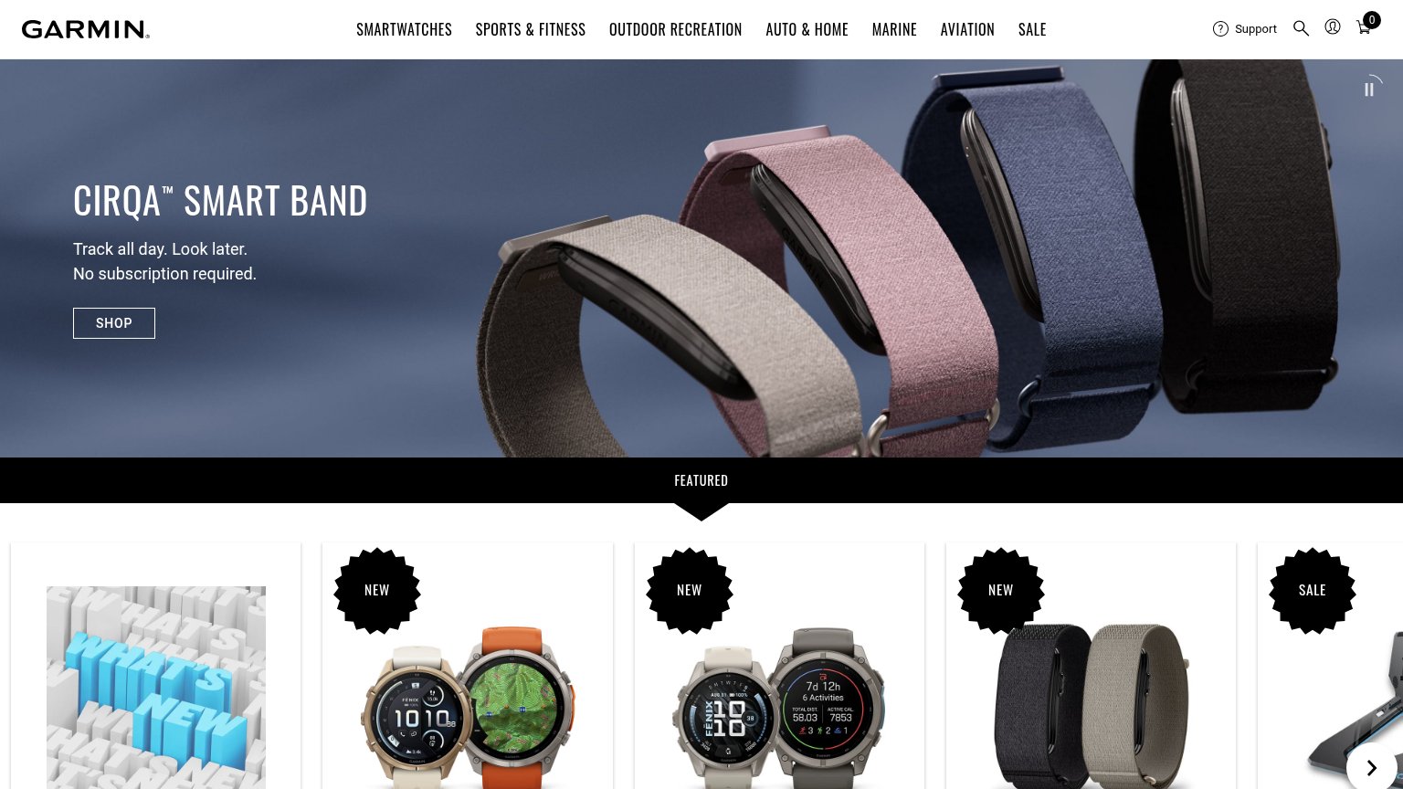
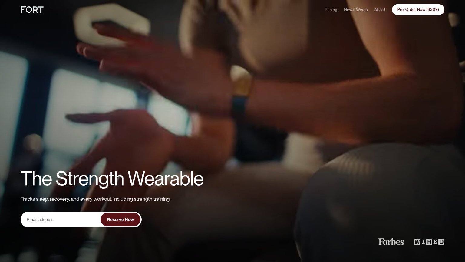
| Trust read | |
|---|---|
| Garmin | "No subscription required." beside the Cirqa Smart Band SHOP CTA |
| Forbes and WIRED press logos at the bottom of the hero | |
| "1 year free of Natural Cycles now included with all WHOOP memberships." partnership banner | |
| "HSA/FSA eligible" badge directly beneath the Explore CTA | |
| Row of real product photos with visible watch-face UI (Google Pixel Watch 5, Fitbit Charge 6, Fitbit Versa 4, etc.) | |
| "Gabby Thomas, 3x Olympic Gold Medalist" athlete endorsement caption in the hero |
Value props
66FairTitle, subtitle, hero — do they sell the product's true value?
Garmin’s headline undersells
CIRQA™ SMART BAND
Track all day. Look later. No subscription required.
Working
- 'No subscription required' hits a real pain
- Clean, punchy phrasing
- Product name is clear and unambiguous
Could improve
- Never says what gets tracked
- Hero image shows bands, not the job done
- No numbers or proof points in the fold
Information hierarchy
68FairDoes the design help or inhibit what the page is trying to say?
What works
What to improve
CTA
68FairCopy, size, verb, cost-feel — does the primary CTA earn the click?
How Garmin compares
Recommended rewrites
Mobile web
72FairThe phone experience as a first-class citizen.
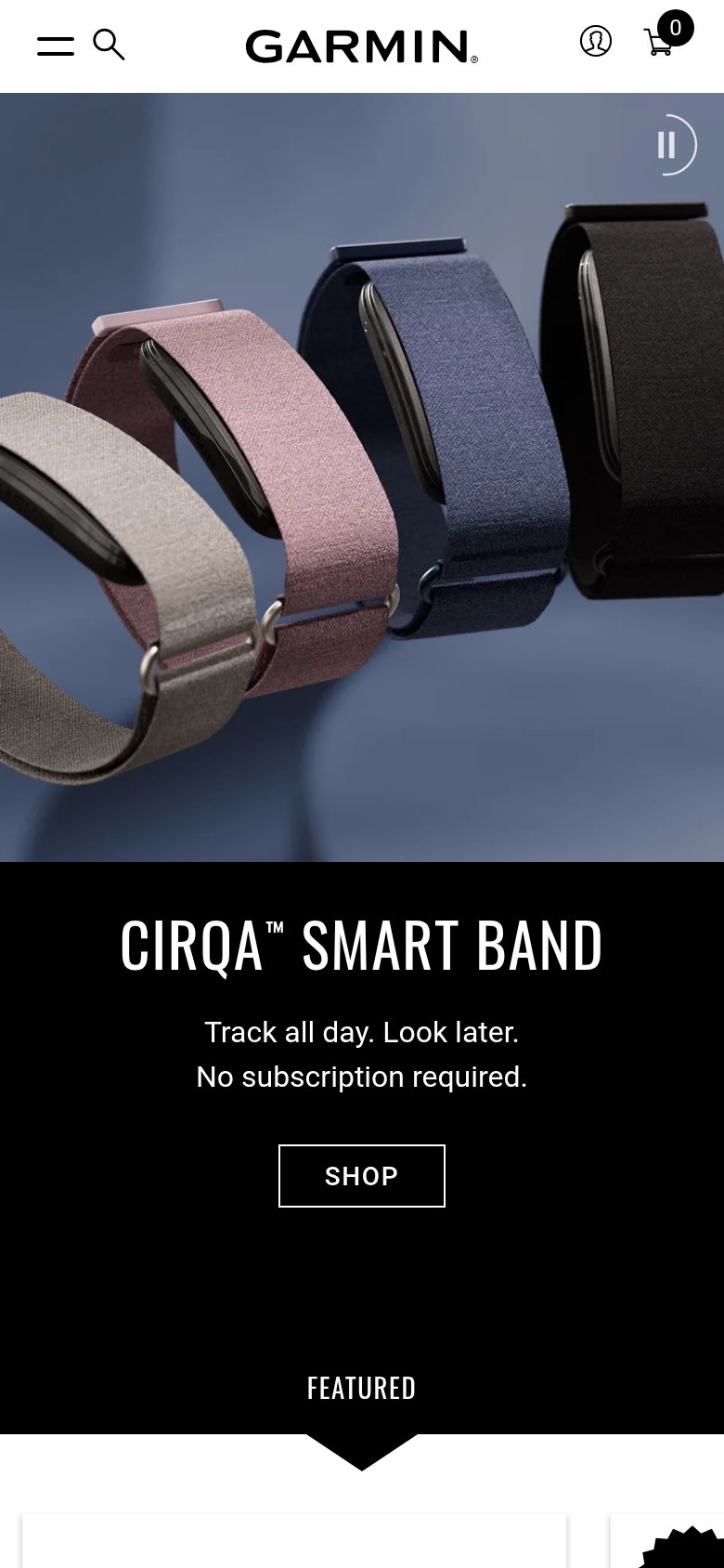
What works
What to improve