
Your landing page’s weakest score is Trust.
How WHOOP ranks
Trust
48PoorProof that the product is real, competent, and safe to try.
| Trust read | |
|---|---|
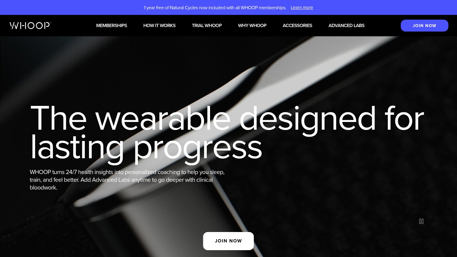
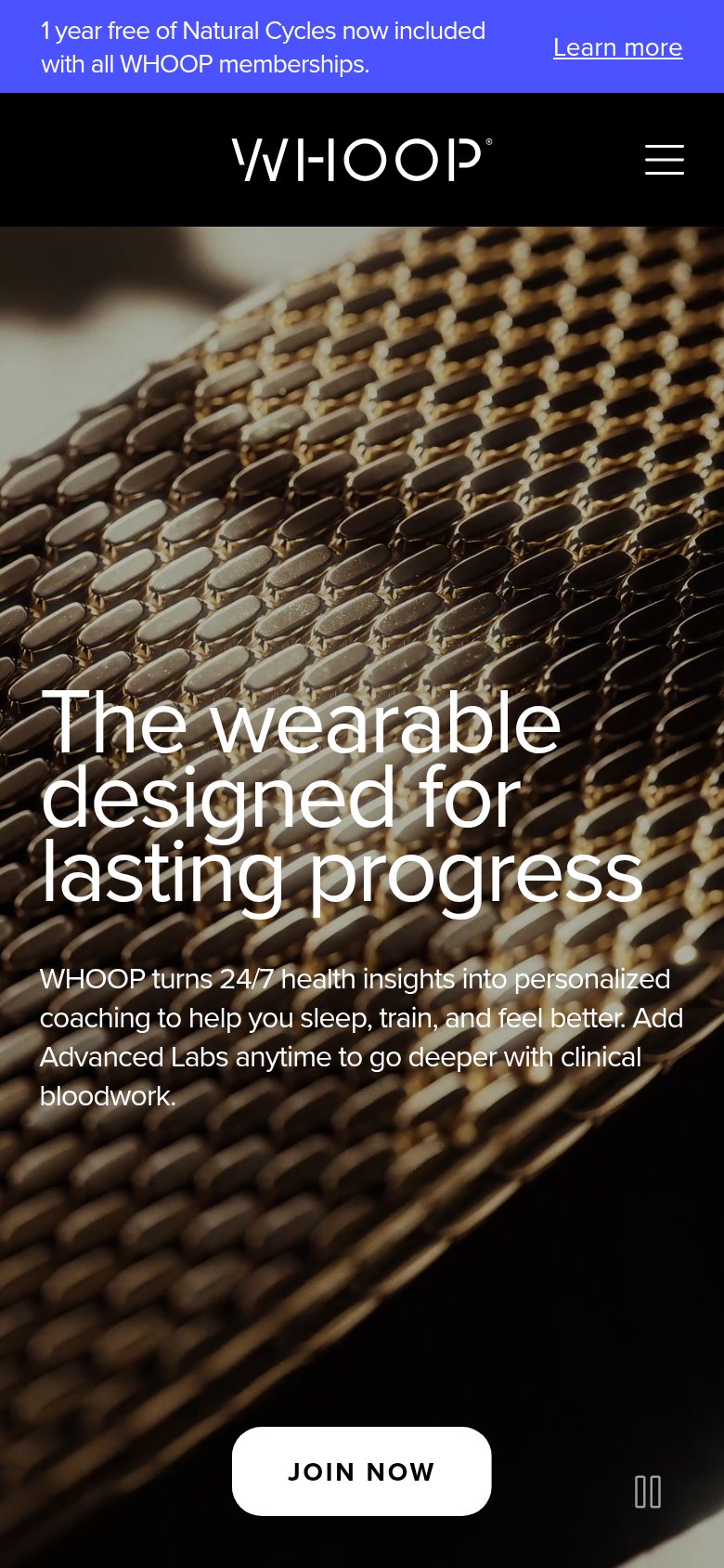
| WHOOP | "1 year free of Natural Cycles now included with all WHOOP memberships." partnership banner |
| No visible trust signal identified. | |
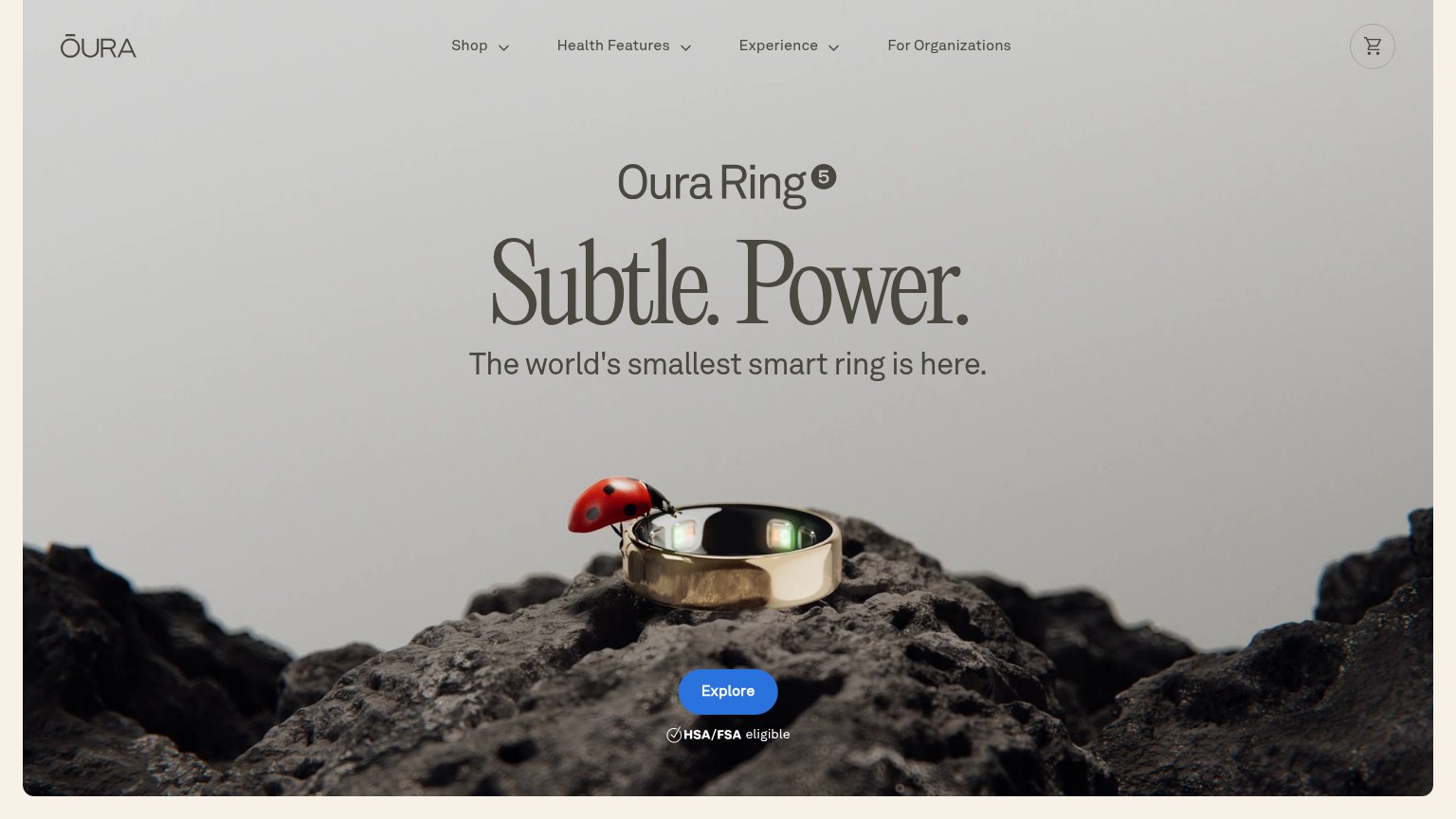
| "HSA/FSA eligible" badge directly beneath the Explore CTA | |
| Photorealistic product shot of the Ring Pro on its charging case | |
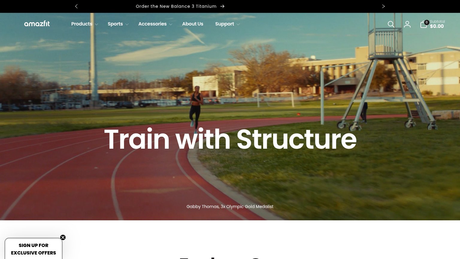
| "Gabby Thomas, 3x Olympic Gold Medalist" athlete endorsement caption in the hero | |
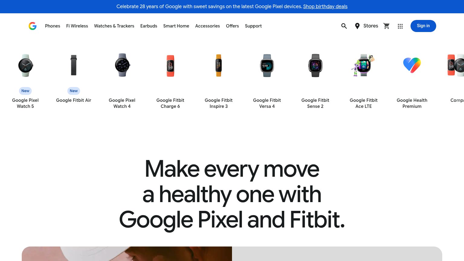
| Row of real product photos with visible watch-face UI (Google Pixel Watch 5, Fitbit Charge 6, Fitbit Versa 4, etc.) |
CTA
72FairCopy, size, verb, cost-feel — does the primary CTA earn the click?
Problems
- 'Join' feels like paid commitment
- ignores visible trial/free hooks
- no value or payoff in the label
Value props
72FairTitle, subtitle, hero — do they sell the product's true value?
WHOOP’s headline
The wearable designed for lasting progress
WHOOP turns 24/7 health insights into personalized coaching to help you sleep, train, and feel better. Add Advanced Labs anytime to go deeper with clinical bloodwork.
Working
Could improve
Information hierarchy
78FairDoes the design help or inhibit what the page is trying to say?
What works
What to improve
Mobile web
78FairThe phone experience as a first-class citizen.
What works
What to improve