
Your landing page’s weakest score is Trust.
How Fort ranks
Trust
62FairProof that the product is real, competent, and safe to try.
| Trust read | |
|---|---|
| Fort | Forbes and WIRED press logos at the bottom of the hero |
| "1 year free of Natural Cycles now included with all WHOOP memberships." partnership banner | |
| "HSA/FSA eligible" badge directly beneath the Explore CTA | |
| Row of real product photos with visible watch-face UI (Google Pixel Watch 5, Fitbit Charge 6, Fitbit Versa 4, etc.) | |
| "No subscription required." beside the Cirqa Smart Band SHOP CTA | |
| "Gabby Thomas, 3x Olympic Gold Medalist" athlete endorsement caption in the hero |
CTA
72FairCopy, size, verb, cost-feel — does the primary CTA earn the click?
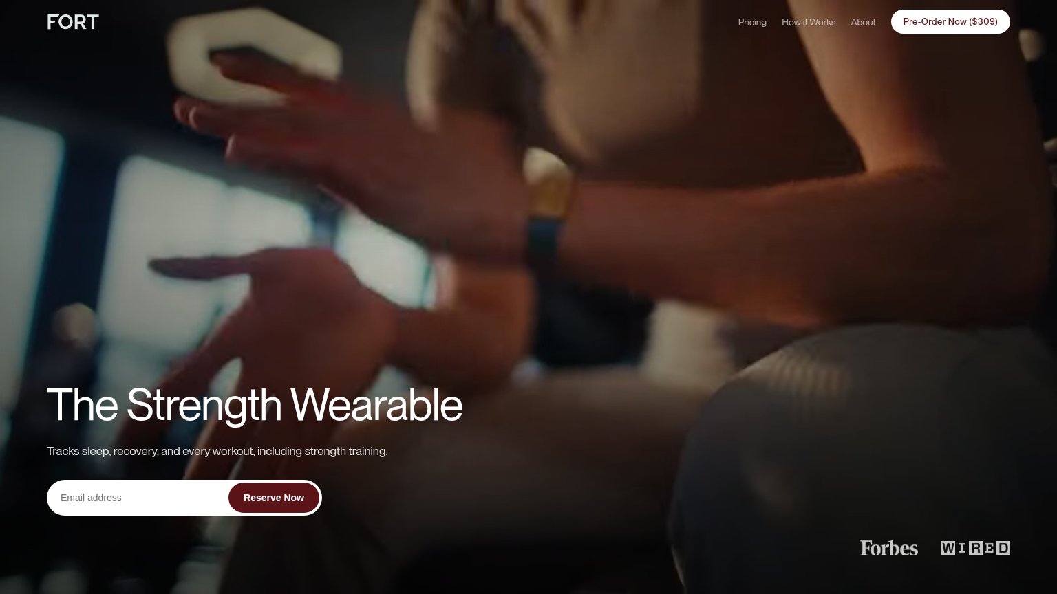
Problems
- conflicts with nav 'Pre-Order ($309)'
- unclear if reserving costs money
- 'Reserve' feels committal
Information hierarchy
78FairDoes the design help or inhibit what the page is trying to say?
What works
What to improve
Value props
78FairTitle, subtitle, hero — do they sell the product's true value?
Fort’s headline
The Strength Wearable
Tracks sleep, recovery, and every workout, including strength training.
Working
Could improve
Mobile web
78FairThe phone experience as a first-class citizen.
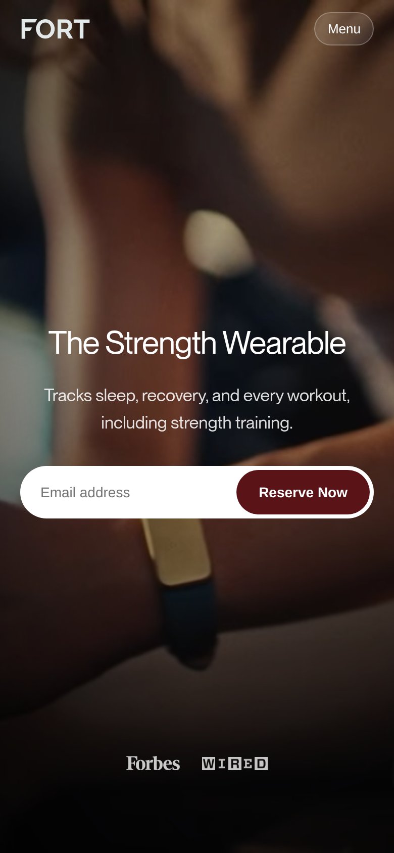
What works
What to improve