
Your landing page’s weakest score is Information hierarchy.
How Fitbit ranks
51Growth scoreupdated
category scores
category scoresShowHide
Information hierarchy
44PoorDoes the design help or inhibit what the page is trying to say?
 1234
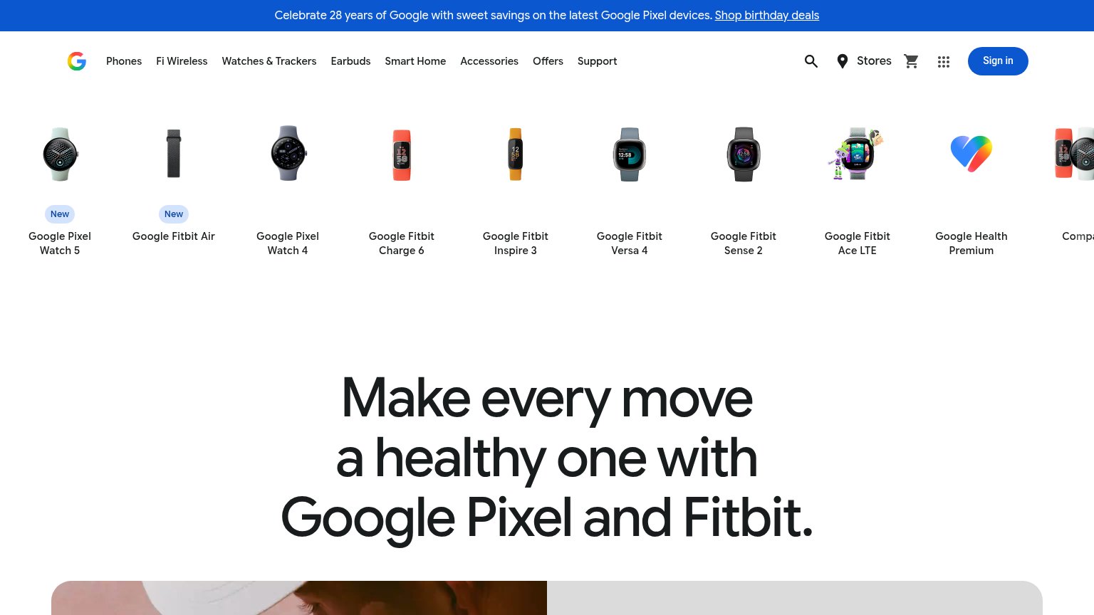
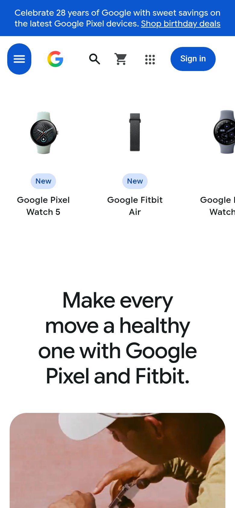
- Product carousel row — Ten equal-weight product tiles outrank the headline and force a scan before any message lands.
- Hero headline block — The value prop 'Make every move a healthy one' has no CTA anywhere near it — nothing to act on.
- Top navigation bar — Nine nav links plus search, stores, cart, apps grid, and Sign in create heavy exit density before the pitch.
- Birthday deals banner — The Pixel promo banner is the first message read and points away from the Fitbit story.
CTA
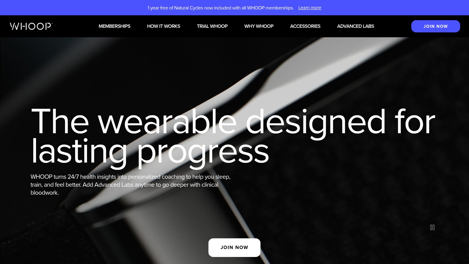
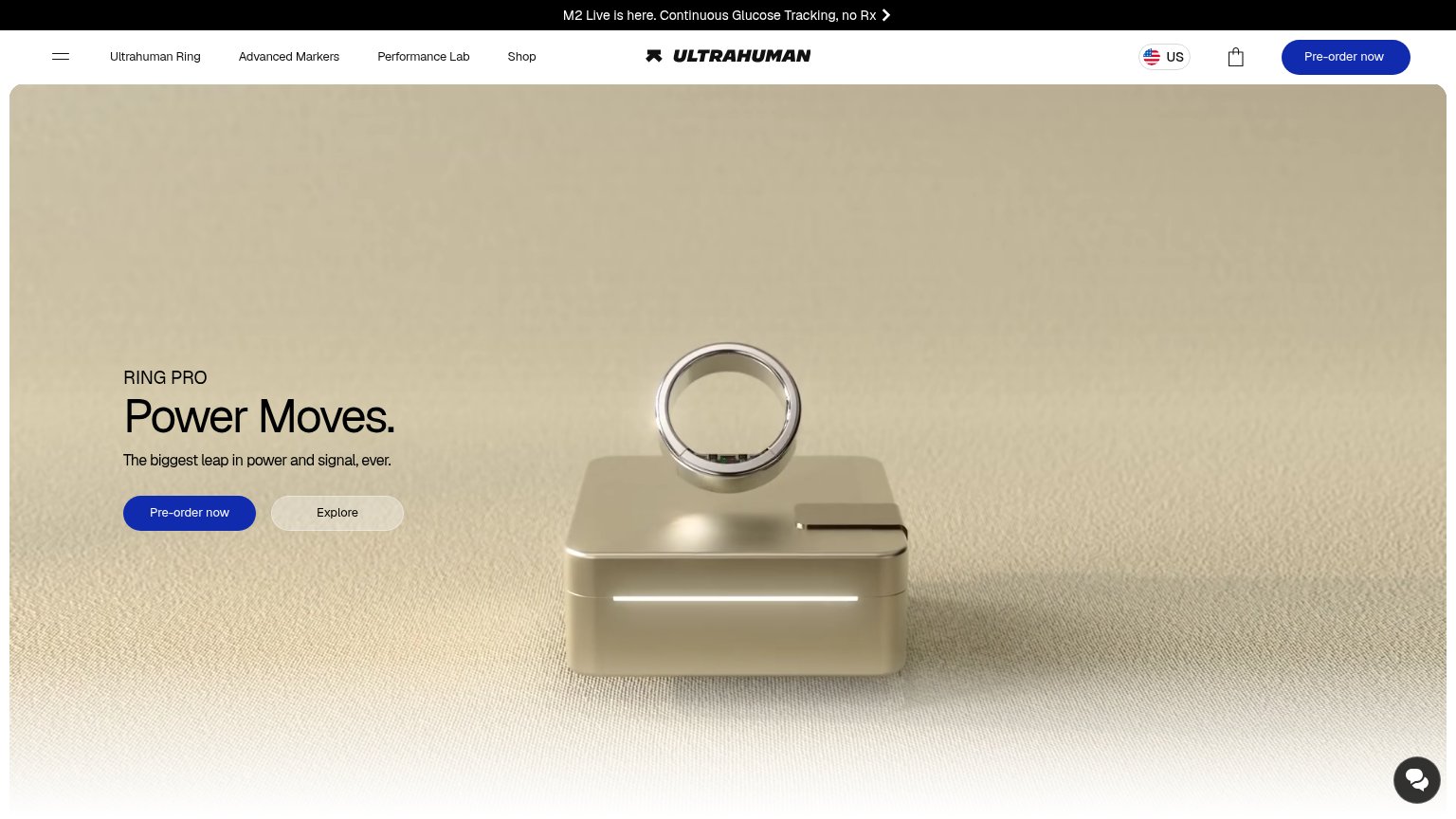
44PoorCopy, size, verb, cost-feel — does the primary CTA earn the click?
Problems
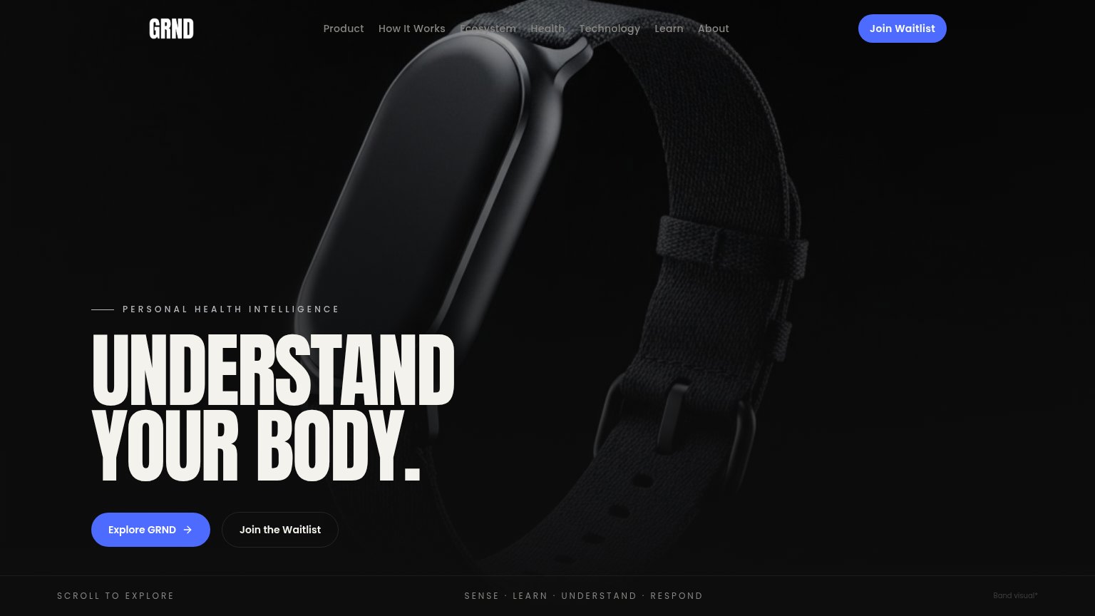
- no CTA under the hero headline
- 'Sign in' is the only prominent button
- banner link is the sole shop action
- carousel items lack visible CTAs
Mobile web
52FairThe phone experience as a first-class citizen.
What works
What to improve
Value props
58FairTitle, subtitle, hero — do they sell the product's true value?
Fitbit’s headline
Make every move a healthy one with Google Pixel and Fitbit.
Working
Could improve
Trust
58FairProof that the product is real, competent, and safe to try.
How Fitbit compares
Trust read