
Your landing page’s weakest score is CTA.
How Amazfit ranks
50Growth scoreupdated
category scores
category scoresShowHide
CTA
44PoorCopy, size, verb, cost-feel — does the primary CTA earn the click?
Problems
- no hero CTA on either viewport
- announcement link is only action
- popup competes for the click
Information hierarchy
48PoorDoes the design help or inhibit what the page is trying to say?
 1234
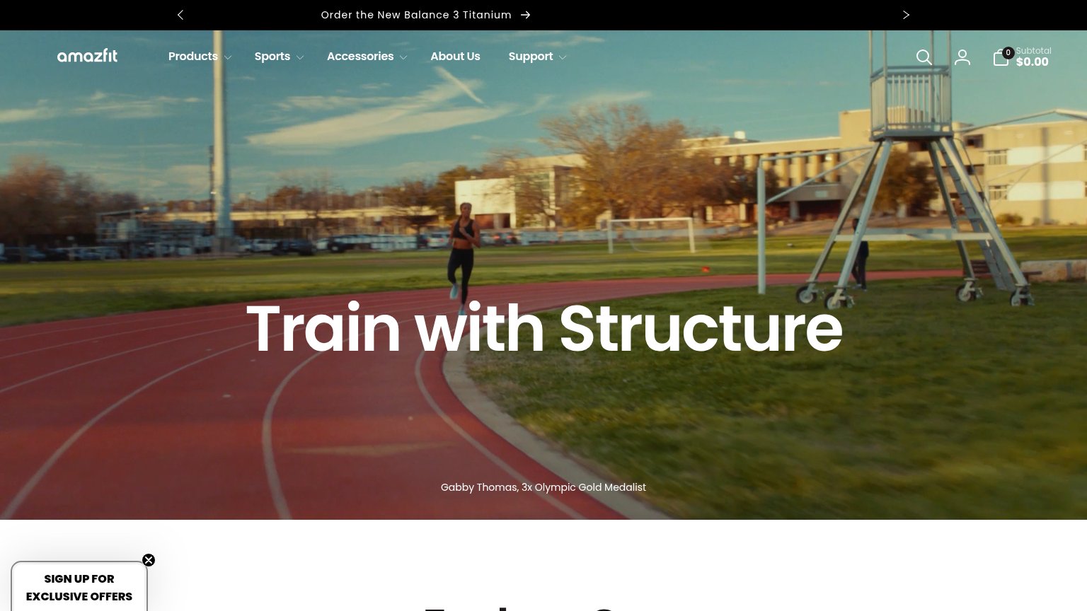
- Hero headline no CTA — "Train with Structure" has no button or link beneath it, so the fold offers zero action path.
- Signup offers popup — The only button-weight element in the fold is an email popup, hijacking attention from any purchase intent.
- Announcement bar link — "Order the New Balance 3 Titanium" arrow is the fold's sole shop path, buried in a rotating strip above the nav.
- Five-menu nav row — Products, Sports, Accessories, About Us, and Support sit at equal weight with no CTA to subordinate them to.
Value props
48PoorTitle, subtitle, hero — do they sell the product's true value?
Amazfit’s headline
Train with Structure
Working
Could improve
Mobile web
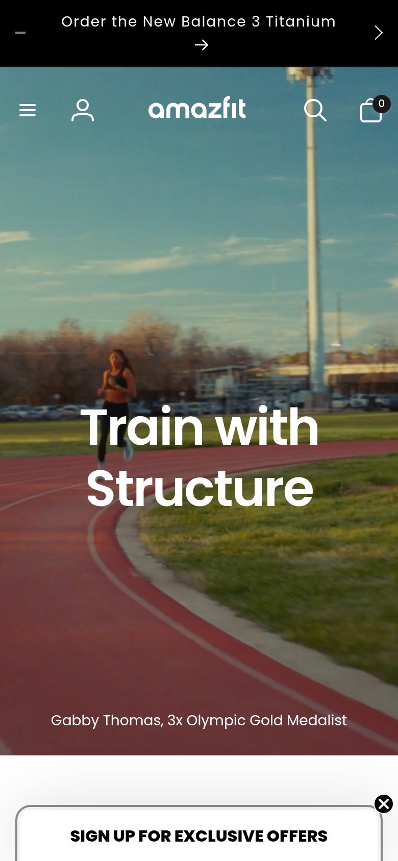
54FairThe phone experience as a first-class citizen.
What works
What to improve
Trust
58FairProof that the product is real, competent, and safe to try.
How Amazfit compares
Trust read