
Your landing page’s weakest score is Trust.
How EquityZen ranks
Trust
62FairProof that the product is real, competent, and safe to try.
| Trust read | |
|---|---|
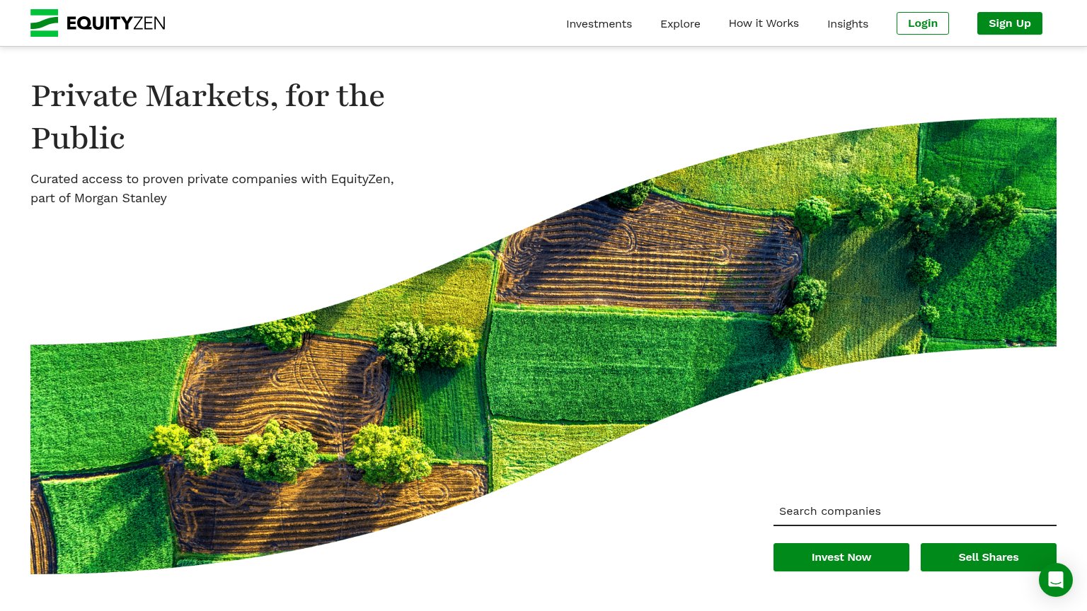
| EquityZen | "Curated access to proven private companies with EquityZen, part of Morgan Stanley" |
| No visible trust signal identified. | |
| Live private-company price ticker with named companies and prices ("Impossible Foods $1.51 ▼$0.09 (6%)") | |
| Hiive50 Index — "176.10 +76.18% all time" with live-updated price chart | |
| "Fund Details" card with "$100.00" price per unit, "$5.34B" est. valuation, "$25,000" min. investment, and a "Price Hist | |
| Dashboard product mockup showing "Portfolio $300,000.00" with invested capital, +12.32% return, and Withdraw/Deposit con |
Mobile web
64FairThe phone experience as a first-class citizen.
 123
- Decorative farmland image — Tall non-functional image pushes the CTAs to the bottom edge of the first viewport.
- Split half-width CTAs — "Invest Now" and "Sell Shares" split the primary action into two half-width taps instead of one dominant button.
- Clipped company ticker — "Kraken" and its ticker are cut off mid-word at the right edge with no visible scroll affordance.
Information hierarchy
68FairDoes the design help or inhibit what the page is trying to say?
What works
What to improve
Value props
68FairTitle, subtitle, hero — do they sell the product's true value?
EquityZen’s headline
Private Markets, for the Public
Curated access to proven private companies with EquityZen, part of Morgan Stanley
Working
Could improve
CTA
72FairCopy, size, verb, cost-feel — does the primary CTA earn the click?
How EquityZen compares
Recommended rewrites