
Your landing page’s weakest score is Trust.
How Digipals ranks
60Growth scoreupdated
category scores
category scoresShowHide
Trust
28PoorProof that the product is real, competent, and safe to try.
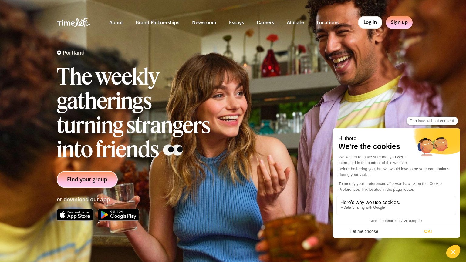
| Trust read | |
|---|---|
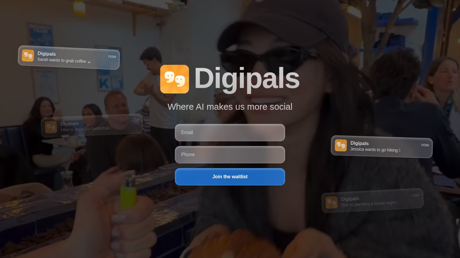
| Digipals | Mock push notifications previewing the product concept ("Sarah wants to grab coffee ☕") |
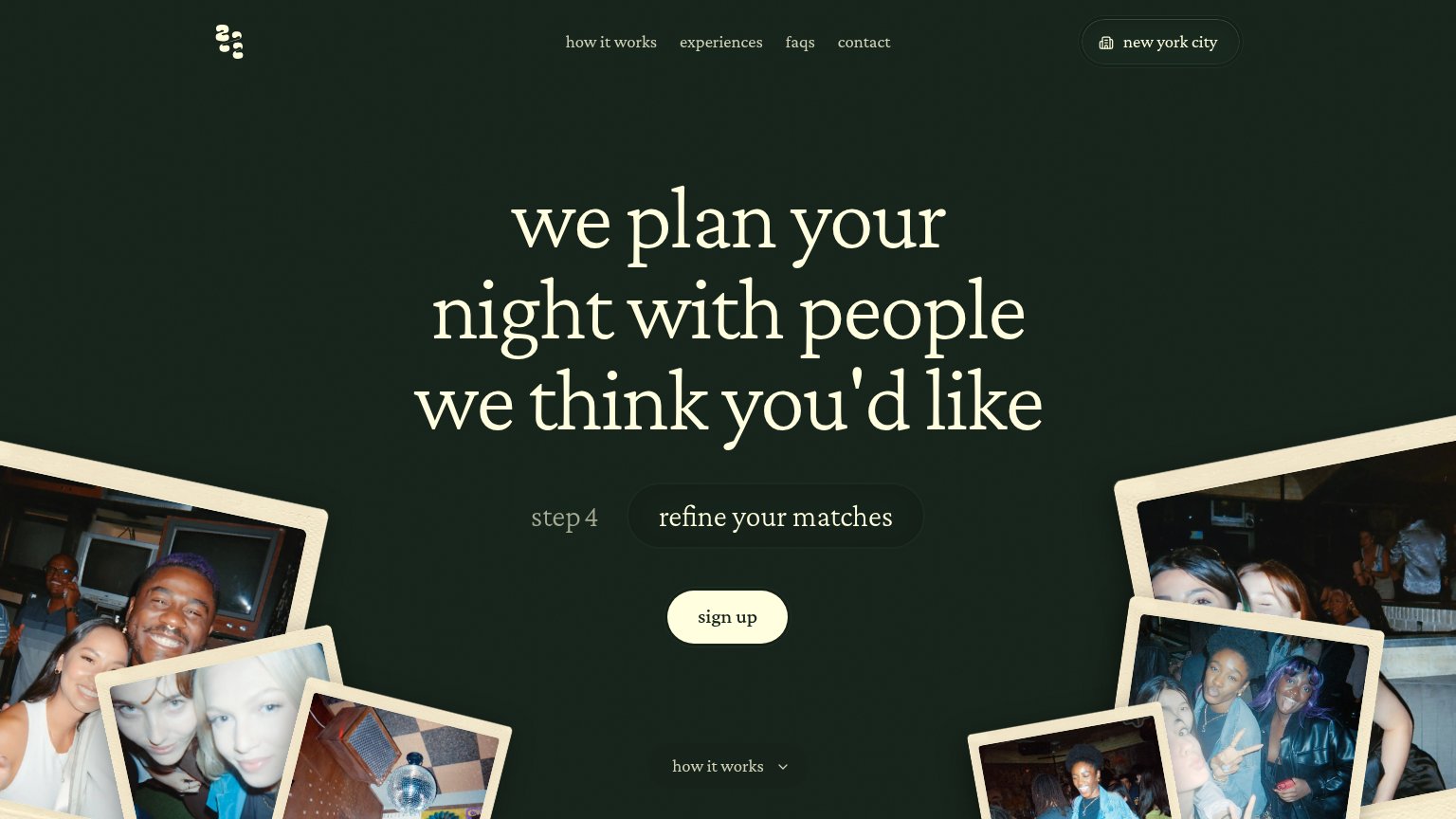
| Candid polaroid-style photos of members at 222 nights out | |
| App Store and Google Play download badges | |
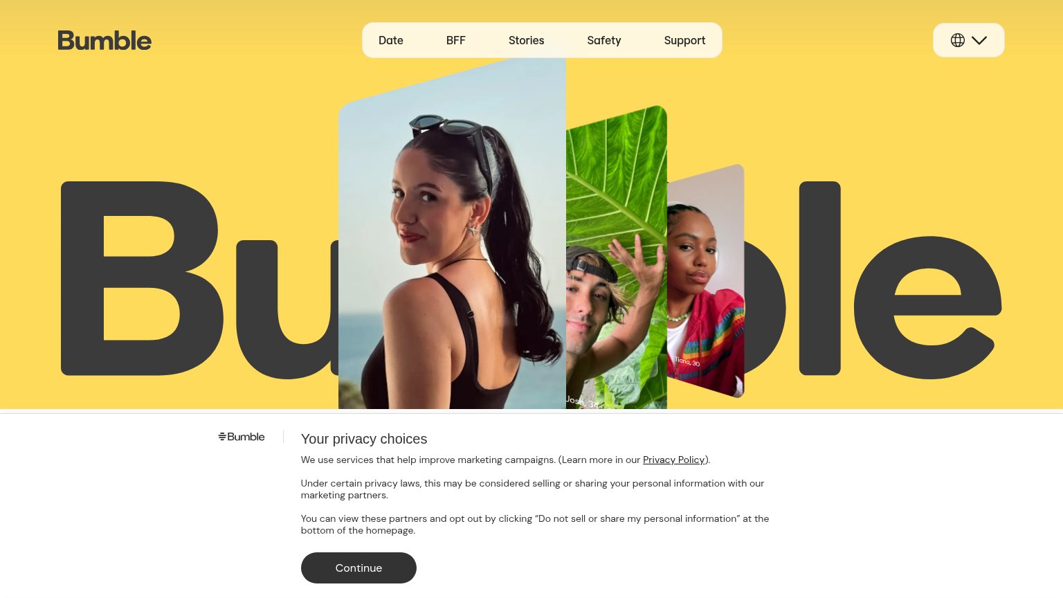
| Profile-card imagery with real member-style overlays ("Danna, 28", "Josh, 34", "Tiana, 30") | |
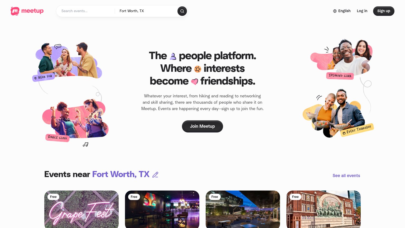
| "Events near Fort Worth, TX" grid with real local event cards (e.g. Grape Fest, "Free") |
Value props
54FairTitle, subtitle, hero — do they sell the product's true value?
Digipals’s headline vague
Digipals
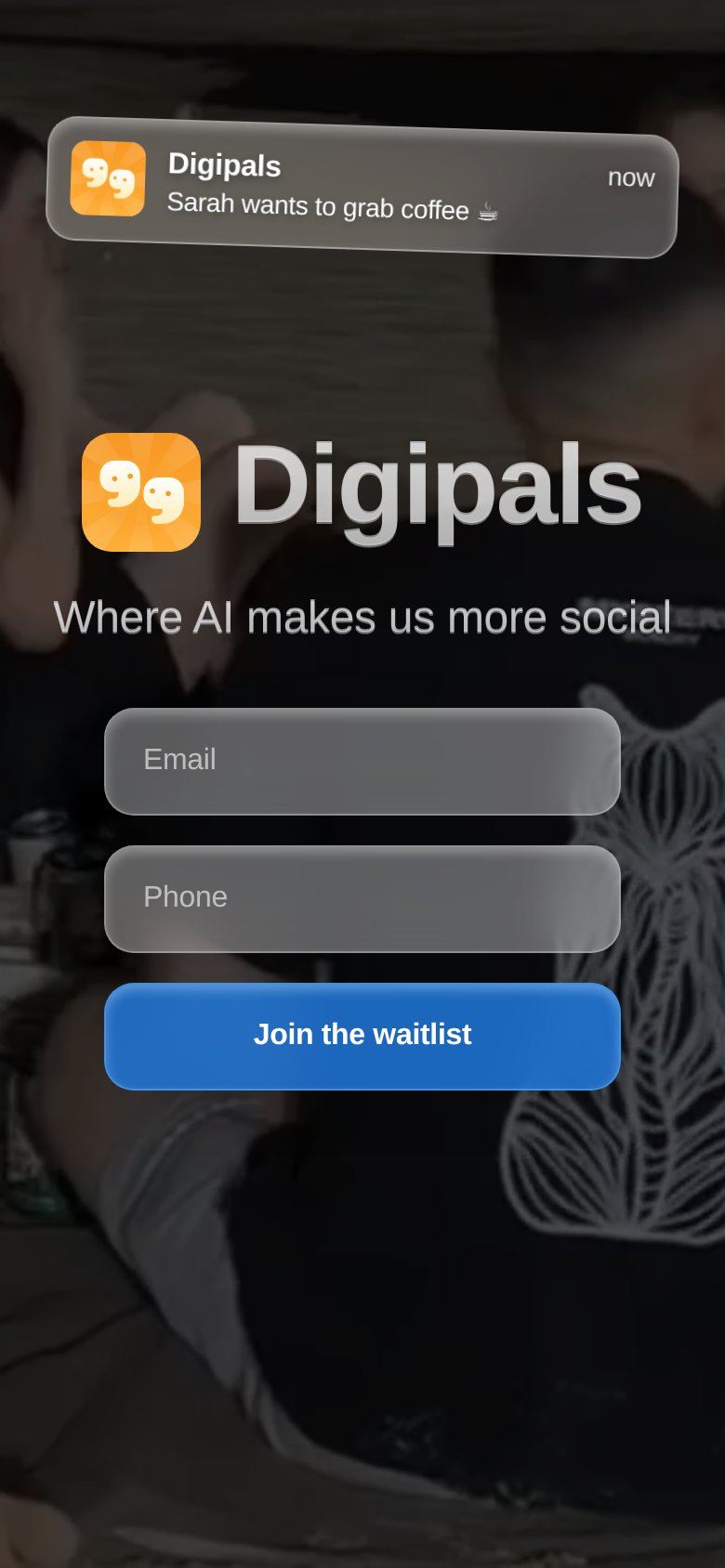
Where AI makes us more social
Working
- Notification mockups show real use cases
- Subhead flips the anti-social AI trope
- Emotional pull: real plans with real friends
Could improve
- No line explains what the product does
- Zero specifics, numbers, or proof
- Mobile keeps only one notification demo
CTA
68FairCopy, size, verb, cost-feel — does the primary CTA earn the click?
How Digipals compares
Recommended rewrites
Information hierarchy
74FairDoes the design help or inhibit what the page is trying to say?
What works
What to improve
Mobile web
78FairThe phone experience as a first-class citizen.
What works
What to improve