
Your landing page’s weakest score is Mobile web.
How Timeleft ranks
Mobile web
41PoorThe phone experience as a first-class citizen.
 123
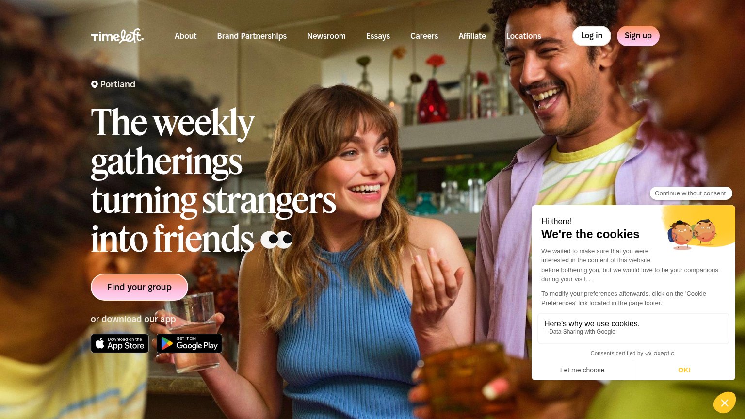
- Cookie consent modal — Covers two-thirds of the fold, hiding the headline and the primary 'Find Timeleft's group' CTA.
- Continue without consent pill — Floats detached over the hero photo, adding a third ambiguous dismiss option on top of 'Let me choose' and 'OK!'.
- OK! button — Styled as low-contrast yellow text on white, not a tappable button, making the fastest dismissal path hard to spot.
Trust
42PoorProof that the product is real, competent, and safe to try.
| Trust read | |
|---|---|
| Timeleft | App Store and Google Play download badges |
| "Free to download. Optional membership. Activity and ticket costs may be separate." disclosure under the CTA | |
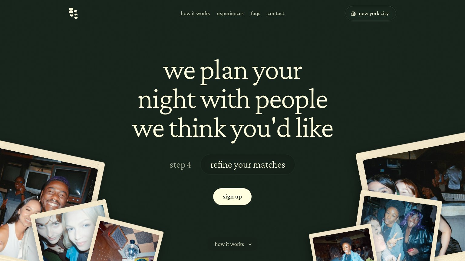
| Candid polaroid-style photos of members at 222 nights out | |
| No visible trust signal identified. | |
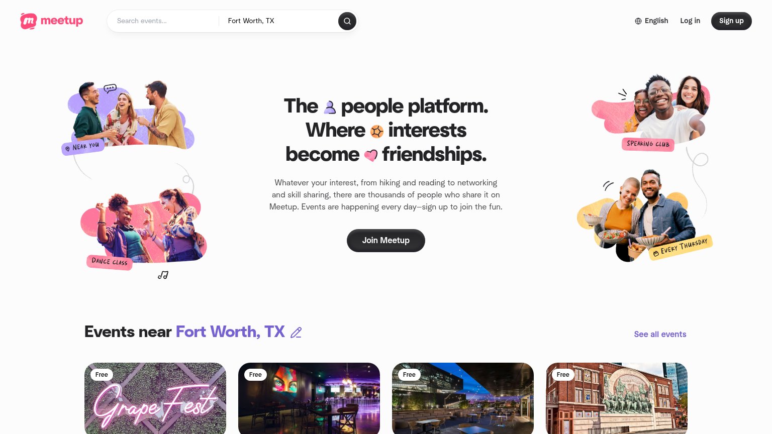
| "Events near Fort Worth, TX" grid with real local event cards (e.g. Grape Fest, "Free") | |
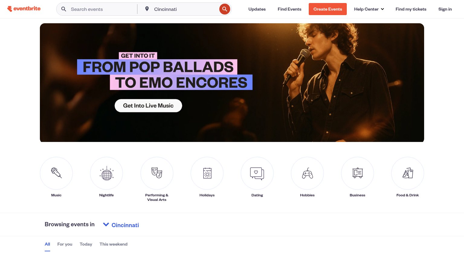
| "Browsing events in Cincinnati" localized event browser with All/For you/Today/This weekend filters |
Information hierarchy
66FairDoes the design help or inhibit what the page is trying to say?
What works
What to improve
CTA
73FairCopy, size, verb, cost-feel — does the primary CTA earn the click?
How Timeleft compares
Recommended rewrites
Value props
76FairTitle, subtitle, hero — do they sell the product's true value?
Timeleft’s headline
The weekly gatherings turning strangers into friends
or download our app
Working
Could improve