
Your landing page’s weakest score is Information hierarchy.
How Conveo ranks
73Growth scoreupdated
category scores
category scoresShowHide
Information hierarchy
68FairDoes the design help or inhibit what the page is trying to say?
 1234
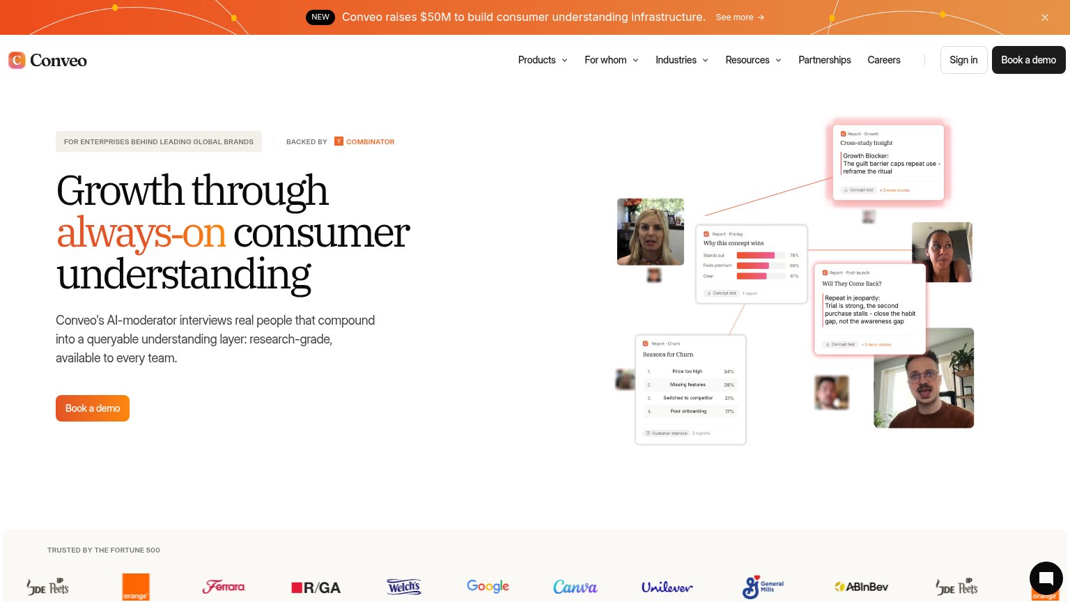
- Announcement banner — Full-width orange bar with 'See more' link outshouts the hero and adds an exit path before the headline.
- Nav menu row — Six top-level items, four with dropdowns, plus Sign in — roughly a dozen exit paths competing with 'Book a demo'.
- Hero 'Book a demo' — Primary CTA is small, isolated below the subhead, and duplicates the nav CTA at a different visual weight.
- Report card collage — Dense cluster of tiny screenshots and faces with unreadable body text — adds cognitive load without a single clear takeaway.
CTA
68FairCopy, size, verb, cost-feel — does the primary CTA earn the click?
Problems
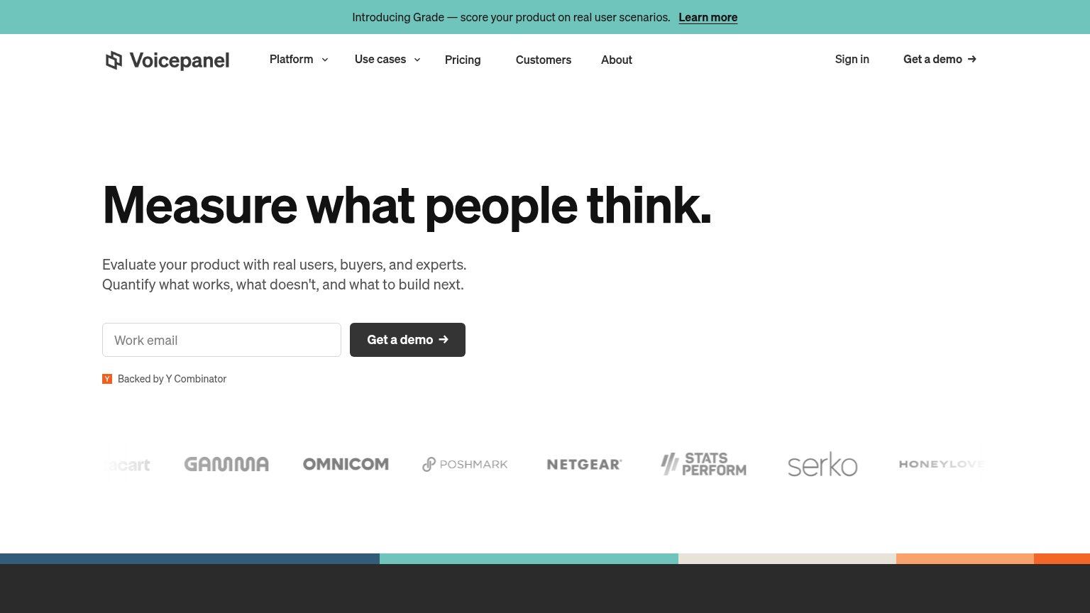
- 'Book' makes the click feel costly
- demo gate; no self-serve entry
- no value payoff in the label
Value props
72FairTitle, subtitle, hero — do they sell the product's true value?
Conveo’s headline
Growth through always-on consumer understanding
Conveo's AI-moderator interviews real people that compound into a queryable understanding layer: research-grade, available to every team.
Working
Could improve
Trust
78FairProof that the product is real, competent, and safe to try.
How Conveo compares
Trust read
Mobile web
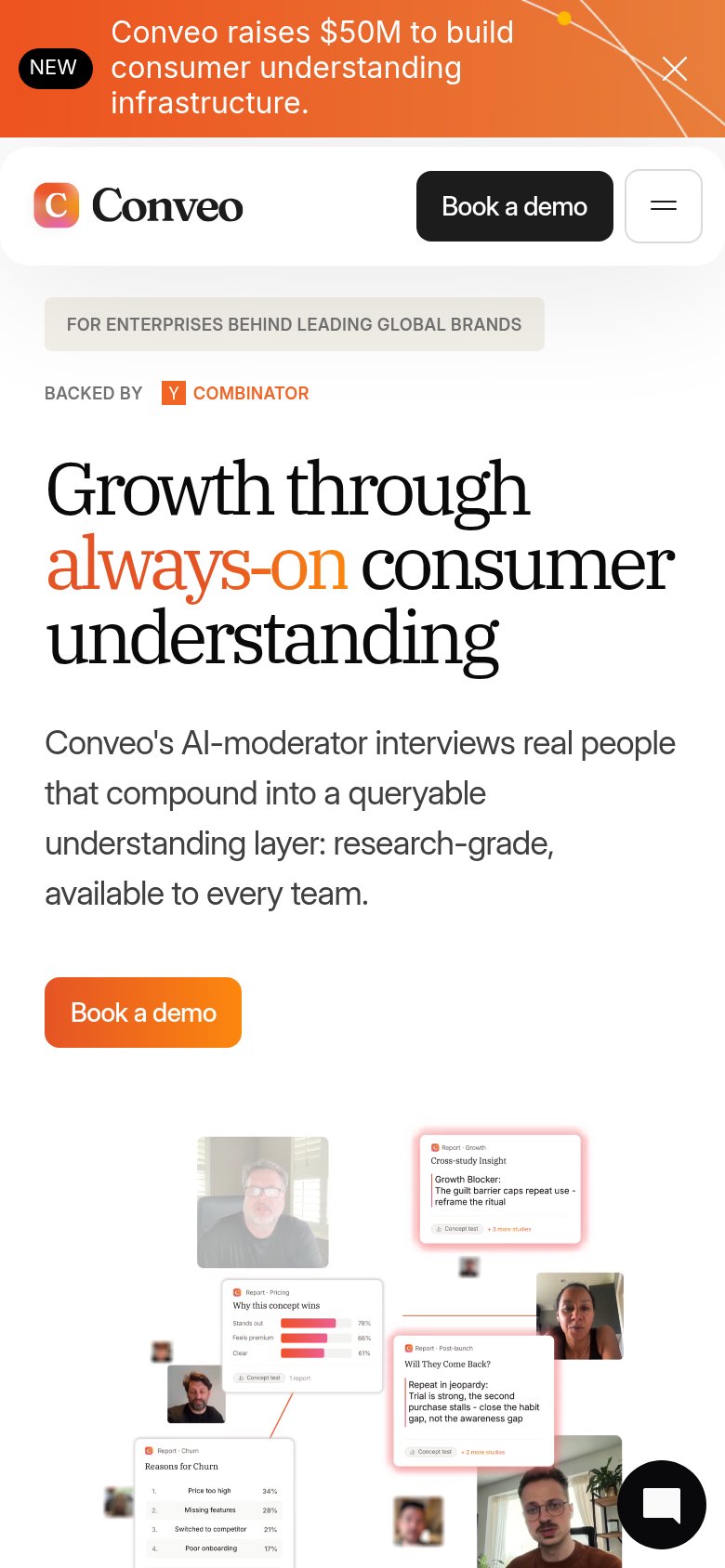
78FairThe phone experience as a first-class citizen.
What works
What to improve