
Your landing page’s weakest score is Trust.
How Centivo ranks
63Growth scoreupdated
category scores
category scoresShowHide
Trust
44PoorProof that the product is real, competent, and safe to try.
| Trust read | |
|---|---|
| Centivo | No visible trust signal identified. |
| "RUNWAY RETURNED $875K — Series B case study" stat card | |
| No visible trust signal identified. | |
| No visible trust signal identified. | |
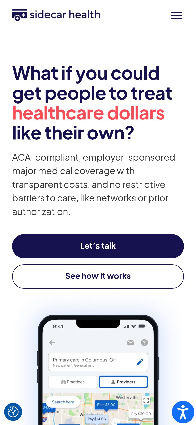
| Phone mockup of the real app showing provider search in Columbus, OH with named providers, care-quality ratings, and pri | |
| "Member Portal" login button in the header indicating a live product with existing members |
Value props
58FairTitle, subtitle, hero — do they sell the product's true value?
Centivo’s headline undersells
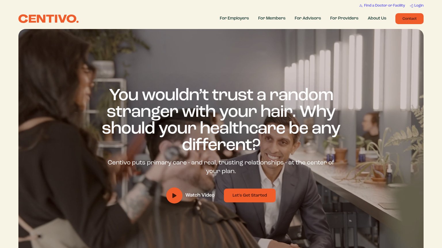
You wouldn't trust a random stranger with your hair. Why should your healthcare be any different?
Centivo puts primary care - and real, trusting relationships - at the center of your plan.
Working
- Emotional analogy makes trust gap felt
- Subhead names primary-care-first model
- Distinctive voice, not category buzzwords
Could improve
- Headline never says what Centivo is
- No numbers: savings, $0 care, members
- Hero image decorates, doesn't demo
CTA
68FairCopy, size, verb, cost-feel — does the primary CTA earn the click?
How Centivo compares
Recommended rewrites
Mobile web
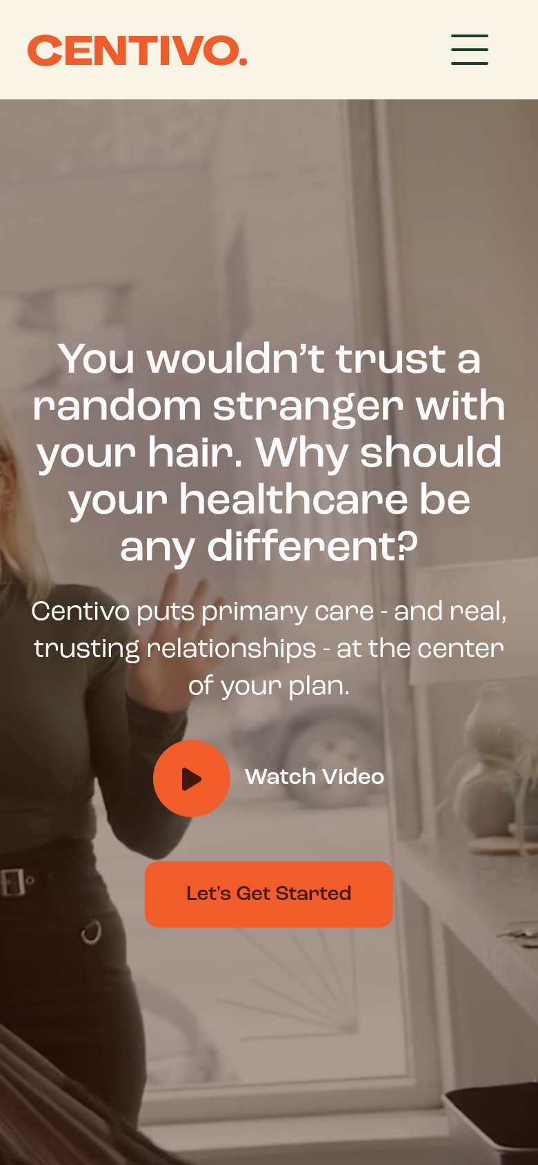
72FairThe phone experience as a first-class citizen.
What works
What to improve
Information hierarchy
74FairDoes the design help or inhibit what the page is trying to say?
What works
What to improve