
Your landing page’s weakest score is Value props.
How Cascadia Motion ranks
52Growth scoreupdated
category scores
category scoresShowHide
Value props
38PoorTitle, subtitle, hero — do they sell the product's true value?
Cascadia Motion’s headline vague
"Cascadia Motion is committed to our customers through the continuous improvement of our products, our processes, and our people. We strive to exceed customer e
Working
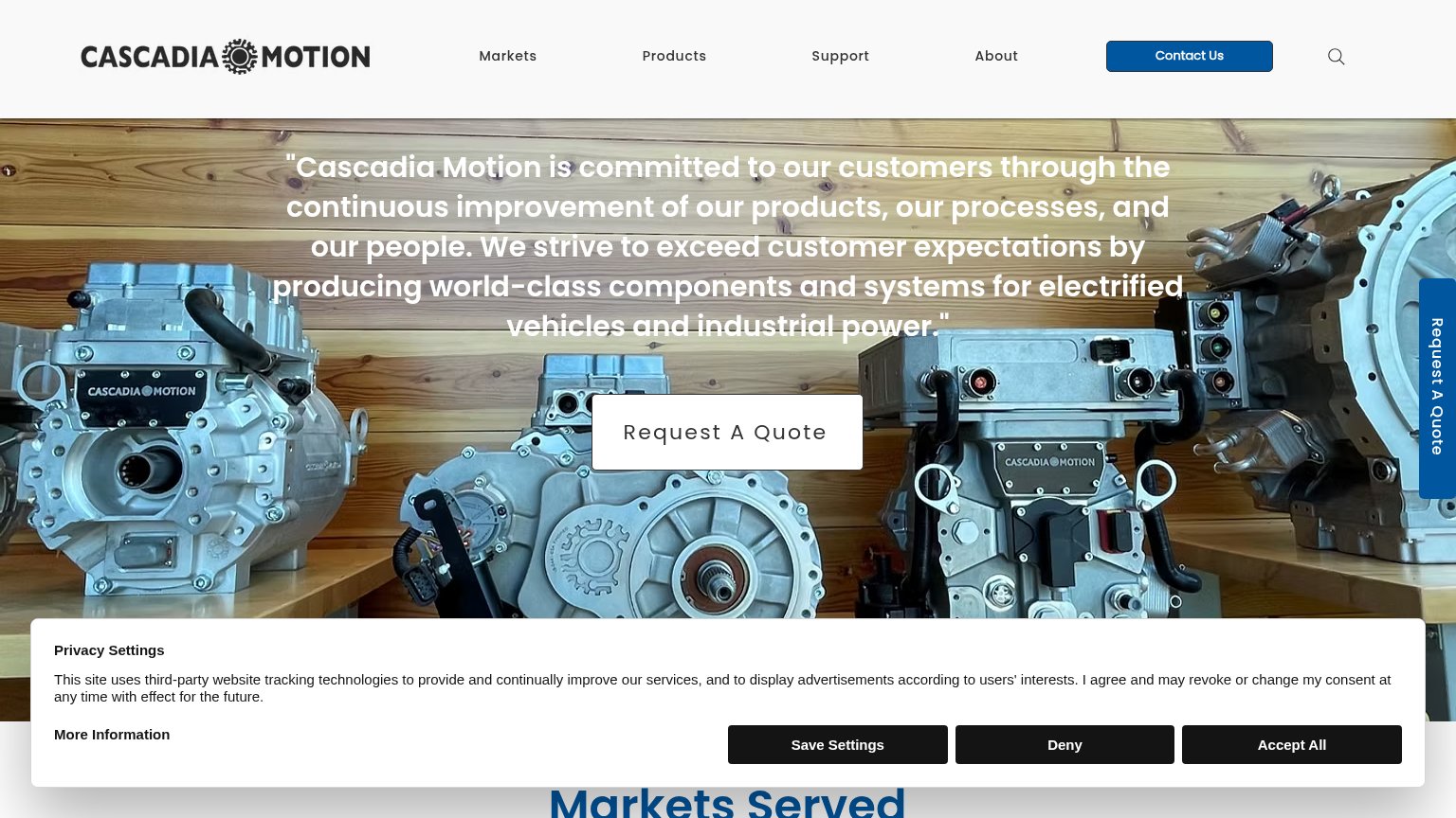
- Hero image shows real hardware products
- Names market: electrified vehicles, industrial
- Clear Request A Quote CTA
Could improve
- Mission statement instead of value prop
- No numbers, specs, or proof points
- No subhead naming actual products
Mobile web
42PoorThe phone experience as a first-class citizen.
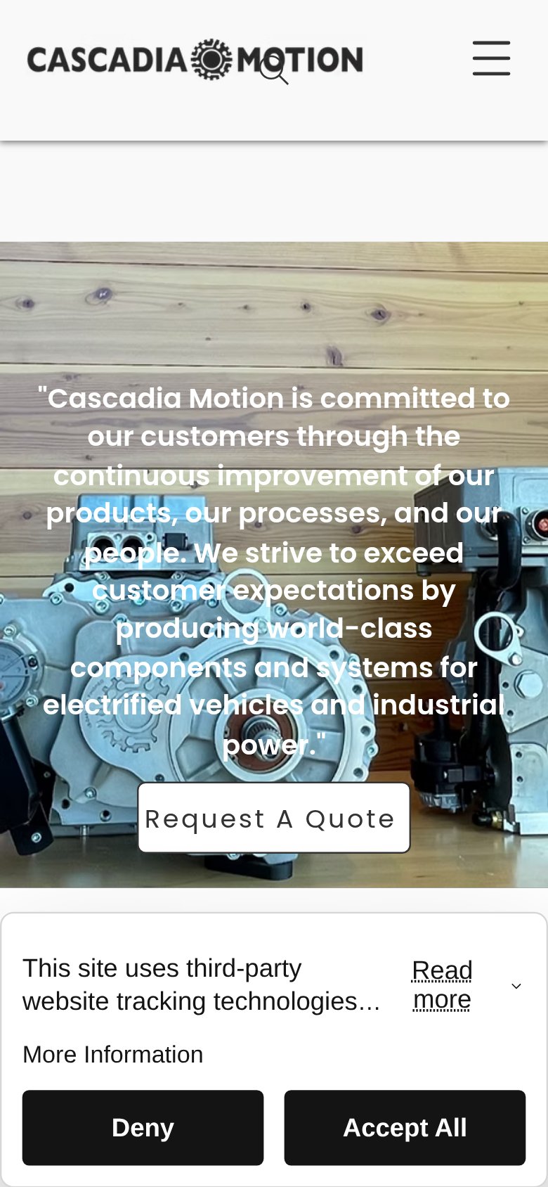 1234
- Cookie consent banner — Dead blocker covering the lower third of the fold; must be dismissed before the CTA can be tapped.
- Nine-line hero quote — Desktop mission statement wraps into nine cramped lines over a busy photo, burying the value proposition.
- Request A Quote button — Desktop-proportioned button pinned at the viewport edge instead of a full-width thumb target.
- Search icon overlaps logo — Search glass renders on top of the logo lockup, signaling an unchecked mobile header layout.
Trust
52FairProof that the product is real, competent, and safe to try.
How Cascadia Motion compares
Trust read
Information hierarchy
58FairDoes the design help or inhibit what the page is trying to say?
What works
What to improve
CTA
68FairCopy, size, verb, cost-feel — does the primary CTA earn the click?
How Cascadia Motion compares
Recommended rewrites