
Your landing page’s weakest score is Trust.
How Bron ranks
Trust
48PoorProof that the product is real, competent, and safe to try.
| Trust read | |
|---|---|
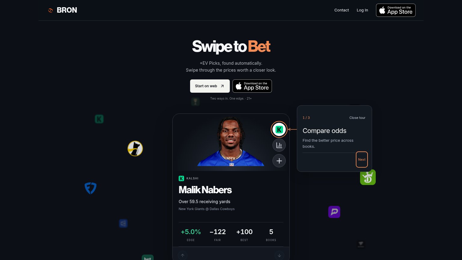
| Bron | Live pick card showing "Malik Nabers — Over 59.5 receiving yards" with +5.0% EDGE, −122 FAIR, +100 BEST across 5 BOOKS |
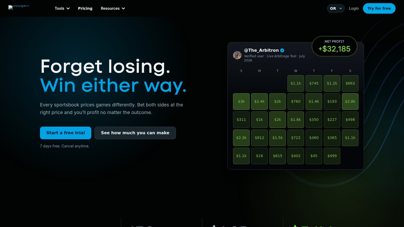
| "@The_Arbitron · Verified user · Live Arbitrage Tool" profit calendar showing "+$32,185" net profit | |
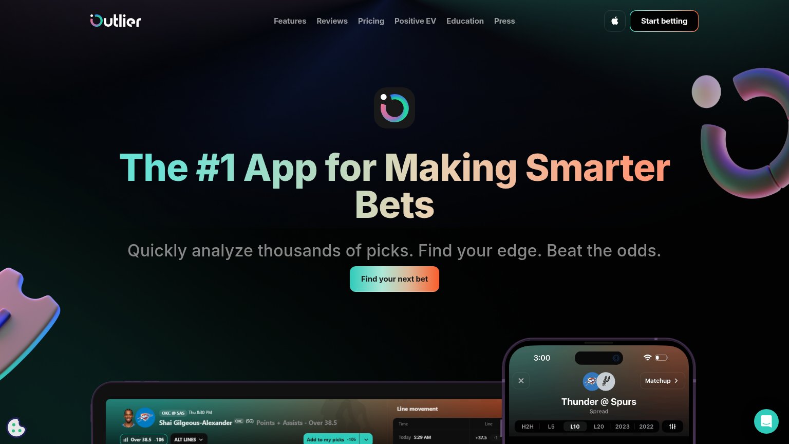
| Detailed real product UI screenshots showing 'Thunder @ Spurs' matchup stats and player prop charts | |
| Phone mockups showing real product UI with player prop lines (e.g. "Nikola Jokic (DEN)") and a Tails picks feed | |
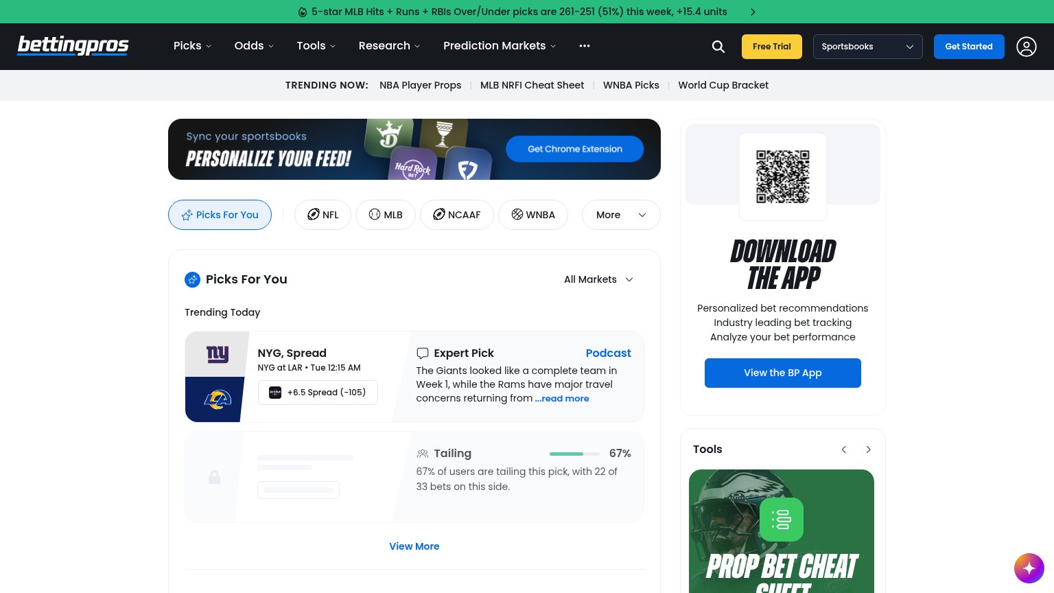
| "67% of users are tailing this pick, with 22 of 33 bets on this side" — live pick-tailing stat in the feed | |
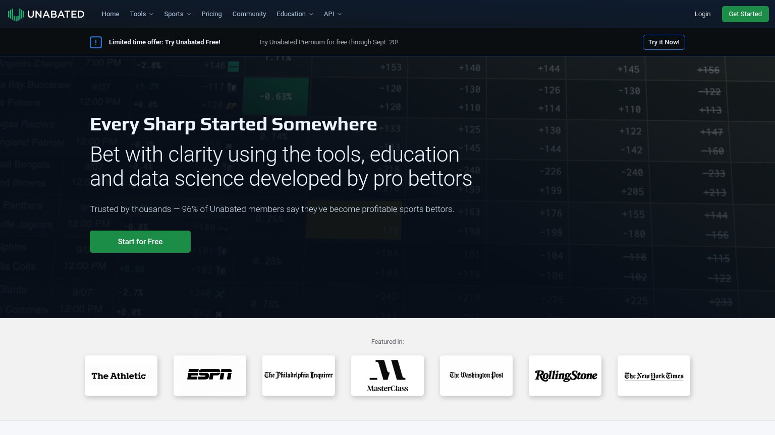
| "Featured in:" press logo bar with The Athletic, ESPN, The Philadelphia Inquirer, MasterClass, The Washington Post, Roll |
Mobile web
64FairThe phone experience as a first-class citizen.
 123
- Product tour overlay — The '1 / 3 Compare odds' tour card interrupts the first swipe and pushes the pick card down without doing any conversion work — a dead blocker on mobile.
- Uncollapsed nav row — Full desktop link row ('Contact', 'Log In', App Store badge) sits crammed in the header instead of a hamburger, competing with the hero CTAs.
- Start on web button — The primary CTA is desktop-proportioned and shares the row with the App Store badge instead of being a full-width thumb target.
Information hierarchy
72FairDoes the design help or inhibit what the page is trying to say?
What works
What to improve
CTA
72FairCopy, size, verb, cost-feel — does the primary CTA earn the click?
How Bron compares
Recommended rewrites
Value props
72FairTitle, subtitle, hero — do they sell the product's true value?
Bron’s headline
Swipe to Bet
+EV Picks, found automatically. Swipe through the prices worth a closer look.
Working
Could improve