
Your landing page’s weakest score is Information hierarchy.
How BettingPros ranks
- 1.
betalyze.io72
- 2.
Outlier70
- 3.
Props.Cash63
- 4.
Linemate62
- 5.
BettingPros55
55Growth scoreupdated
category scores
category scoresShowHide
Information hierarchy
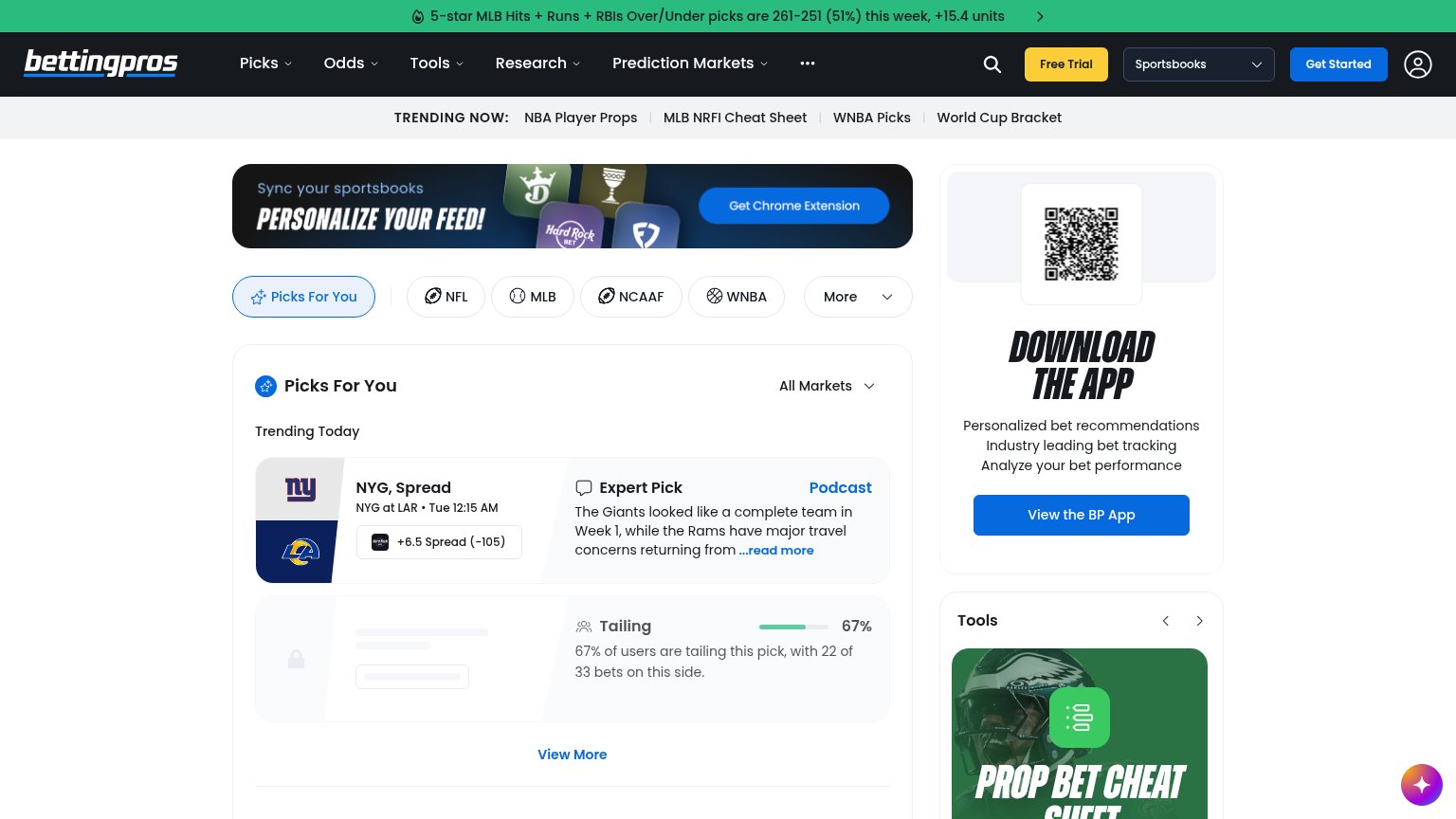
48PoorDoes the design help or inhibit what the page is trying to say?
 1234
- Get Started vs Free Trial — Two adjacent header CTAs styled at similar weight split the primary action; neither reads as the one path forward.
- Chrome extension banner — The most prominent hero-position surface pitches a browser extension, outranking any statement of what BettingPros is or does.
- Trending Now strip — Four equal-weight exit links sit directly under the nav, pulling attention sideways before the fold's main content.
- Skeleton locked pick card — A greyed placeholder card occupies prime real estate below the first pick, reading as broken content rather than a paywall prompt.
Value props
48PoorTitle, subtitle, hero — do they sell the product's true value?
BettingPros’s headline undersells
Picks For You
Working
- Ticker shows real record: 51%, +15.4 units
- Live pick card demonstrates the product
- Sport tabs make coverage breadth obvious
Could improve
- No hero headline stating what BettingPros is
- Best proof buried in a scrolling ticker
- No emotional hook about winning smarter
Trust
58FairProof that the product is real, competent, and safe to try.
How BettingPros compares
Trust read
Mobile web
58FairThe phone experience as a first-class citizen.
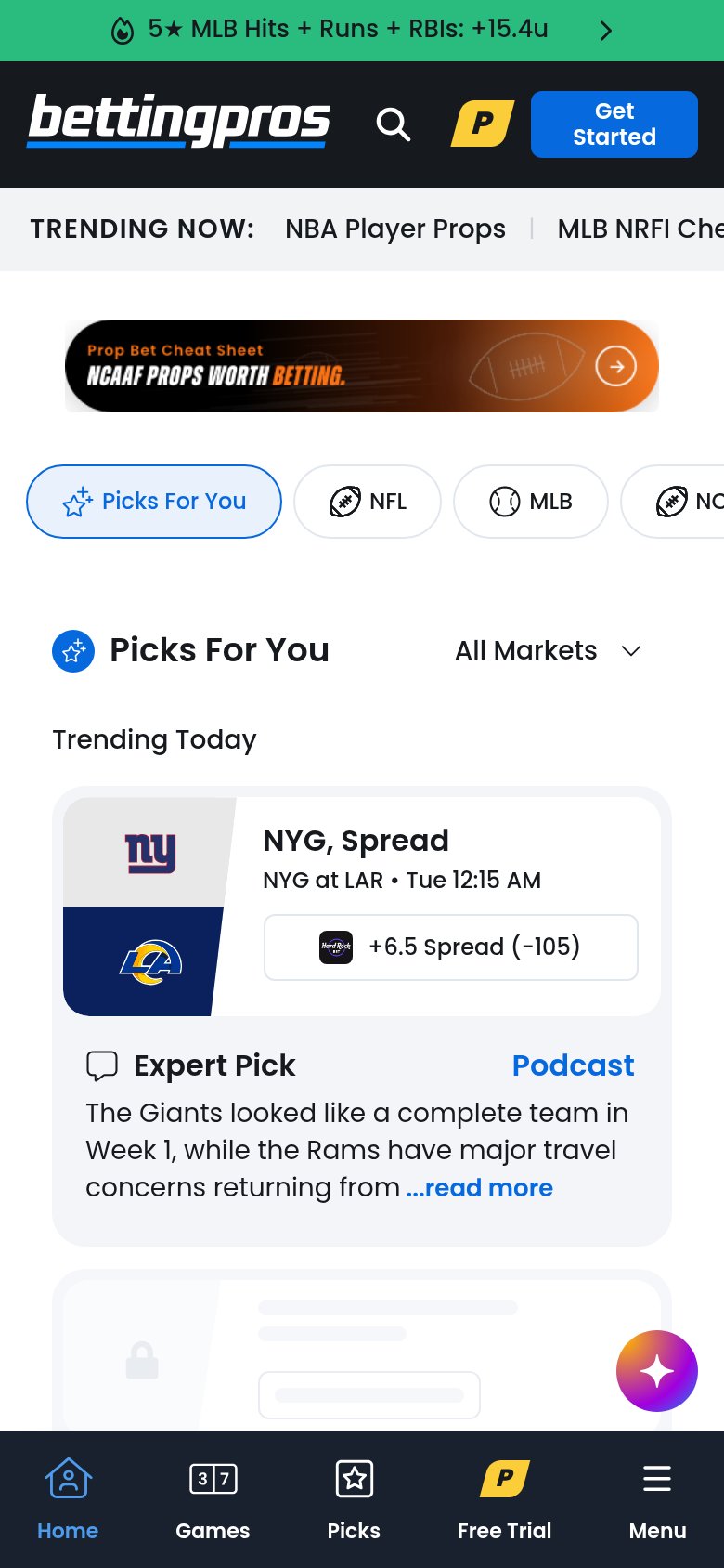
What works
What to improve
CTA
64FairCopy, size, verb, cost-feel — does the primary CTA earn the click?
How BettingPros compares
Recommended rewrites