
Your landing page’s weakest score is Trust.
How Outlier ranks
Trust
52FairProof that the product is real, competent, and safe to try.
| Trust read | |
|---|---|
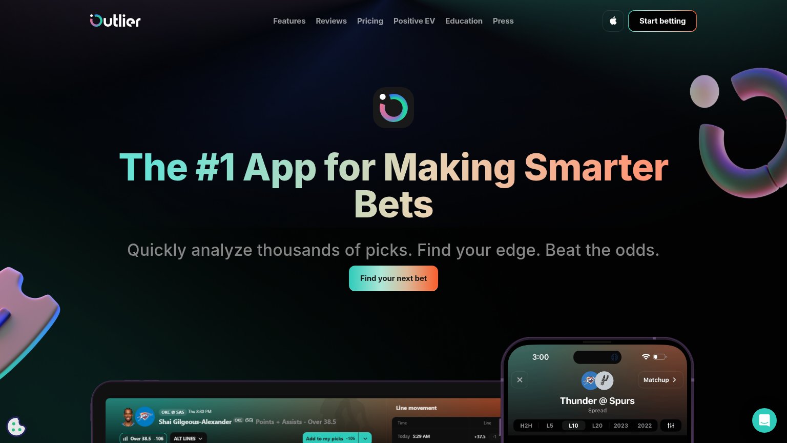
| Outlier | Detailed real product UI screenshots showing 'Thunder @ Spurs' matchup stats and player prop charts |
| "2 400+ Props analysés / semaine" stat in the metrics bar | |
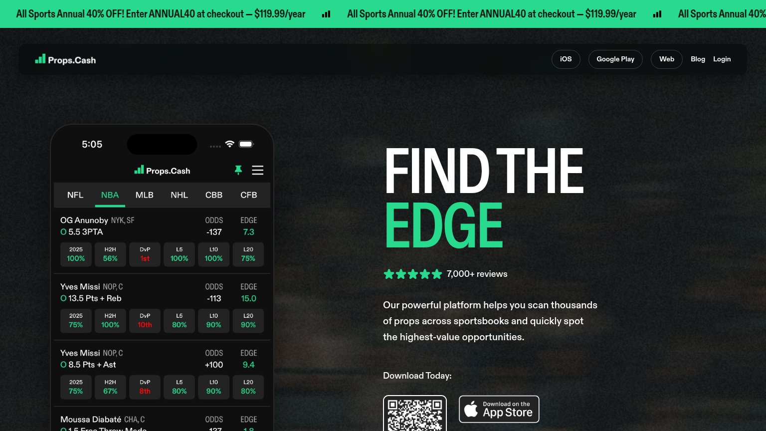
| Five-star rating with "7,000+ reviews" above the App Store download CTA | |
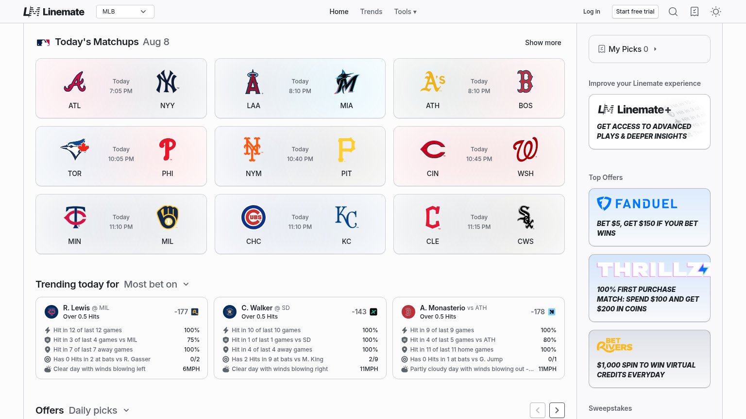
| Live trending-picks UI: "R. Lewis @ MIL, Over 0.5 Hits — Hit in 12 of last 12 games 100%" | |
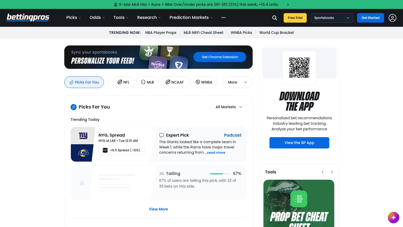
| "67% of users are tailing this pick, with 22 of 33 bets on this side" — live pick-tailing stat in the feed |
Mobile web
68FairThe phone experience as a first-class citizen.
 123
- Uncollapsed nav row — Full desktop link row crammed below the header with "Educa…" clipped mid-word — it overflows the viewport and stacks a second header deck over the hero.
- Find Outlier's next bet — Primary CTA is under half the column width; a desktop-proportioned button where a full-bleed thumb target should be.
- Chat bubble — Dead-blocker chat widget overlaps the product screenshot and adds a competing tap target near the scroll path.
Value props
74FairTitle, subtitle, hero — do they sell the product's true value?
Outlier’s headline
The #1 App for Making Smarter Bets
Quickly analyze thousands of picks. Find your edge. Beat the odds.
Working
Could improve
CTA
78FairCopy, size, verb, cost-feel — does the primary CTA earn the click?
How Outlier compares
Recommended rewrites
Information hierarchy
80StrongDoes the design help or inhibit what the page is trying to say?
What works
What to improve