
Your landing page’s weakest score is Value props.
How Accordance ranks
67Growth scoreupdated
category scores
category scoresShowHide
Value props
56FairTitle, subtitle, hero — do they sell the product's true value?
Accordance’s headline vague
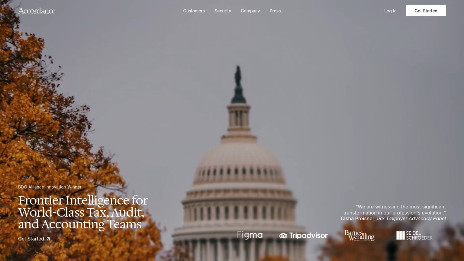
Frontier Intelligence for World-Class Tax, Audit, and Accounting Teams
Working
- Names the exact audience: tax, audit, accounting
- Strong proof: IRS panel quote, BDO award, logos
- Premium, confident brand tone
Could improve
- "Frontier Intelligence" says nothing concrete
- No subhead explaining what the product does
- Hero image decorates, never shows the product
Information hierarchy
68FairDoes the design help or inhibit what the page is trying to say?
 123
- Get Started text link — The primary in-hero CTA is a small underline-style text link with an arrow, visually weaker than the nav's Get Started button it duplicates.
- Faded logo strip — Figma and Tripadvisor logos are irrelevant proof for tax/audit teams and blur into the background image, adding noise without credibility.
- Testimonial quote block — The Tasha Preisner quote in low-contrast gray text competes with the headline at the same fold level and is barely legible over the sky.
CTA
68FairCopy, size, verb, cost-feel — does the primary CTA earn the click?
How Accordance compares
Recommended rewrites
Trust
72FairProof that the product is real, competent, and safe to try.
How Accordance compares
Trust read
Mobile web
72FairThe phone experience as a first-class citizen.
What works
What to improve