
Your landing page’s weakest score is Mobile web.
How Basis ranks
Mobile web
42PoorThe phone experience as a first-class citizen.
 123
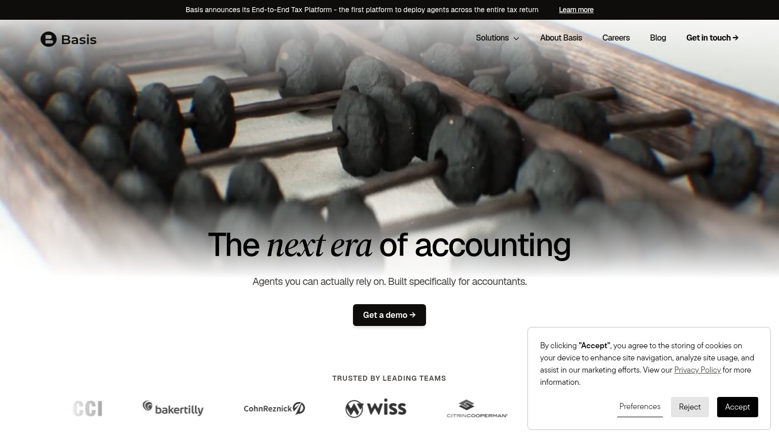
- Cookie consent card — Full-height dead blocker covers two-thirds of the fold and hides the CTA area with zero conversion value.
- Headline without CTA — Hero ends at the headline — the Get a demo button is pushed entirely below the first viewport.
- Announcement banner — Wraps to three lines plus a Learn more link, consuming a large slice of the fold before the hero.
Trust
58FairProof that the product is real, competent, and safe to try.
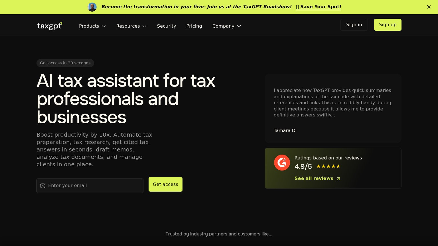
| Trust read | |
|---|---|
| Basis | "TRUSTED BY LEADING TEAMS" logo bar with Baker Tilly, CohnReznick, Wiss, CitrinCooperman |
| Product UI showing "Cranston found §199A information in an attached Schedule K-1 Statement A that was omitted from the d | |
| "AI Tax Summit — Recap the Day from Nasdaq Tower" event banner | |
| Customer logo strip with named CPA firms (DWC, Schwarcz CPA, Stratax, Lagow CPA, Knapp, KSP) | |
| G2 card: "Ratings based on our reviews — 4.9/5" with star rating and "See all reviews" link |
Value props
62FairTitle, subtitle, hero — do they sell the product's true value?
Basis’s headline
The next era of accounting
Agents you can actually rely on. Built specifically for accountants.
Working
Could improve
CTA
64FairCopy, size, verb, cost-feel — does the primary CTA earn the click?
How Basis compares
Recommended rewrites
Information hierarchy
72FairDoes the design help or inhibit what the page is trying to say?
What works
What to improve