
Your landing page’s weakest score is Trust.
How Scheduling Wizard ranks
- 1.
Amion70
- 2.
Scheduling Wizard67
- 3.
Lightning Bolt (PerfectServe)64
- 4.
QGenda58
- 5.
MedRez55
- 6.
ShiftAdmin44
67Growth scoreupdated
category scores
category scoresShowHide
Score over time
Trust
55FairProof that the product is real, competent, and safe to try.

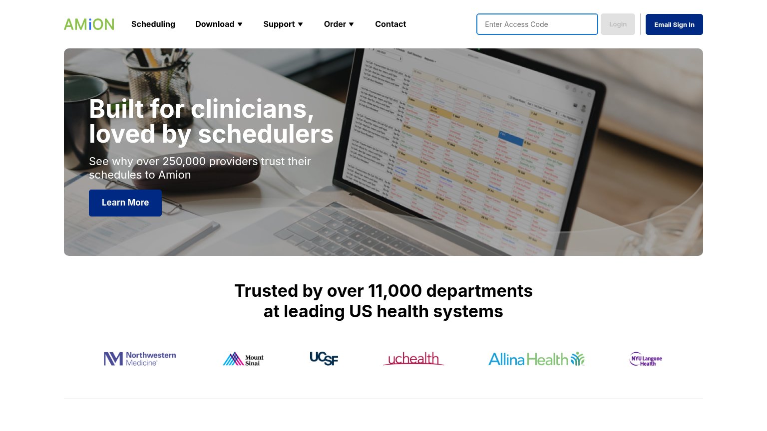
| Trust read | |
|---|---|
| Scheduling Wizard | "Backed by Y Combinator" badge above the hero headline |
| "Trusted by over 11,000 departments at leading US health systems" with logos of Northwestern Medicine, Mount Sinai, UCSF | |
| No visible trust signal identified. | |
| No visible trust signal identified. | |
| Detailed schedule-viewer screenshot on iPad and iPhone showing real UI ("Request days off", "Download a PDF of your sche | |
| "A QGENDA COMPANY" tagline under the ShiftAdmin logo plus the 1-888-SHIFT40 phone line |
CTA
62FairCopy, size, verb, cost-feel — does the primary CTA earn the click?
Problems
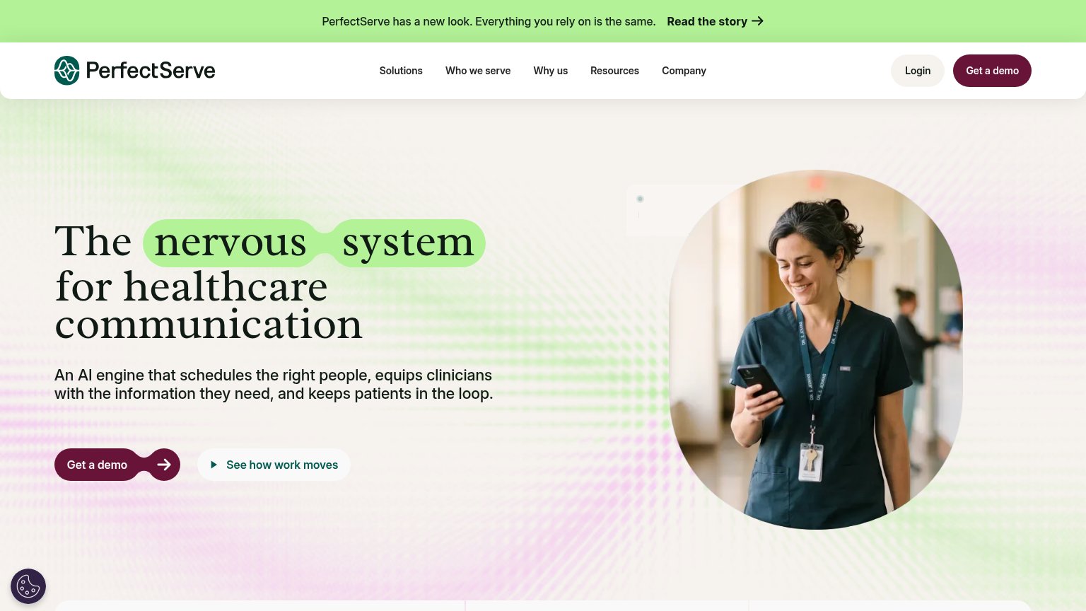
- outcome of click is unclear
- low contrast vs. nav's yellow pill
- 4 words, reads slow
- two competing CTA labels
Information hierarchy
68FairDoes the design help or inhibit what the page is trying to say?
1234- Two CTAs compete — Hero button 'Take back Scheduling Wizard's time' is dark gray on dark, while the nav's yellow 'Get a Quote' outshines it — the primary action loses the contrast battle.
- Take back Scheduling Wizard's time — Low-contrast charcoal fill blends into the background and the vague label doesn't say what happens on click.
- Six-link nav row — Home, Use Cases, Demo, Customers, Team, Contact us are six equal-weight exits before the visitor reaches the hero promise.
- Serving 25+ departments — The pill is styled at nearly the same weight and shape as the CTA below it, muddying which element is clickable.
Value props
72FairTitle, subtitle, hero — do they sell the product's true value?
Scheduling Wizard’s headline sells
Never Schedule Again.
We save GME programs, provider groups and private practices hundreds of hours through our cutting-edge approach to physician schedule creation.
Working
- Outcome-first headline hits the pain
- Subhead names exact audience segments
- 'Hundreds of hours' quantifies the win
Could improve
- 'Cutting-edge approach' hides what it is
- No product visual — hero is empty space
- '25+ departments' is weak social proof
Mobile web
78FairThe phone experience as a first-class citizen.
 123
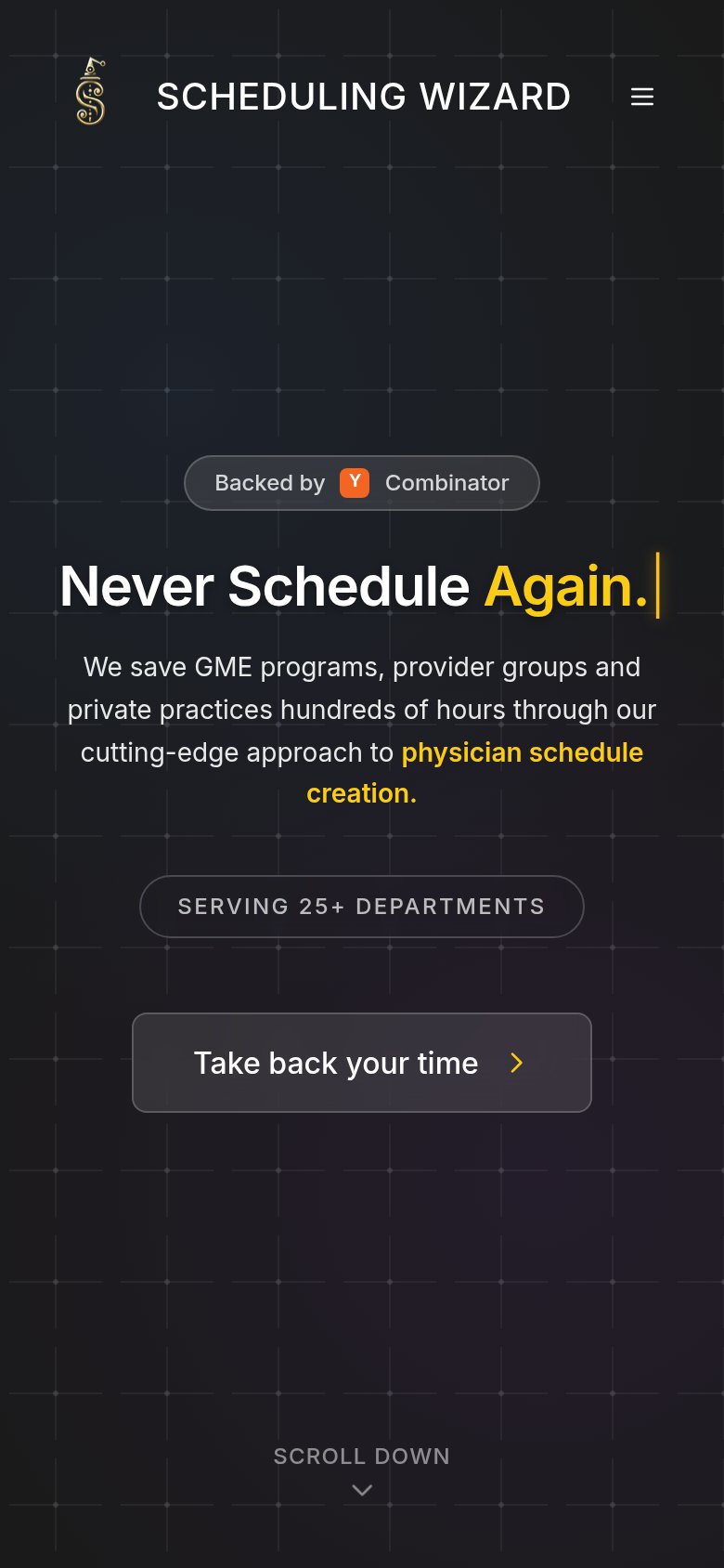
- Take back Scheduling Wizard's time — Dark gray button blends into the background and stops short of full width — the primary action is the least eye-catching element on the fold.
- SERVING 25+ DEPARTMENTS badge — Pill-shaped and button-styled, it competes with the real CTA below while doing nothing on tap.
- Backed by badge — The orange Y Combinator mark is the brightest tappable-looking element on the fold, drawing thumbs to a non-clickable badge.