
Your landing page’s weakest score is Trust.
How Forum ranks
64Growth scoreupdated
category scores
category scoresShowHide
Score over time
Trust
35PoorProof that the product is real, competent, and safe to try.

| Trust read | |
|---|---|
| Forum | No visible trust signal identified. |
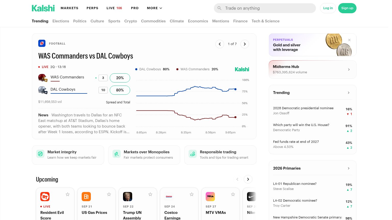
| Live market card showing "$11,050,553 vol" with a real-time price chart for WAS Commanders vs DAL Cowboys | |
| Live market volume figures — "$7M Vol." on the NATO x Russia market and Hot Topics showing "$614K today" traded | |
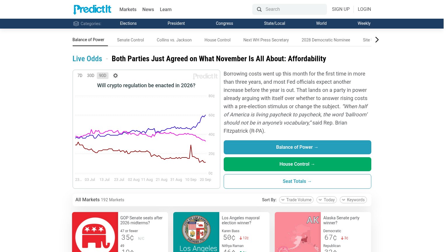
| Live market chart "Will crypto regulation be enacted in 2026?" with real-time price history and 192-market listing | |
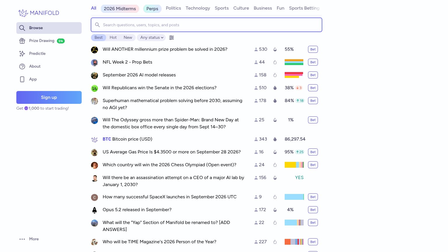
| Live market listings with real trader counts and volumes, e.g. "Will Republicans win the Senate in the 2026 elections?" | |
| No visible trust signal identified. |
Value props
58FairTitle, subtitle, hero — do they sell the product's true value?
Forum’s headline undersells
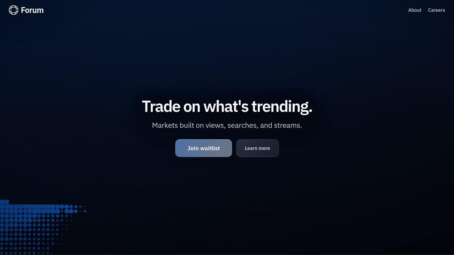
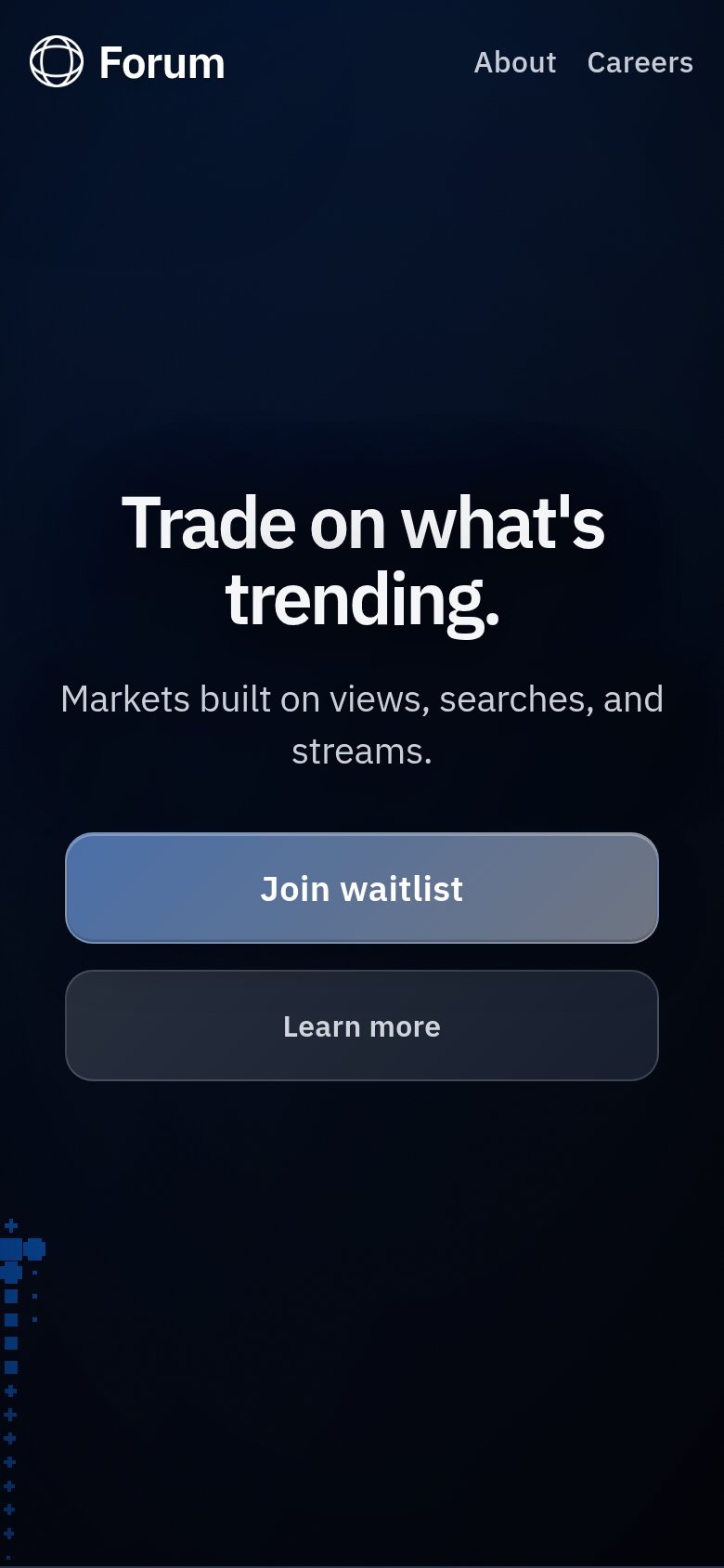
Trade on what's trending.
Markets built on views, searches, and streams.
Working
- Names the core action: trading
- Subhead names novel assets: views, searches, streams
- Short, punchy, memorable rhythm
Could improve
- No example market or number to make it concrete
- Hero shows zero product — pure decoration
- No emotional hook: edge, thrill, being early
CTA
68FairCopy, size, verb, cost-feel — does the primary CTA earn the click?
Problems
- 'waitlist' signals deferred payoff
- no echo of 'Trade on what's trending'
- no value hook near the button
Information hierarchy
76FairDoes the design help or inhibit what the page is trying to say?
123- Learn more button — Secondary button sits at near-equal size and adjacency to "Join waitlist", splitting the single click decision.
- Join waitlist button — Muted slate-blue fill blends into the dark navy background, weakening the one-second find test for the primary action.
- Subheadline copy — "Markets built on views, searches, and streams" is the only explanation of the product and is set in low-contrast grey that recedes into the background.
Mobile web
84StrongThe phone experience as a first-class citizen.
 12
- Uncollapsed nav links — "About" and "Careers" sit as a full desktop link row instead of a hamburger, adding tap targets that compete with the hero.
- Headline wraps to two lines — "Trade on what's trending." scales down only slightly, wrapping mid-phrase and pushing the CTA lower in the viewport.